Jewelry Showcase Prop Design: Tone Zoning and Cushion Selection for Jade珠宝展柜道具设计方案:玉石翡翠的色调分区与衬垫选型
Jade is different from gold. It does not win by reflection but by texture, water and color. If glass species, ice species and glutinous species are mixed in one showcase, the tones disturb each other and nothing stands out. The first step of showcase prop design for jade is not choosing trays but zoning by tone, then selecting cushions, and finally considering the shape of stands.
Tone zoning expands by jade color: green, lavender, yellow and white ice are the four most common families. The design suggests dividing the showcase into four small scenes with removable boards about twelve centimeters high, so neighboring tones do not mix visually. Inside each scene, separate by species: glass species in the brightest position, glutinous and bean species in the darker rear, letting strengths support weaknesses.
Cushion selection is the most delicate part. Jade has a cool color temperature; warm cushions enrich it, cold cushions weaken it. In practice, green jade matches rice-white or light gray velvet, lavender matches lotus-root velvet, yellow jade matches two-tone white and light coffee pads, and white ice uses pure white with an embedded light strip. Use short-pile velvet with pile height under 1.5 mm to avoid a foggy look.
Stand shapes must follow the piece. Bracelets use curved soft stands with a figure-eight groove, one third of the ring embedded. Pendants use upright backboards at about seventy degrees so light passes through the center. Cabochons use round sunken trays three millimeters deep, letting edges catch a contour light. All metal fittings should be matte titanium or bronze, avoiding bright plating whose reflections disturb color judgment.
Lighting must be linked with tone zones. Green area uses 3500-4000K, slightly warm to make green alive; lavender uses 4500-5000K to amplify clarity; white ice uses over 5500K with bottom light to show the glowing effect of glass species. Each zone has independent lamps and switches, so clerks can strengthen one zone temporarily for promoted pieces.
Safety is part of the plan. All props should be lockable: trays fixed to the cabinet with buckles opened by a special key. After closing, trays are lifted into velvet-lined safe grids divided by bracelet, pendant and cabochon, with pearl cotton walls to prevent collision. Each cell has a numbered slot so inventory checking by number is faster and easier.
For festivals, tone zones can move as a whole. For example, before Spring Festival, shrink the lavender zone and enlarge the red jade zone, changing only boards and cushion colors while stands and lamps stay. This "fixed zones, changeable cushions" idea gives the showcase theme-switching ability with low cost and direct effect.
In short, jade showcase prop design can be summarized in three sentences: zone first then cushions, cushions serve the jade color, and lighting zones are controllable. Showcases built this way let customers lock onto appealing pieces at first glance, and clerks can more easily explain why a piece is good, clearly reducing communication cost before purchase.玉石翡翠与黄金不同,它不靠反光取胜,靠的是本身的质地、水头与色彩。同一只展柜里,如果玻璃种、冰种、糯种混在一起摆,浓淡深浅互相干扰,顾客反而看不出任何一件的亮点。给玉石翡翠做展柜道具设计,第一件事不是选托,而是先做色调分区,再根据分区选定衬垫,最后才考虑托架的形态。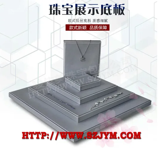 色调分区按玉色展开:绿翠、紫罗兰、黄翡、白冰是四类最常见的色系。设计方案建议展柜内部分成四个独立小景,每个小景用一块可拆卸的隔板限定范围,隔板高度控制在十二厘米左右,既不影响视线穿透,又能防止相邻色系在视觉上"串色"。分区完成后,每个小景内部再按种水细分,玻璃种放最亮的位置,糯种与豆种放靠内的暗位,让强项衬托弱项,而不是互相稀释。
衬垫选型是玉翠展柜设计里最讲究的环节。翡翠的色温偏冷,暖色衬垫会提升玉色的饱满度,冷色衬垫则会削弱玉色的浓度。实践中,绿翠配米白或浅灰绒面,紫罗兰配藕荷色绒面,黄翡配本白加浅咖的双色拼垫,白冰则用纯白绒面加内嵌光带。绒面材质统一选用短毛植绒,绒高控制在一点五毫米以内,避免长绒产生"雾感"挡住玉石的玻璃光泽。种水好的翡翠,衬垫只做托底,不抢戏;种水一般的料子,则可以通过衬垫色彩的轻微提亮来补足视觉浓度。
托架形态要服从玉件的形状。手镯用弧形软托,托面开八字槽,镯身三分之一嵌入槽内,既稳当又不遮挡内圈;挂件与胸针用立式靠板,靠板角度七十度左右,让玉件自然垂悬,光可以从中部穿过,凸显水头;戒面与蛋面用圆形凹托,凹槽深度三毫米,刚好让蛋面的边缘露出,配合顶部射灯形成一圈轮廓光。道具的金属件全部选用哑光钛色或古铜色,回避高亮度电镀,因为亮面金属的反光会在展柜玻璃上形成倒影,干扰顾客对玉色的判断。
展柜内的灯光要与色调分区联动。绿翠区建议三千五到四千K的色温,略微偏暖可以让翠色更"活";紫罗兰区建议四千五到五千K,偏冷的光能放大紫色的清透感;白冰区则用五千五K以上的冷光加底光,让玻璃种特有的起荧光效果尽可能完整地呈现。每区独立布灯、独立开关,营业员可以根据当天主推货品临时增强某一分区的亮度,形成阶段性的视觉重心。
收纳与安全也是道具方案的一部分。玉石件体积小、价值高,展柜内道具建议全部采用可锁定结构:托盘与柜体之间用卡扣固定,营业员用专用钥匙才能取出;闭店后整层托盘提出,放入带软衬的保险箱格,格内按手镯、挂件、戒面分格,格壁贴珍珠棉,防止移动中相互磕碰。每个格位在道具表面留编号位,盘点时按号核对,比逐件清点更快也更容易发现差异。
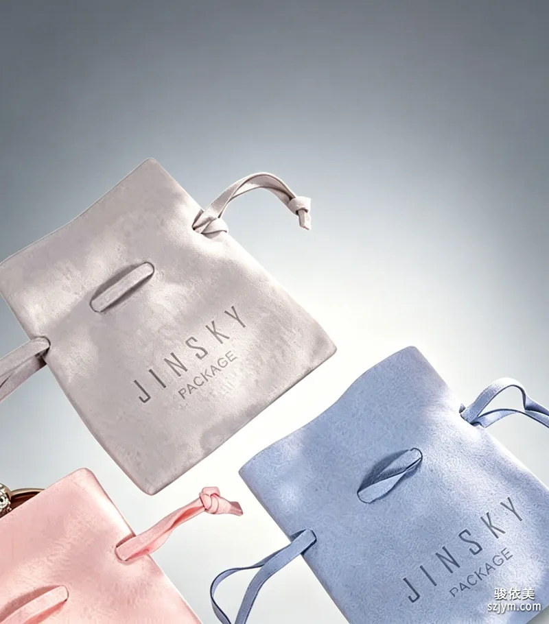 换季与节庆时,色彩分区可以整体平移。比如春节前后主推绿翠与红翡,可以临时把紫罗兰区缩到最小,红翡区扩到最大,工具上只需要更换分区隔板与衬垫颜色,托架与灯光位不用动。这套"分区不变、衬垫可变"的思路,让展柜在不换柜体的前提下具备主题切换能力,投入小,见效直接。
总的来说,玉石翡翠展柜的道具设计可以概括为三句话:先分区后选垫,衬垫服务玉色,灯光分区可控。按这个逻辑落地的展柜,顾客隔着玻璃就能第一眼锁定自己感兴趣的玉件,营业员推荐时也更容易讲出"这件好在哪里",成交前的沟通成本明显降低。
除了托架与灯光,展柜道具还要为营业员的讲解留出空间。翡翠的价值判断依赖细节观察,顾客往往需要贴近看水头与棉絮,道具设计应允许营业员单手将托架从柜内取出,放在柜面托盘上供顾客近观。取放结构建议采用磁吸式底座,吸力适中,既稳定又方便;取出后的空位由备用托盘补上,柜面始终保持满陈列的状态。每个小景托盘的底面印上货号区,取出的托盘放回时按号归位,闭店盘点时逐号核对,效率比整柜清点高得多,也避免了玉件来回搬动带来的磕碰风险。
Tone zoning expands by jade color: green, lavender, yellow and white ice are the four most common families. The design suggests dividing the showcase into four small scenes with removable boards about twelve centimeters high, so neighboring tones do not mix visually. Inside each scene, separate by species: glass species in the brightest position, glutinous and bean species in the darker rear, letting strengths support weaknesses.
Cushion selection is the most delicate part. Jade has a cool color temperature; warm cushions enrich it, cold cushions weaken it. In practice, green jade matches rice-white or light gray velvet, lavender matches lotus-root velvet, yellow jade matches two-tone white and light coffee pads, and white ice uses pure white with an embedded light strip. Use short-pile velvet with pile height under 1.5 mm to avoid a foggy look.
Stand shapes must follow the piece. Bracelets use curved soft stands with a figure-eight groove, one third of the ring embedded. Pendants use upright backboards at about seventy degrees so light passes through the center. Cabochons use round sunken trays three millimeters deep, letting edges catch a contour light. All metal fittings should be matte titanium or bronze, avoiding bright plating whose reflections disturb color judgment.
Lighting must be linked with tone zones. Green area uses 3500-4000K, slightly warm to make green alive; lavender uses 4500-5000K to amplify clarity; white ice uses over 5500K with bottom light to show the glowing effect of glass species. Each zone has independent lamps and switches, so clerks can strengthen one zone temporarily for promoted pieces.
Safety is part of the plan. All props should be lockable: trays fixed to the cabinet with buckles opened by a special key. After closing, trays are lifted into velvet-lined safe grids divided by bracelet, pendant and cabochon, with pearl cotton walls to prevent collision. Each cell has a numbered slot so inventory checking by number is faster and easier.
For festivals, tone zones can move as a whole. For example, before Spring Festival, shrink the lavender zone and enlarge the red jade zone, changing only boards and cushion colors while stands and lamps stay. This "fixed zones, changeable cushions" idea gives the showcase theme-switching ability with low cost and direct effect.
In short, jade showcase prop design can be summarized in three sentences: zone first then cushions, cushions serve the jade color, and lighting zones are controllable. Showcases built this way let customers lock onto appealing pieces at first glance, and clerks can more easily explain why a piece is good, clearly reducing communication cost before purchase.玉石翡翠与黄金不同,它不靠反光取胜,靠的是本身的质地、水头与色彩。同一只展柜里,如果玻璃种、冰种、糯种混在一起摆,浓淡深浅互相干扰,顾客反而看不出任何一件的亮点。给玉石翡翠做展柜道具设计,第一件事不是选托,而是先做色调分区,再根据分区选定衬垫,最后才考虑托架的形态。
色调分区按玉色展开:绿翠、紫罗兰、黄翡、白冰是四类最常见的色系。设计方案建议展柜内部分成四个独立小景,每个小景用一块可拆卸的隔板限定范围,隔板高度控制在十二厘米左右,既不影响视线穿透,又能防止相邻色系在视觉上"串色"。分区完成后,每个小景内部再按种水细分,玻璃种放最亮的位置,糯种与豆种放靠内的暗位,让强项衬托弱项,而不是互相稀释。
衬垫选型是玉翠展柜设计里最讲究的环节。翡翠的色温偏冷,暖色衬垫会提升玉色的饱满度,冷色衬垫则会削弱玉色的浓度。实践中,绿翠配米白或浅灰绒面,紫罗兰配藕荷色绒面,黄翡配本白加浅咖的双色拼垫,白冰则用纯白绒面加内嵌光带。绒面材质统一选用短毛植绒,绒高控制在一点五毫米以内,避免长绒产生"雾感"挡住玉石的玻璃光泽。种水好的翡翠,衬垫只做托底,不抢戏;种水一般的料子,则可以通过衬垫色彩的轻微提亮来补足视觉浓度。
托架形态要服从玉件的形状。手镯用弧形软托,托面开八字槽,镯身三分之一嵌入槽内,既稳当又不遮挡内圈;挂件与胸针用立式靠板,靠板角度七十度左右,让玉件自然垂悬,光可以从中部穿过,凸显水头;戒面与蛋面用圆形凹托,凹槽深度三毫米,刚好让蛋面的边缘露出,配合顶部射灯形成一圈轮廓光。道具的金属件全部选用哑光钛色或古铜色,回避高亮度电镀,因为亮面金属的反光会在展柜玻璃上形成倒影,干扰顾客对玉色的判断。
展柜内的灯光要与色调分区联动。绿翠区建议三千五到四千K的色温,略微偏暖可以让翠色更"活";紫罗兰区建议四千五到五千K,偏冷的光能放大紫色的清透感;白冰区则用五千五K以上的冷光加底光,让玻璃种特有的起荧光效果尽可能完整地呈现。每区独立布灯、独立开关,营业员可以根据当天主推货品临时增强某一分区的亮度,形成阶段性的视觉重心。
收纳与安全也是道具方案的一部分。玉石件体积小、价值高,展柜内道具建议全部采用可锁定结构:托盘与柜体之间用卡扣固定,营业员用专用钥匙才能取出;闭店后整层托盘提出,放入带软衬的保险箱格,格内按手镯、挂件、戒面分格,格壁贴珍珠棉,防止移动中相互磕碰。每个格位在道具表面留编号位,盘点时按号核对,比逐件清点更快也更容易发现差异。
换季与节庆时,色彩分区可以整体平移。比如春节前后主推绿翠与红翡,可以临时把紫罗兰区缩到最小,红翡区扩到最大,工具上只需要更换分区隔板与衬垫颜色,托架与灯光位不用动。这套"分区不变、衬垫可变"的思路,让展柜在不换柜体的前提下具备主题切换能力,投入小,见效直接。
总的来说,玉石翡翠展柜的道具设计可以概括为三句话:先分区后选垫,衬垫服务玉色,灯光分区可控。按这个逻辑落地的展柜,顾客隔着玻璃就能第一眼锁定自己感兴趣的玉件,营业员推荐时也更容易讲出"这件好在哪里",成交前的沟通成本明显降低。
除了托架与灯光,展柜道具还要为营业员的讲解留出空间。翡翠的价值判断依赖细节观察,顾客往往需要贴近看水头与棉絮,道具设计应允许营业员单手将托架从柜内取出,放在柜面托盘上供顾客近观。取放结构建议采用磁吸式底座,吸力适中,既稳定又方便;取出后的空位由备用托盘补上,柜面始终保持满陈列的状态。每个小景托盘的底面印上货号区,取出的托盘放回时按号归位,闭店盘点时逐号核对,效率比整柜清点高得多,也避免了玉件来回搬动带来的磕碰风险。