Jewelry Counter Display Prop Design: Layered Display and Storage Flow for Gold Jewelry珠宝柜台陈列道具设计方案:黄金饰品的层次展示与收纳动线
How gold jewelry is arranged in a counter often decides how long a customer stays for the first look. Many stores simply line up gold pieces by category. The counter looks neat, but there is no hierarchy, and visitors cannot tell what the store is really promoting. The key is not to buy a more expensive counter, but to redesign the layering of display props. This article discusses four angles: layering, color zoning, storage and traffic flow.
Layered display means making the hero product stand out. The common sloped velvet trays are only used for raising height before. They should be upgraded to adjustable stepped bases: the first tier for daily bracelets and beads, the second for necklaces and pendants, and the third for heavy and complex craft pieces. Dark velvet between tiers guides the eye from bottom to top, so promoted items gain more exposure.
Color zoning is the most ignored part of gold counters. When large areas of gold gather together, the counter looks blurry. The design suggests splitting the surface into champagne gold, pure gold and rose gold micro-zones, each marked by velvet trays of different tones. A two to three tenths difference in color is enough to make zones visible.
Storage and flow concern turnover efficiency. Add lockable drawer-style velvet grid trays inside the counter, with three-centimeter-deep cells for earrings, rings, pendants and chains. Use damped three-section slides for quiet opening, and make the grids detachable so the whole tray can be moved to the vault after closing time.
Between the display zone and the transaction zone, set a small transition table covered with soft pads. After a customer selects an item, the clerk takes it off the display stand and places it on the transition table, then presents it on a tray. The whole process stays in the customer`s sight, which is both safe and courteous.
Lighting should work with props. Gold counters usually use warm white light around 4000K. The props should avoid glossy reflectors and use matte metal edges with velvet bodies, preventing glaring spots. A 1.5 cm breathing gap under the bases lets light reach the underside of the jewelry, making the pieces look more dimensional.
Velvet trays should be renewed every quarter by rotating zones, and drawer linings checked every half year. The core logic is simple: props are not just holders. Through layering, color, storage and flow, every gold piece gets a clear position and every pick-up becomes easier. Counters that follow this plan usually see more than twenty percent longer dwell time on hero products and visible improvement in inventory efficiency.黄金饰品在柜台里如何摆,往往决定了顾客第一眼的停留时间。很多珠宝店把金饰按品类一排排码放,柜台显得整齐,却缺少主次,顾客看了一圈也说不出店里主推的是什么。要解决这个问题,关键不在买更贵的柜台,而在重新设计陈列道具的层次结构。本文从层次、色彩、收纳与动线四个角度,给出黄金饰品柜台陈列道具的一套可落地设计方案。 层次展示的核心是"把主角立起来"。黄金柜台常用的斜面绒托,过去只承担垫高功能,如今应改成可调节角度的阶梯式托座:第一层放日常款手链与转运珠,第二层放套链与吊坠,第三层放克重大、工艺复杂的摆件级产品。三层之间用深色植绒做视觉过渡,顾客的目光会自然从底部扫向顶部,主推款因此获得更高的曝光率。道具选型上,绒托密度建议选用每平方厘米十八至二十针的中高密植绒,黄金的光泽感不会被粗糙绒面吃掉,同时又能避免强反光让顾客眯眼。
色彩分区是黄金柜台最容易被忽略的环节。大面积金饰聚集时,金色与金色之间缺乏边界,柜台看上去会发"糊"。设计方案里,我们建议将柜面按色系拆成香槟金、足金黄、玫瑰金三个微分区,每个分区用不同深浅的底色绒托做标记:香槟金配浅驼色托、足金黄配焦糖色托、玫瑰金配灰粉色托。颜色差异不需要很强烈,两三成的色差就能让分区在视觉上成立,顾客也能凭直觉快速找到自己想看的色段。
收纳动线关系到柜台的周转效率。黄金饰品盘点频繁、调拨量大,道具设计必须同步考虑"展示面"与"收纳面"的切换。可以在柜台内侧加装带锁的抽屉式绒格盘,按耳饰、戒指、吊坠、链身分格收纳,格深统一为三厘米,避免小件饰品在翻找时互相缠绕。抽屉滑轨选择带缓冲的三节轨,开合安静,营业员在顾客面前取货时不会发出刺耳的金属摩擦声。绒格盘建议做成分体可拆结构,闭店后整盘端走入库,省去逐件收捡的耗时。
动线设计要照顾营业员的作业习惯。黄金柜台通常由一到两名营业员负责,左侧展示右侧成交是常见布局。道具方案里,在展示区与成交区之间设一个过渡小台,台面铺软胶垫,顾客看中款式后,营业员把饰品从展示托上取下放到过渡台,再用托盘呈递,整套动作不离开顾客视线,既安全又体面。过渡台高度与柜面齐平,宽度不超过三十五厘米,避免侵占顾客的浏览空间。
灯光与道具的配合也是方案的一部分。黄金柜台的射灯多采用四千K左右的暖白光,道具设计时应避开高反射的亮面材料,改用哑光金属边条与绒布主体,防止灯光在道具边缘形成刺眼的光斑。托座与柜体之间保留一点五厘米的呼吸缝,光线可以渗入饰品底部,让金饰的立体感更明显。
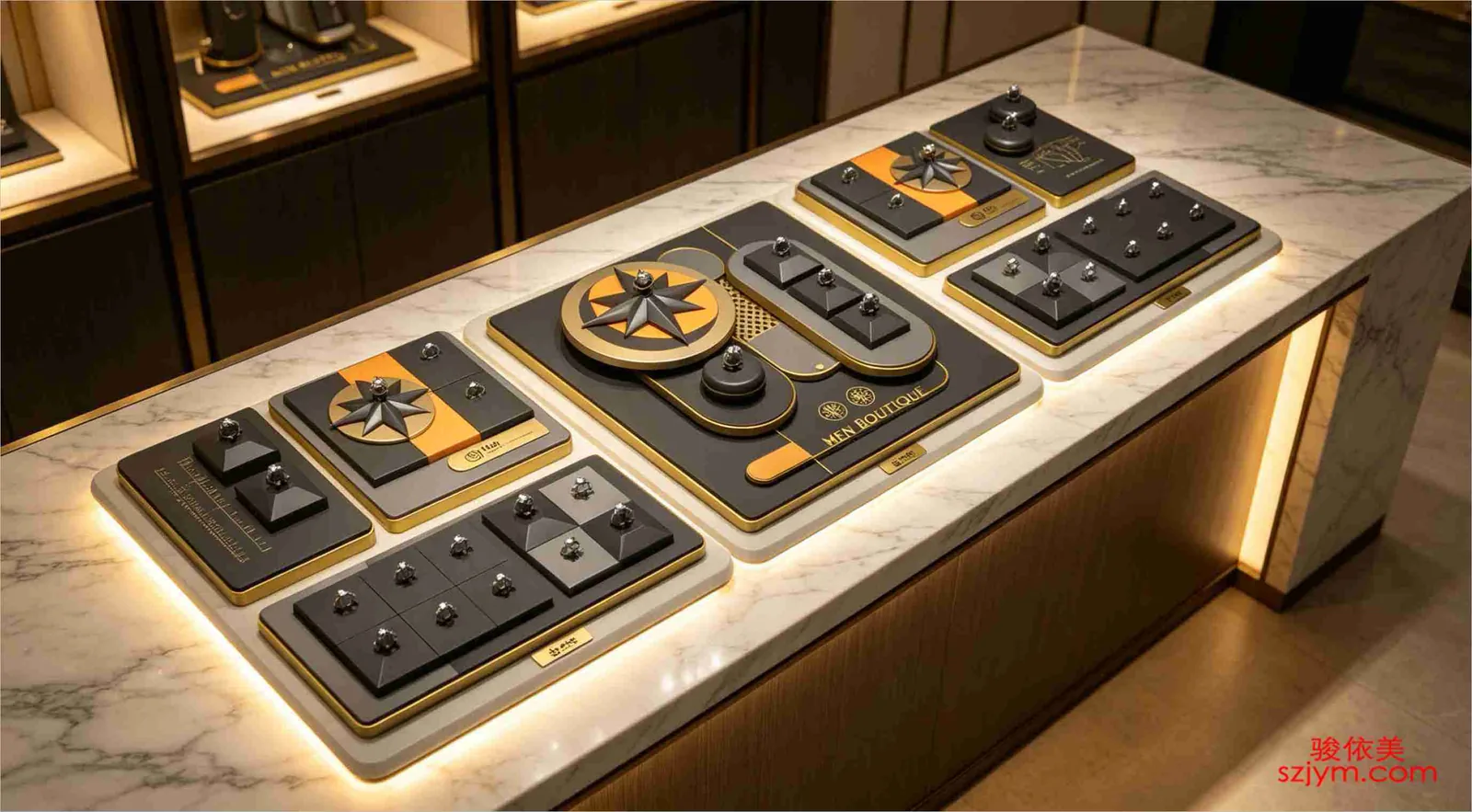 试戴与成交区的道具衔接同样不能忽略。黄金饰品的大部分成交动作发生在柜台边缘,一套完整的方案里,柜台边缘应预留一块可展开的试戴软垫,垫面用与绒托同色系的短毛绒,顾客试戴时饰品不会直接接触柜台玻璃。软垫下方设一个带磁吸盖的小抽屉,存放镊子、软布与放大镜等常用工具,营业员不用离开视线就能取用。这块软垫平时收在柜台边缘的凹槽里,展开时与柜面齐平,不破坏整体的陈列观感,需要时一拉即出,用完一推即收。
最后是周期的维护建议。绒托使用三个月后会出现倒绒与压痕,建议每季度按分区轮换更新一次,轮换时把待更新的绒托集中送去植绒厂翻新,成本远低于整体更换。抽屉格盘的绒布内衬则建议半年检查一次,边角起毛的及时补片,避免小件饰品被绒毛勾住造成盘点差异。
这套方案的核心逻辑只有一句话:道具不是把金饰托起来就完事,而是通过层次、色彩、收纳与动线的配合,让每件黄金饰品都在柜台里获得清晰的展示位置,也让营业员的每次取放都省时省力。按此落地的柜台,主推款的停留时长通常能提升两成以上,盘点效率也会有看得见的改善。
Layered display means making the hero product stand out. The common sloped velvet trays are only used for raising height before. They should be upgraded to adjustable stepped bases: the first tier for daily bracelets and beads, the second for necklaces and pendants, and the third for heavy and complex craft pieces. Dark velvet between tiers guides the eye from bottom to top, so promoted items gain more exposure.
Color zoning is the most ignored part of gold counters. When large areas of gold gather together, the counter looks blurry. The design suggests splitting the surface into champagne gold, pure gold and rose gold micro-zones, each marked by velvet trays of different tones. A two to three tenths difference in color is enough to make zones visible.
Storage and flow concern turnover efficiency. Add lockable drawer-style velvet grid trays inside the counter, with three-centimeter-deep cells for earrings, rings, pendants and chains. Use damped three-section slides for quiet opening, and make the grids detachable so the whole tray can be moved to the vault after closing time.
Between the display zone and the transaction zone, set a small transition table covered with soft pads. After a customer selects an item, the clerk takes it off the display stand and places it on the transition table, then presents it on a tray. The whole process stays in the customer`s sight, which is both safe and courteous.
Lighting should work with props. Gold counters usually use warm white light around 4000K. The props should avoid glossy reflectors and use matte metal edges with velvet bodies, preventing glaring spots. A 1.5 cm breathing gap under the bases lets light reach the underside of the jewelry, making the pieces look more dimensional.
Velvet trays should be renewed every quarter by rotating zones, and drawer linings checked every half year. The core logic is simple: props are not just holders. Through layering, color, storage and flow, every gold piece gets a clear position and every pick-up becomes easier. Counters that follow this plan usually see more than twenty percent longer dwell time on hero products and visible improvement in inventory efficiency.黄金饰品在柜台里如何摆,往往决定了顾客第一眼的停留时间。很多珠宝店把金饰按品类一排排码放,柜台显得整齐,却缺少主次,顾客看了一圈也说不出店里主推的是什么。要解决这个问题,关键不在买更贵的柜台,而在重新设计陈列道具的层次结构。本文从层次、色彩、收纳与动线四个角度,给出黄金饰品柜台陈列道具的一套可落地设计方案。
层次展示的核心是"把主角立起来"。黄金柜台常用的斜面绒托,过去只承担垫高功能,如今应改成可调节角度的阶梯式托座:第一层放日常款手链与转运珠,第二层放套链与吊坠,第三层放克重大、工艺复杂的摆件级产品。三层之间用深色植绒做视觉过渡,顾客的目光会自然从底部扫向顶部,主推款因此获得更高的曝光率。道具选型上,绒托密度建议选用每平方厘米十八至二十针的中高密植绒,黄金的光泽感不会被粗糙绒面吃掉,同时又能避免强反光让顾客眯眼。
色彩分区是黄金柜台最容易被忽略的环节。大面积金饰聚集时,金色与金色之间缺乏边界,柜台看上去会发"糊"。设计方案里,我们建议将柜面按色系拆成香槟金、足金黄、玫瑰金三个微分区,每个分区用不同深浅的底色绒托做标记:香槟金配浅驼色托、足金黄配焦糖色托、玫瑰金配灰粉色托。颜色差异不需要很强烈,两三成的色差就能让分区在视觉上成立,顾客也能凭直觉快速找到自己想看的色段。
收纳动线关系到柜台的周转效率。黄金饰品盘点频繁、调拨量大,道具设计必须同步考虑"展示面"与"收纳面"的切换。可以在柜台内侧加装带锁的抽屉式绒格盘,按耳饰、戒指、吊坠、链身分格收纳,格深统一为三厘米,避免小件饰品在翻找时互相缠绕。抽屉滑轨选择带缓冲的三节轨,开合安静,营业员在顾客面前取货时不会发出刺耳的金属摩擦声。绒格盘建议做成分体可拆结构,闭店后整盘端走入库,省去逐件收捡的耗时。
动线设计要照顾营业员的作业习惯。黄金柜台通常由一到两名营业员负责,左侧展示右侧成交是常见布局。道具方案里,在展示区与成交区之间设一个过渡小台,台面铺软胶垫,顾客看中款式后,营业员把饰品从展示托上取下放到过渡台,再用托盘呈递,整套动作不离开顾客视线,既安全又体面。过渡台高度与柜面齐平,宽度不超过三十五厘米,避免侵占顾客的浏览空间。
灯光与道具的配合也是方案的一部分。黄金柜台的射灯多采用四千K左右的暖白光,道具设计时应避开高反射的亮面材料,改用哑光金属边条与绒布主体,防止灯光在道具边缘形成刺眼的光斑。托座与柜体之间保留一点五厘米的呼吸缝,光线可以渗入饰品底部,让金饰的立体感更明显。
试戴与成交区的道具衔接同样不能忽略。黄金饰品的大部分成交动作发生在柜台边缘,一套完整的方案里,柜台边缘应预留一块可展开的试戴软垫,垫面用与绒托同色系的短毛绒,顾客试戴时饰品不会直接接触柜台玻璃。软垫下方设一个带磁吸盖的小抽屉,存放镊子、软布与放大镜等常用工具,营业员不用离开视线就能取用。这块软垫平时收在柜台边缘的凹槽里,展开时与柜面齐平,不破坏整体的陈列观感,需要时一拉即出,用完一推即收。
最后是周期的维护建议。绒托使用三个月后会出现倒绒与压痕,建议每季度按分区轮换更新一次,轮换时把待更新的绒托集中送去植绒厂翻新,成本远低于整体更换。抽屉格盘的绒布内衬则建议半年检查一次,边角起毛的及时补片,避免小件饰品被绒毛勾住造成盘点差异。
这套方案的核心逻辑只有一句话:道具不是把金饰托起来就完事,而是通过层次、色彩、收纳与动线的配合,让每件黄金饰品都在柜台里获得清晰的展示位置,也让营业员的每次取放都省时省力。按此落地的柜台,主推款的停留时长通常能提升两成以上,盘点效率也会有看得见的改善。