Black-and-Orange Watch Set: Stands, Slots and the Metal Frame黑橙撞色腕表套装,托位怎么排
The S9 watch display set runs a bold contrast: premium black as the base, vibrant orange as the few accents that pop — the watch cushion, the edge of the ring tray, the foot of the earring posts. Contrast is not random. Too much orange and it steals the show from the watch, so we keep it under a third of the surface, just enough to pull the eye to the dial. The orange is matched against a color card before it goes on; half a shade off within a batch and the whole set looks cheap. A gold metal frame outlines the set, and that frame is the part most likely to lose its color.
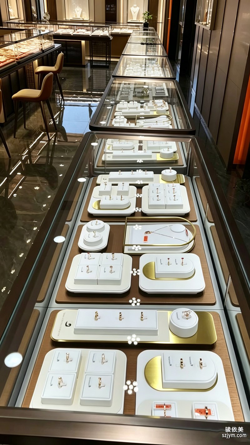 We finish the gold frame by electrophoresis, not by sticking on a gold film. Before that, the metal must be degreased and activated, or the gold will not hold; the electrophoretic layer eats into the substrate and outwears paint, so a counter wiped daily will not show the base. The corners are joined at 45 degrees, and the seam gets a touch of matching paint — miss it and you get a dark line a close customer spots at once. So every frame is checked against the light after joining, and anything with a visible seam goes back. Overseas buyers often ask about salt-spray testing; a passed electrophoretic layer will not rust easily even in a seaside store.
Inside, each rest has its job. The watch sits on a cushioned pad with a foamed core; the firmness has to be right — too hard and it marks the strap, too soft and the watch sinks and looks lifeless. We set a rebound range for the usual mechanical strap and let it spring back. Rings get a shallow groove, earrings get posts, necklaces get their own bust, all staggered so the spacing reads intentional: too tight looks busy, too loose loses the rhythm. The usual failures are a leaning post or a collapsed pad that drags the whole set down. The orange blocks are rub-tested for color fastness — fifty strokes with a white cloth and no transfer, or the counter would whiten after a few wipes. The pad rebound is measured too: pressed to seventy percent it should spring back; too stiff reads rigid, too soft reads collapsed. Post verticality is checked with a square, because one degree off and the whole row looks tilted, so every post is passed before the line starts. The watch cushion is built in layers: the layer touching the strap is microfiber that will not scratch the case, and the core is high-rebound foam that recovers after pressure. Lighting matters too — the key light comes from above and to the side of the dial, so the velvet does not steal the glow and the metal frame only catches one edge, leaving the indexes clear.
The set clicks and magnets together, so it flats into a shipping box and is assembled in store — overseas clients love this because it cuts freight sharply. Every surface is matte anti-glare, so the cabinet light does not bounce off and hide the watch. Black and orange with a gold edge — placed in a window, the timepiece stands on its own.
 At the end of the day, contrast exists so the watch gets seen, not so the stand looks pretty. Use orange with restraint, finish the gold edge cleanly, and the watch stays the lead. Good display is the kind of work the customer is not supposed to notice — when the frame is clean and the pads hold, the watch simply looks like it was always meant to be there.
This is original content. Copyright belongs to Shenzhen Junyimei.
Junyimei — present every jewel and timepiece at its best.S9这套腕表陈列,用的是高级黑配活力橙的撞色。黑是底,橙是那几块跳出来的焦点——手表枕托、戒指槽的边、耳环立柱的底座,都是橙。撞色不是随便涂,橙块面积一大就抢了表的戏,我们把它压在三分之一以内,刚好把视线引到表盘上。橙色要和色卡对过才上,同一批差半個色号,整组看着就怯。外圈一圈金色金属边框收边,这圈框最怕掉色。
金色边框我们走电泳,不是贴金膜。电泳前得先把金属除油、活化,不然金层附不牢;电泳出来的金层吃进金属底,比喷漆耐磨,门市天天擦也不容易露底。框的拐角是45度拼接,接缝要补一道同色漆,补不好就留一道暗线,客人凑近一看就露怯。所以我们每根框拼完都对着光看接缝,暗线超标的直接返工。海外客户还常问盐雾测试,这层电泳过关,海边门店也不容易锈。前处理这步省不得,油没除净,后面镀层再漂亮也迟早起皮。
里面的托各有各的活。手表那块是枕垫托,芯是发泡材料,软硬得调:太硬表带硌出印子,太软表往里陷显得没精神。我们按大多数机械表带厚度定了一个回弹区间,压下去能缓回来。戒指是浅槽,耳环是立柱,项链是独立人台,四样错落排开,间距留得讲究——太挤显乱,太疏又接不上气。常见翻车是立柱歪、枕垫塌陷,整套看着就垮。橙色块我们做过摩擦色牢度,白布擦五十次不掉色,不然柜台擦两下就泛白。枕垫回弹也有数,压下去七成能回来,太死板显僵,太软显垮。立柱的垂直度拿角尺卡,偏一度整排看着就歪,所以上线前每根都过一遍。手表枕托我们做成分层,贴表带那层是微纤维,不刮表壳,里层是高回弹发泡,压完能缓回来。柜台灯位也有讲究,主光从表盘斜上方打,绒面不抢光,金属框只勾一道边,表的刻度才清。
整组是卡接加磁吸组合,拆开能平放进运输箱,到店自己拼,海外客户最吃这套,运费省一大截。所有表面都做了哑光防眩,专柜灯打上去不反光挡表。黑橙撞色加金边,往橱窗一摆,腕表自己就立住了。
说到底,撞色是为了让表被看见,不是为了让架子好看。橙用得克制,金边收得利落,表才是一号主角。好陈列是那种客人不该注意到的功夫——框干净、托位撑得住,表就像本来就该在那儿。
本文为原创内容,版权归深圳骏依美所有。如需转载请注明出处。
骏依美——把每件珠宝,都装进配得上它的盒子里。
We finish the gold frame by electrophoresis, not by sticking on a gold film. Before that, the metal must be degreased and activated, or the gold will not hold; the electrophoretic layer eats into the substrate and outwears paint, so a counter wiped daily will not show the base. The corners are joined at 45 degrees, and the seam gets a touch of matching paint — miss it and you get a dark line a close customer spots at once. So every frame is checked against the light after joining, and anything with a visible seam goes back. Overseas buyers often ask about salt-spray testing; a passed electrophoretic layer will not rust easily even in a seaside store.
Inside, each rest has its job. The watch sits on a cushioned pad with a foamed core; the firmness has to be right — too hard and it marks the strap, too soft and the watch sinks and looks lifeless. We set a rebound range for the usual mechanical strap and let it spring back. Rings get a shallow groove, earrings get posts, necklaces get their own bust, all staggered so the spacing reads intentional: too tight looks busy, too loose loses the rhythm. The usual failures are a leaning post or a collapsed pad that drags the whole set down. The orange blocks are rub-tested for color fastness — fifty strokes with a white cloth and no transfer, or the counter would whiten after a few wipes. The pad rebound is measured too: pressed to seventy percent it should spring back; too stiff reads rigid, too soft reads collapsed. Post verticality is checked with a square, because one degree off and the whole row looks tilted, so every post is passed before the line starts. The watch cushion is built in layers: the layer touching the strap is microfiber that will not scratch the case, and the core is high-rebound foam that recovers after pressure. Lighting matters too — the key light comes from above and to the side of the dial, so the velvet does not steal the glow and the metal frame only catches one edge, leaving the indexes clear.
The set clicks and magnets together, so it flats into a shipping box and is assembled in store — overseas clients love this because it cuts freight sharply. Every surface is matte anti-glare, so the cabinet light does not bounce off and hide the watch. Black and orange with a gold edge — placed in a window, the timepiece stands on its own.
At the end of the day, contrast exists so the watch gets seen, not so the stand looks pretty. Use orange with restraint, finish the gold edge cleanly, and the watch stays the lead. Good display is the kind of work the customer is not supposed to notice — when the frame is clean and the pads hold, the watch simply looks like it was always meant to be there.
This is original content. Copyright belongs to Shenzhen Junyimei.Junyimei — present every jewel and timepiece at its best.S9这套腕表陈列,用的是高级黑配活力橙的撞色。黑是底,橙是那几块跳出来的焦点——手表枕托、戒指槽的边、耳环立柱的底座,都是橙。撞色不是随便涂,橙块面积一大就抢了表的戏,我们把它压在三分之一以内,刚好把视线引到表盘上。橙色要和色卡对过才上,同一批差半個色号,整组看着就怯。外圈一圈金色金属边框收边,这圈框最怕掉色。
金色边框我们走电泳,不是贴金膜。电泳前得先把金属除油、活化,不然金层附不牢;电泳出来的金层吃进金属底,比喷漆耐磨,门市天天擦也不容易露底。框的拐角是45度拼接,接缝要补一道同色漆,补不好就留一道暗线,客人凑近一看就露怯。所以我们每根框拼完都对着光看接缝,暗线超标的直接返工。海外客户还常问盐雾测试,这层电泳过关,海边门店也不容易锈。前处理这步省不得,油没除净,后面镀层再漂亮也迟早起皮。
里面的托各有各的活。手表那块是枕垫托,芯是发泡材料,软硬得调:太硬表带硌出印子,太软表往里陷显得没精神。我们按大多数机械表带厚度定了一个回弹区间,压下去能缓回来。戒指是浅槽,耳环是立柱,项链是独立人台,四样错落排开,间距留得讲究——太挤显乱,太疏又接不上气。常见翻车是立柱歪、枕垫塌陷,整套看着就垮。橙色块我们做过摩擦色牢度,白布擦五十次不掉色,不然柜台擦两下就泛白。枕垫回弹也有数,压下去七成能回来,太死板显僵,太软显垮。立柱的垂直度拿角尺卡,偏一度整排看着就歪,所以上线前每根都过一遍。手表枕托我们做成分层,贴表带那层是微纤维,不刮表壳,里层是高回弹发泡,压完能缓回来。柜台灯位也有讲究,主光从表盘斜上方打,绒面不抢光,金属框只勾一道边,表的刻度才清。
整组是卡接加磁吸组合,拆开能平放进运输箱,到店自己拼,海外客户最吃这套,运费省一大截。所有表面都做了哑光防眩,专柜灯打上去不反光挡表。黑橙撞色加金边,往橱窗一摆,腕表自己就立住了。
说到底,撞色是为了让表被看见,不是为了让架子好看。橙用得克制,金边收得利落,表才是一号主角。好陈列是那种客人不该注意到的功夫——框干净、托位撑得住,表就像本来就该在那儿。
本文为原创内容,版权归深圳骏依美所有。如需转载请注明出处。骏依美——把每件珠宝,都装进配得上它的盒子里。