Prop Color Matters: Black Velvet, White Velvet and Gold Trim for Different Goods道具颜色也有讲究:黑绒、白绒、金边,分别衬什么货
Prop color looks like a design question, but it's really a business question. The same diamond ring looks brilliant on black velvet and flat on white. The first thing a customer sees isn't the piece alone — it's the combined effect of goods plus props. Match the colors and the merchandise looks more expensive; mismatch them and even good goods look cheap.
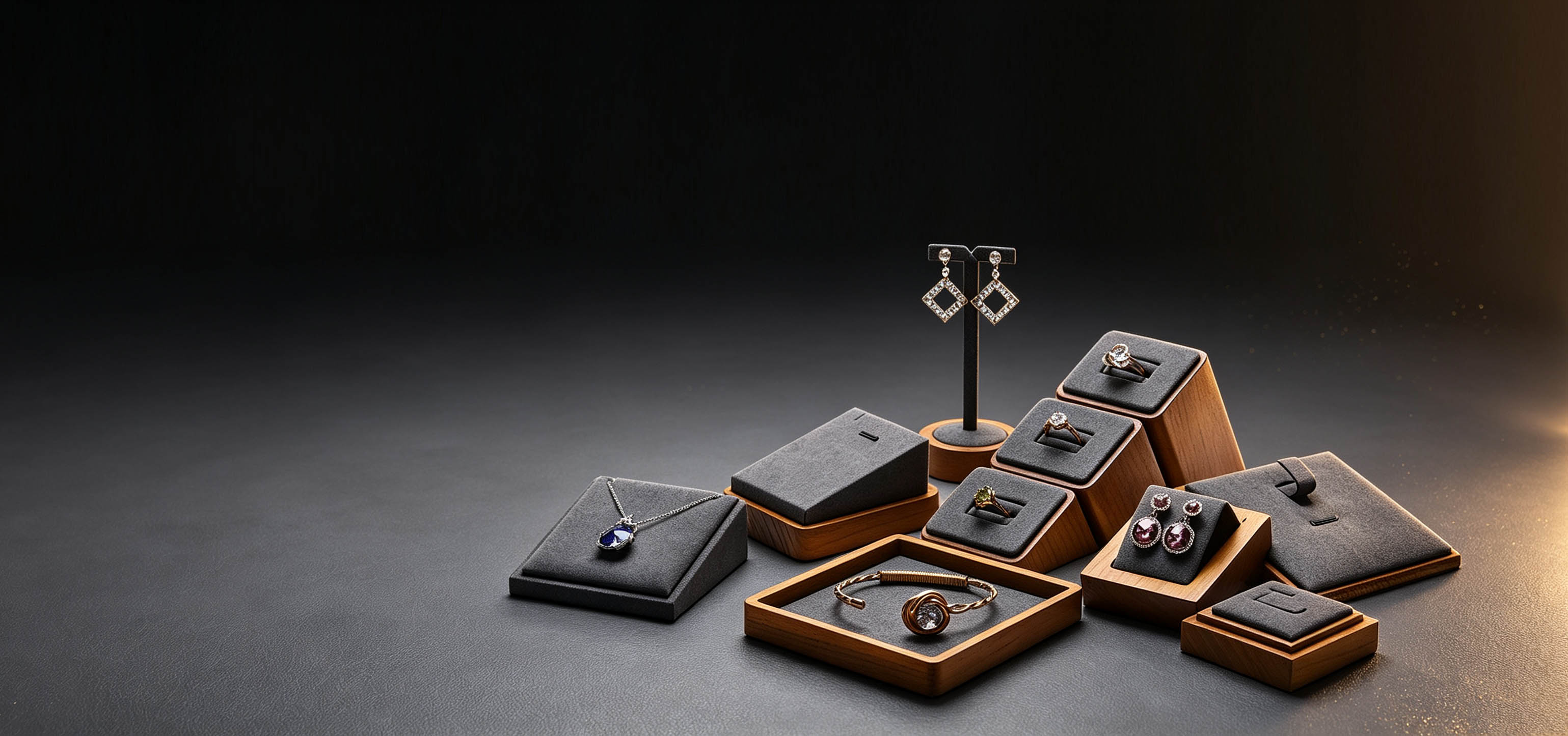
Black velvet is a classic for a practical reason: it absorbs light, "eats" the surrounding light and leaves it all to the metal and stones. Diamond, platinum and silver — naturally bright pieces — get the strongest contrast on black. That's why diamond counters in high-end stores are almost uniformly black velvet. Not tradition for its own sake — it works.
White velvet takes the opposite path: it reads as clean and translucent. Pearls, light-colored stones, silverware and this year's macaron pastels look clean and calm on white. But gold pieces actually suffer on pure white — gold looks flat and dull against it. Gold suits warm tones: beige, earth tones, light coffee — the colors blend and the gold looks warm and expensive.
Red velvet carries festive energy. Wedding season, holiday promotions, new gold arrivals — red compartments build atmosphere and visibly lift impulse buying. Gold trim and metal hardware are the "premium" accessory: black velvet with gold trim is light-luxury, white velvet with gold trim is refined. The same piece, on a gold-trimmed prop, can command a higher price.
There are plenty of failure stories too. The most common: pearls on black velvet — their luster turns gray and old-looking, and customers put them down after a long look. Or silver on red velvet — the contrast just looks cheap. No color is absolutely right or wrong; it's all about matching. A simple rule: use the prop color as a complement to the goods — deep base for bright goods, light base for pale goods. When unsure, keep black and white on hand, add a gold-trim set for the premium zone, and you won't go far wrong.
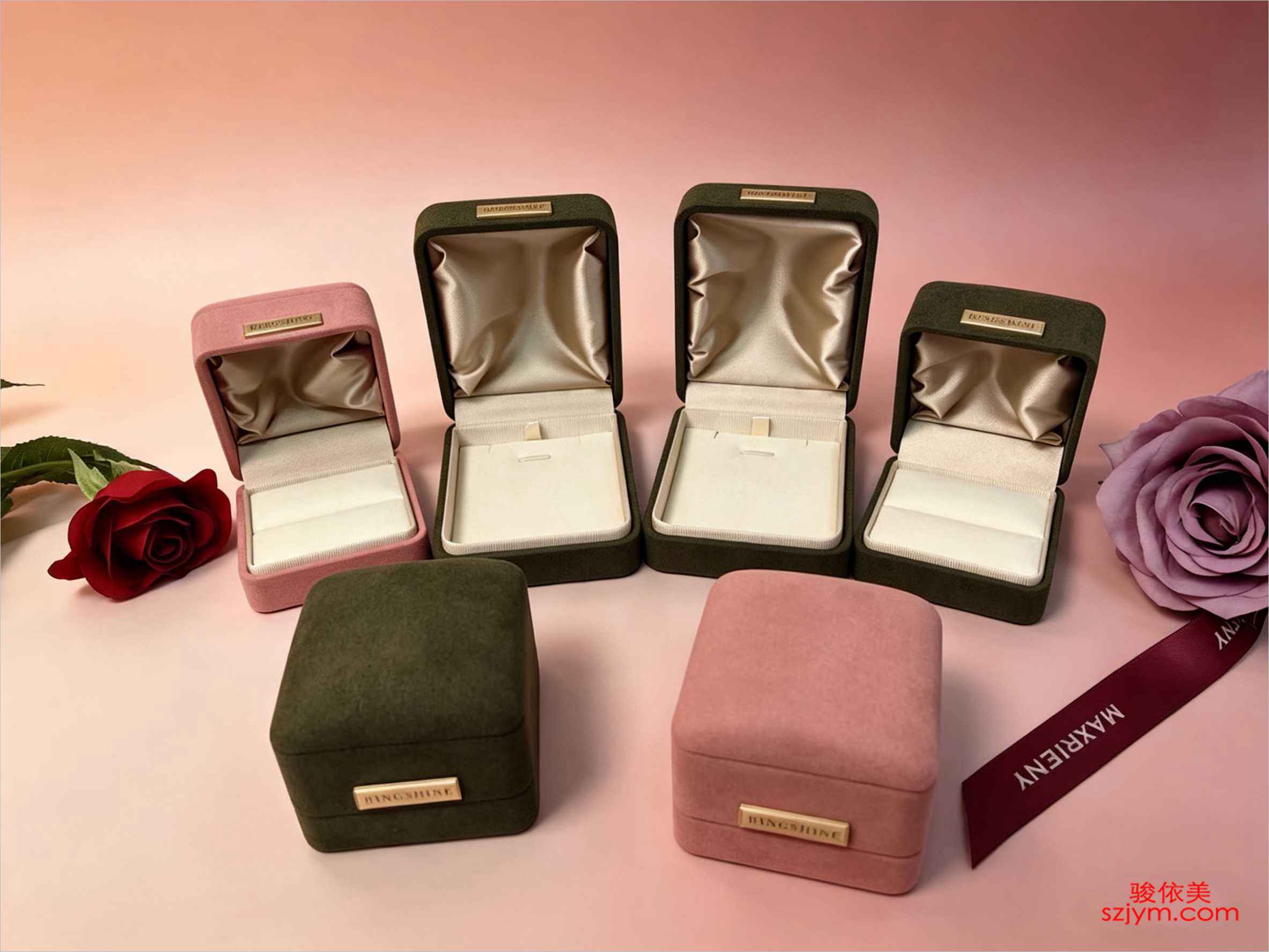
One more reminder: maintaining prop color matters as much as choosing it. Black velvet shows dust fast — hand contact turns it gray; vacuum it often and rotate surfaces. White velvet shows dirt worst — one stain and the pad is done. The SJ display stands and SH jewelry boxes come in multiple liner colors, so you can adjust them with the assortment each season at little cost while the counter looks completely different. Color is a small expense that does a big job.
Color must sync with lighting. Black velvet under a cool spotlight makes diamond fire explode; white velvet under neutral light makes pale goods look cleanest; red velvet under warm light pushes the festive mood. The same counter looks different in daylight and under evening lamps — factor your store's usual light temperature into the prop color decision.
Seasons drive color too. Autumn and winter shoppers want steady, premium depth — deep velvets and warm tones win; spring and summer favor light and macaron shades. Stores willing to swap liners by season give returning customers something new each visit, and repeat rates creep up. There's no absolute answer for prop color — but there's common sense: follow the goods, follow the light, follow the season, and keep black, white and gold as the three anchors; you can't go far wrong.
 道具的颜色,看着是个审美问题,其实是生意问题。同样一枚钻戒,摆在黑绒上,钻石的火彩能"跳"出来;摆在白绒上就平平无奇。客人进店第一眼看到的不是货本身,而是货和道具叠出来的整体效果——颜色搭配对了,货自动显贵;搭配错了,好货也像地摊货。
黑色绒布是珠宝柜台的经典配色,原因很实在:黑绒吸光,把周围的光"吃掉",剩下全部留给金属和宝石。钻石、白金、银饰这种本身亮的货,放黑绒上反差最大,亮得更亮。所以你看高档珠宝柜台,钻石区几乎清一色黑绒,不是保守,是有道理。
白绒走的是另一条路:显洁净、显通透。珍珠、浅色宝石、银饰、还有今年流行的马卡龙色系彩宝,放白绒上,颜色干净不打架。但要注意,金色系货品放纯白绒上反而吃亏——金色在白底上显"菜",发闷。金饰更适合米色、大地色、浅咖这类暖调道具,颜色揉在一起,金才显得温润贵气。
红色绒布带喜气,婚庆季、节庆大促、黄金新款上柜,用红绒格位最能烘托氛围,客人的购买冲动明显高。金边和金属件是"提档次"的配件:黑绒加金边是轻奢,白绒加金边是精致,同样的货,换个带金边的道具,定价都能往上走一走。
翻车经验也不少。最常见的是珍珠配黑绒——珍珠的晕彩在黑底上显得灰旧,客人拿起来端详半天放下;还有银饰放红绒上,红底衬银色,显得廉价。颜色没有绝对的对错,只有配不配。有个简单办法:把道具颜色当成货品的"反衬色",亮的货用深底、浅的货用浅底,拿不准就黑白常备,再加一套金边提档,基本不会出错。
再提醒一句:道具颜色的维护跟选色一样重要。黑绒最怕灰,客人手摸多了会发白,要勤吸尘、勤翻面;白绒最怕脏,污渍一上来整块报废。SJ系列的陈列架、SH系列的首饰盒都有多种内衬色可选,换季的时候跟着货品结构一起调,成本不高,柜台观感却完全是两回事。颜色这件事,花小钱,办大事。
颜色还要跟灯光联动。黑绒配偏冷的射灯,钻石的火彩最炸;白绒配中性光,浅色货的质感最干净;红绒配暖光,喜庆氛围直接拉满。同一个柜台,白天自然光和晚上灯光下的观感不一样,选道具颜色时把店里常开的灯光温度也一起算进去。
季节也影响配色。秋冬客人进门想要沉稳高级感,深色绒和暖色系当季;春夏浅色、马卡龙色更应景。舍得按季换内衬的店,客人每次进店都有新意,复购率会悄悄往上走。道具颜色没有标准答案,但有常识:跟货、跟光、跟季节,再守住黑白金三种基本色,怎么配都不会离谱。
道具的颜色,看着是个审美问题,其实是生意问题。同样一枚钻戒,摆在黑绒上,钻石的火彩能"跳"出来;摆在白绒上就平平无奇。客人进店第一眼看到的不是货本身,而是货和道具叠出来的整体效果——颜色搭配对了,货自动显贵;搭配错了,好货也像地摊货。
黑色绒布是珠宝柜台的经典配色,原因很实在:黑绒吸光,把周围的光"吃掉",剩下全部留给金属和宝石。钻石、白金、银饰这种本身亮的货,放黑绒上反差最大,亮得更亮。所以你看高档珠宝柜台,钻石区几乎清一色黑绒,不是保守,是有道理。
白绒走的是另一条路:显洁净、显通透。珍珠、浅色宝石、银饰、还有今年流行的马卡龙色系彩宝,放白绒上,颜色干净不打架。但要注意,金色系货品放纯白绒上反而吃亏——金色在白底上显"菜",发闷。金饰更适合米色、大地色、浅咖这类暖调道具,颜色揉在一起,金才显得温润贵气。
红色绒布带喜气,婚庆季、节庆大促、黄金新款上柜,用红绒格位最能烘托氛围,客人的购买冲动明显高。金边和金属件是"提档次"的配件:黑绒加金边是轻奢,白绒加金边是精致,同样的货,换个带金边的道具,定价都能往上走一走。
翻车经验也不少。最常见的是珍珠配黑绒——珍珠的晕彩在黑底上显得灰旧,客人拿起来端详半天放下;还有银饰放红绒上,红底衬银色,显得廉价。颜色没有绝对的对错,只有配不配。有个简单办法:把道具颜色当成货品的"反衬色",亮的货用深底、浅的货用浅底,拿不准就黑白常备,再加一套金边提档,基本不会出错。
再提醒一句:道具颜色的维护跟选色一样重要。黑绒最怕灰,客人手摸多了会发白,要勤吸尘、勤翻面;白绒最怕脏,污渍一上来整块报废。SJ系列的陈列架、SH系列的首饰盒都有多种内衬色可选,换季的时候跟着货品结构一起调,成本不高,柜台观感却完全是两回事。颜色这件事,花小钱,办大事。
颜色还要跟灯光联动。黑绒配偏冷的射灯,钻石的火彩最炸;白绒配中性光,浅色货的质感最干净;红绒配暖光,喜庆氛围直接拉满。同一个柜台,白天自然光和晚上灯光下的观感不一样,选道具颜色时把店里常开的灯光温度也一起算进去。
季节也影响配色。秋冬客人进门想要沉稳高级感,深色绒和暖色系当季;春夏浅色、马卡龙色更应景。舍得按季换内衬的店,客人每次进店都有新意,复购率会悄悄往上走。道具颜色没有标准答案,但有常识:跟货、跟光、跟季节,再守住黑白金三种基本色,怎么配都不会离谱。
道具的颜色,看着是个审美问题,其实是生意问题。同样一枚钻戒,摆在黑绒上,钻石的火彩能"跳"出来;摆在白绒上就平平无奇。客人进店第一眼看到的不是货本身,而是货和道具叠出来的整体效果——颜色搭配对了,货自动显贵;搭配错了,好货也像地摊货。
黑色绒布是珠宝柜台的经典配色,原因很实在:黑绒吸光,把周围的光"吃掉",剩下全部留给金属和宝石。钻石、白金、银饰这种本身亮的货,放黑绒上反差最大,亮得更亮。所以你看高档珠宝柜台,钻石区几乎清一色黑绒,不是保守,是有道理。
白绒走的是另一条路:显洁净、显通透。珍珠、浅色宝石、银饰、还有今年流行的马卡龙色系彩宝,放白绒上,颜色干净不打架。但要注意,金色系货品放纯白绒上反而吃亏——金色在白底上显"菜",发闷。金饰更适合米色、大地色、浅咖这类暖调道具,颜色揉在一起,金才显得温润贵气。
红色绒布带喜气,婚庆季、节庆大促、黄金新款上柜,用红绒格位最能烘托氛围,客人的购买冲动明显高。金边和金属件是"提档次"的配件:黑绒加金边是轻奢,白绒加金边是精致,同样的货,换个带金边的道具,定价都能往上走一走。
翻车经验也不少。最常见的是珍珠配黑绒——珍珠的晕彩在黑底上显得灰旧,客人拿起来端详半天放下;还有银饰放红绒上,红底衬银色,显得廉价。颜色没有绝对的对错,只有配不配。有个简单办法:把道具颜色当成货品的"反衬色",亮的货用深底、浅的货用浅底,拿不准就黑白常备,再加一套金边提档,基本不会出错。
再提醒一句:道具颜色的维护跟选色一样重要。黑绒最怕灰,客人手摸多了会发白,要勤吸尘、勤翻面;白绒最怕脏,污渍一上来整块报废。SJ系列的陈列架、SH系列的首饰盒都有多种内衬色可选,换季的时候跟着货品结构一起调,成本不高,柜台观感却完全是两回事。颜色这件事,花小钱,办大事。
颜色还要跟灯光联动。黑绒配偏冷的射灯,钻石的火彩最炸;白绒配中性光,浅色货的质感最干净;红绒配暖光,喜庆氛围直接拉满。同一个柜台,白天自然光和晚上灯光下的观感不一样,选道具颜色时把店里常开的灯光温度也一起算进去。
季节也影响配色。秋冬客人进门想要沉稳高级感,深色绒和暖色系当季;春夏浅色、马卡龙色更应景。舍得按季换内衬的店,客人每次进店都有新意,复购率会悄悄往上走。道具颜色没有标准答案,但有常识:跟货、跟光、跟季节,再守住黑白金三种基本色,怎么配都不会离谱。