Right Zoning: Let Customers Find the Shelf Themselves柜台分区做对,客人自己就能找到货架
When a customer steps in and the first question is “where's your gold?”, the counter's zoning isn't doing its job. Treat the counter as a map: plan it well, and the customer's eyes will do most of the selling for you — provided the zones are clear and the hierarchy is obvious.
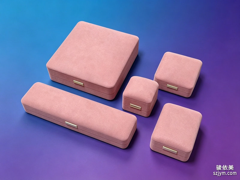
Start by category, the most basic layer. Gold and silver don't belong in the same counter — gold is warm, silver is cool, and together they fight for attention while the customer squints. Put gold in the prominent position, visible from the door; silver near the try-on area, so there's room to put things on; colored stones and jade, the higher-priced goods, in the middle or against the background, spotlit separately — they naturally become the focal point.
After categories, zone again by buying motive. Self-purchase pieces go where a hand can reach; gift pieces are displayed as complete sets — box, tray, packaging shown together, so the customer sees the whole “picture of giving”; wedding pieces get their own zone, couples and three-piece gold sets together, so customers walk in and go straight to the point without asking around.
Zoning rests on goods, but also on light and props. Use different color temperatures as soft dividers: warm light on gold, neutral on silver, accent on colored stones — the customer senses the zone before reaching it. Props follow suit: dark velvet under gold, light velvet under silver. The boundaries don't need labels; the eye reads them.
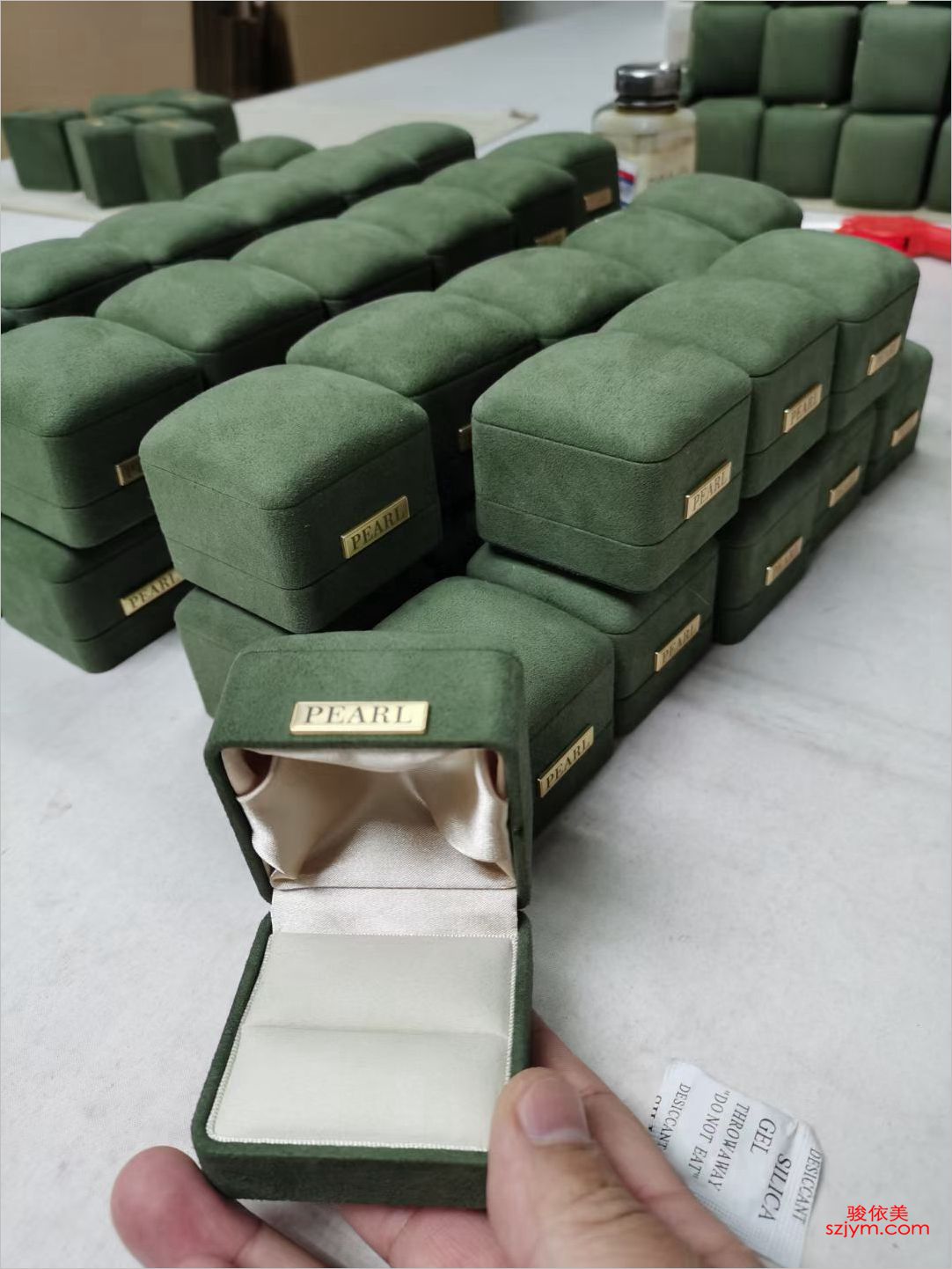
I burned myself once. For a while I zoned by price — thousands in one counter, hundreds in another — thinking it would make pricing easy. Instead, the cheap pieces crowded into one counter, the expensive one stood empty and intimidating, and neither sold well. We switched to category-and-motive zoning, mixing prices, and browsing came alive again: people shop for the goods, not the price tag.
When the zoning is done, check the flow once more: left turn, right turn, straight ahead — every direction should lead to at least one hero display. Whichever door a customer enters, if they can find what they came for within three seconds, the store is seventy percent done. The map does the rest of the work; the remaining thirty percent is conversation.
客人进了门,如果第一句话是"你们黄金在哪边",说明柜台的区域感没做出来。把柜台当成一张地图来规划,客人的眼睛会替你完成大部分导购工作——前提是分区清楚、主次分明。
最基础的是按品类分区。黄金和银饰不要混在一个柜台,金是暖色、银是冷色,摆在一起互相抢戏,客人看着也费劲。黄金区放显眼位,进门第一眼就能看到;银饰区靠试戴区,客人想上手就有位置;彩宝、翡翠这类高单价货品放中间或背景位,用灯光单独一打,自然成为焦点。
按品类分好之后,再按购买动机二次分区。自戴款放在顾客伸手能试的位子,送礼款整套陈列出来——盒子、托盘、包装摆在一起,客人看到的是一整套"送出去的画面";婚庆款单独成区,对戒、三金放在一起,客人进店直奔主题,不用东问西问。
分区靠货,也靠灯光和道具。每个区用不同色温的灯做软分隔:黄金区暖光、银饰区中性光、彩宝区重点光,客人还没走到就已经"感知"到区域的差别。道具同理,深色绒托配金货、浅色绒托配银货,区域边界不用贴标签,视觉自己会说话。
翻过一次车。有阵子按价格带分区,把几千的和几百的放在不同柜台,本意是方便找价,结果客人进来一看,便宜的都挤在一个柜台,贵的柜台空着不敢进,两边都不好卖。后来改成按品类和动机分区,价格混着放,客人反而挑得更起劲——人找的是"货",不是"价"。
分区做完,最后检查一遍动线:进店左转、右转、直走,每个方向至少各有一个主推位。客人不管从哪个门进来,都能在三秒内找到想看的区域,店就成功了七成。地图画好了,剩下三成才是销售的话术。