Velvet, Acrylic or Wood: Which Tray Serves Which Jewelry绒托盘、亚克力托盘、木托盘,分别伺候什么货
The tray is the foundation of the counter. The same pieces change price appearance the moment they sit on a different texture. Of all the questions I get in years of jewelry packaging and display work, tray selection is one of the most frequent — and the answer boils down to three lines: velvet absorbs light and flatters fire, acrylic looks clean and young, wood carries weight and heritage. The rest is matching.
Velvet first. For goods that live on reflections and fire — diamonds, colored stones, pearls — velvet is the steadiest base. A matte velvet surface doesn't reflect, so all the light goes to the piece; dark velvet under white diamonds is the classic combo; on navy or deep green trays the fire of a diamond jumps out so clearly that customers lean in to touch it.
Acrylic next. Silver pieces, plain K-gold bands, light-luxury lines — they suit acrylic trays best. It reads transparent and modern, matches the goods' tone, and is easy to keep clean: one wipe and it's bright. Its weakness is scratching. Hard goods should sit on a soft pad inside, or the scratches will make customers assume the stock is old.
Wood is the third. For jade, gemstone carvings, Chinese-style vintage pieces and antique jewelry, wood brings out the weight and substance. Skip glossy lacquered trays — matte raw wood holds the warmth of jade much better. A shiny surface steals the show from the goods.
I once put silver earrings on a silver-gray velvet pad. The goods melted into the base, and customers walked past without noticing anything was displayed. Swapped to a dark tray with gold edges, same single piece, entirely different presence. Wrong tray pairing is as good as displaying nothing.
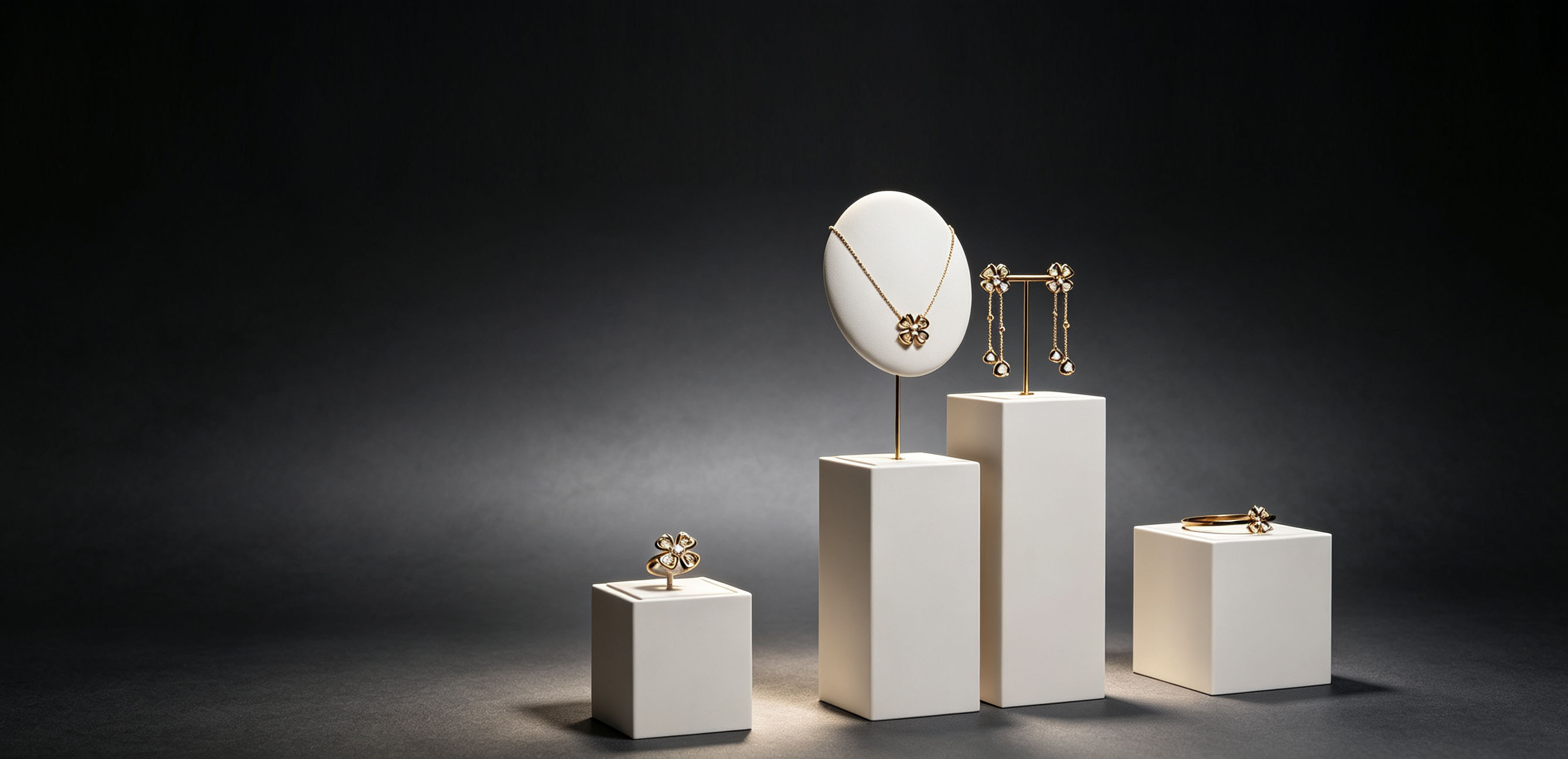
Last word on mixing. Never use one tray type for the whole counter: low ring wells in front, level with the customer's eyes as they lean over; a raised second layer in the middle for pendants, adding depth to the sightline; the highest position at the back standing earrings upright as the finish. The up-and-down rhythm gives the eye a path to follow. Trays swap faster than counters — match one tray family to one product line, refresh before peak season, and you'll see the difference immediately.
托盘是柜台的“底座”,同一批货放在不同质感的托盘上,身价能差出一截。做珠宝包装陈列这些年,被问得最多的问题之一就是托盘怎么选。其实就三句话:绒托吸光衬火彩,亚克力通透显年轻,木托压重显底蕴。剩下的是怎么配。
先说明绒托。钻石、彩宝、珍珠这类靠反光和火彩吃饭的货,绒布是最稳的底。哑光绒面不反光,光线全给到货品身上;深色绒布衬白钻最出效果,藏青色、墨绿色的绒托,钻石放上去火彩跳得很明显,客人扫一眼就想上手。
再说亚克力。银饰、素圈K金、轻奢线这类货,亚克力托盘通透现代,跟货的气质搭,而且耐脏好打理,抹布一擦就亮。缺点是容易划花,放硬底货品时托上最好加一层软垫,不然划痕起来,客人会以为是放久的旧货。
木托是第三种。玉石、翡翠、中式复古款、中古珠宝,木头一衬,厚度和分量全出来了。木托别选太亮的漆面,哑光原木更能托住玉石的温润,漆面一亮,反而抢了货的戏。
翻过一次车,记得很清楚。有次把银色耳饰放在银灰色绒布上,货和底混成一片,客人路过都没发现那里摆了货。后来换成金边深色绒托,还是那只单品,存在感完全两样。材质搭配错了,货等于白摆。
最后说组合用法。一个柜台别只用一种托盘:前沿放矮的戒指位,客人俯身平视正好看到;中位垫高一层放吊坠,视觉就有了第二层;靠里用最高的位子把耳饰立起来收尾。高矮错开,客人的视线就有动线。托盘换起来比换柜台快得多,一条产品线配一组托盘,旺季前过一遍,效果立竿见影。