Black-and-White Display, Ring Box That Opens Clean黑白几何展具,戒指盒怎么开得利落
For a window that stops traffic, black-and-white contrast is the easiest win and the riskiest. Junyimei's Window Display Prop CH9 is exactly that geometry: a stepped platform, a square base, and an openable ring box set into the middle. The lines are crisp and modern, but a few spots trip you up if you don't watch them.
The geometry is not a simple two-tone print; it is die-cut steps and blocks. The white piece is usually matte lacquer or laminated MDF, the black a matte velvet or matte paint. Die-cut edges must align, and where white sits over black we leave about a 1 mm step — enough depth for layering, not enough to chip the corner paint. Cheap versions butt the two colors edge to edge; after a few moves the black rubs the white and it looks grubby fast. We hold the die-cut to a half-millimeter tolerance so a replacement tier from a later batch still seats cleanly. A clean step edge also photographs better for the brand's own social posts.
The stepped offsets are for the eye. CH9 has three tiers, each stepped two or three centimeters, with rings, pendants and earrings on separate levels so a glance takes it all in. Don't overdo the drop, though; too high and the top piece catches the ceiling light and glares. We put pendants on top, rings in the middle, earrings at the base for a stable center of gravity. The base color and tier count are adjustable to the window size — two tiers for a narrow case, three for a wide one.
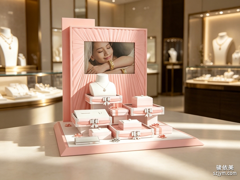 The square base is the foot of the whole thing. It needs weight, or a tier loaded with metal pieces topples at a touch; a base without weight also lets the whole prop rock when a customer leans on the top tier. We fill the base or thicken the board and stick anti-slip velvet underneath so it won't slide in a glass window. The base clips to the steps from behind, with the joint hidden so no seam shows on the front.
The star is the openable ring box. Set into the platform, it stays closed as a display face and flips open when a customer wants the real piece. The hinge is small with a magnetic catch; too stiff a hinge feels awkward, and the magnet must not be too strong or the customer thinks it won't open, nor too weak or it gaps. Inside, the ring seat is slotted so the band sits without rattling, lined with scratch-free velvet. Slot depth follows common ring sizes — too shallow won't hold, too deep buries the ring.
The square base is the foot of the whole thing. It needs weight, or a tier loaded with metal pieces topples at a touch; a base without weight also lets the whole prop rock when a customer leans on the top tier. We fill the base or thicken the board and stick anti-slip velvet underneath so it won't slide in a glass window. The base clips to the steps from behind, with the joint hidden so no seam shows on the front.
The star is the openable ring box. Set into the platform, it stays closed as a display face and flips open when a customer wants the real piece. The hinge is small with a magnetic catch; too stiff a hinge feels awkward, and the magnet must not be too strong or the customer thinks it won't open, nor too weak or it gaps. Inside, the ring seat is slotted so the band sits without rattling, lined with scratch-free velvet. Slot depth follows common ring sizes — too shallow won't hold, too deep buries the ring.
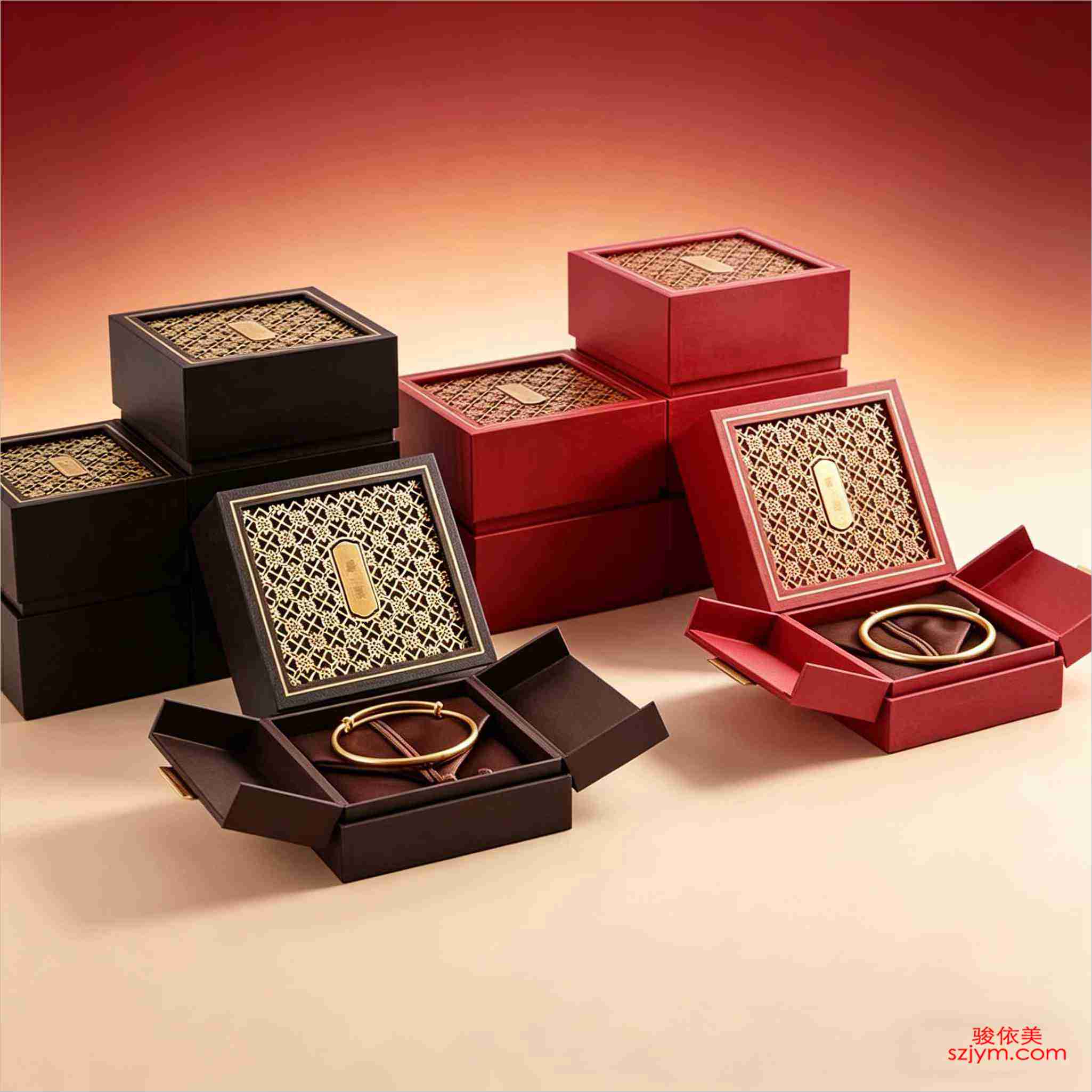 Counter spotlights hit black-and-white hard: white reflects, black absorbs, and the contrast is good, but never aim the lamp straight at the white face. A 45-degree angle softens the glare. At a show it breaks into a few pieces and assembles in ten minutes, far easier to move than a welded frame.
The black-white ratio and tier count are not fixed. Want it colder, give black more face; want it brighter, leave more white. We set the ratio from the brand's other fixtures so the prop doesn't fight the room. At acceptance, don't trust the styled photo. Open and close the ring box twenty times — listen for hinge noise and check the magnet lines up. A display can look great in a shot and still feel wrong in the hand.
Bottom line: black-and-white geometry looks simple, but the steps, the base and the opening box each need care, or it wobbles, scratches, or won't open clean.橱窗要抓眼球,黑白撞色最省事也最冒险。骏依美这套珠宝橱窗陈列道具CH9走的就是黑白几何:阶梯式展台、方形底座,中间还嵌一个开启式戒指盒。线条利落,现代感够,但真做起来,几个地方不留意就翻车。
先从几何造型说起。黑白两块不是简单拼色,是模切出来的阶梯和方块。白色那块一般是哑光烤漆或者覆膜密度板,黑色那块多为哑光绒面或者哑光漆。模切边缘要对齐,白块压黑块的地方留 1 毫米左右的台阶,既出层次又不会磕掉边角漆。很多廉价款黑白交界是直碰,搬几次黑漆蹭白面,越用越脏。这套模切我们卡在半毫米公差内,后面批次补一块台阶照样严丝合缝。
阶梯的错落是为视线。CH9 三层台阶,每层落差两三厘米,戒指、吊坠、耳饰各占一层,客人一眼扫过去不费劲。但落差别贪大,台阶太高,最上层那件反而被柜顶灯照得反光刺眼。我们一般把最高层留给吊坠,戒指放中层,耳饰压底层,重心稳。CH9 的底色和台阶层数都能按橱窗尺寸改,窄柜做两层、宽柜做三层。
方形底座是整套的脚。它得配重,不然阶梯上摆满金属件,一碰就倒;没配重的底座还会让整套在客人倚着顶层时跟着晃。底座里灌配重或者底板加厚,底面再贴防滑绒,放玻璃橱窗里推一下不动。底座和台阶是卡扣接的,卡扣位要藏在背面,正面看不到缝。
重头戏是那个开启式戒指盒。它嵌在展台里,平时合着当展示面,客人要看实物,一翻就开。开合靠小合页加磁吸,合页别用太硬的,硬了开合生涩;磁吸高斯数别太高,太高客人觉得“掰不开”,太低合不拢留缝。盒内戒指位要开槽,戒指圈卡进槽里不晃,绒面内衬防刮。开槽深度按常见戒圈走,太浅卡不住,太深戒指陷进去不好拿。
柜台射灯打在黑白件上,白面反光、黑面吃光,对比强是好事,但灯位别正对白面,斜 45 度打,反光就柔了。展会拆成几件装箱,到店拼起来十分钟,比整体焊死的架子好运。
CH9 的黑白配比、台阶层数都不是死的。想更冷一点就加大黑面占比,想亮一点就多留白,我们按品牌其他道具的调性来定,免得这套和整个橱窗打架。收货时别只看摆好的照片,把开合盒反复开合二十次,听合页有没有异响、磁吸有没有吸偏。展具这东西,照片好看不等于用着顺。
一句话:黑白几何看着简单,阶梯、底座、开合盒三处都得上心,不然要么晃,要么刮手,要么开不利落。
本文为原创内容,版权归深圳骏依美所有。如需转载请注明出处。
Counter spotlights hit black-and-white hard: white reflects, black absorbs, and the contrast is good, but never aim the lamp straight at the white face. A 45-degree angle softens the glare. At a show it breaks into a few pieces and assembles in ten minutes, far easier to move than a welded frame.
The black-white ratio and tier count are not fixed. Want it colder, give black more face; want it brighter, leave more white. We set the ratio from the brand's other fixtures so the prop doesn't fight the room. At acceptance, don't trust the styled photo. Open and close the ring box twenty times — listen for hinge noise and check the magnet lines up. A display can look great in a shot and still feel wrong in the hand.
Bottom line: black-and-white geometry looks simple, but the steps, the base and the opening box each need care, or it wobbles, scratches, or won't open clean.橱窗要抓眼球,黑白撞色最省事也最冒险。骏依美这套珠宝橱窗陈列道具CH9走的就是黑白几何:阶梯式展台、方形底座,中间还嵌一个开启式戒指盒。线条利落,现代感够,但真做起来,几个地方不留意就翻车。
先从几何造型说起。黑白两块不是简单拼色,是模切出来的阶梯和方块。白色那块一般是哑光烤漆或者覆膜密度板,黑色那块多为哑光绒面或者哑光漆。模切边缘要对齐,白块压黑块的地方留 1 毫米左右的台阶,既出层次又不会磕掉边角漆。很多廉价款黑白交界是直碰,搬几次黑漆蹭白面,越用越脏。这套模切我们卡在半毫米公差内,后面批次补一块台阶照样严丝合缝。
阶梯的错落是为视线。CH9 三层台阶,每层落差两三厘米,戒指、吊坠、耳饰各占一层,客人一眼扫过去不费劲。但落差别贪大,台阶太高,最上层那件反而被柜顶灯照得反光刺眼。我们一般把最高层留给吊坠,戒指放中层,耳饰压底层,重心稳。CH9 的底色和台阶层数都能按橱窗尺寸改,窄柜做两层、宽柜做三层。
方形底座是整套的脚。它得配重,不然阶梯上摆满金属件,一碰就倒;没配重的底座还会让整套在客人倚着顶层时跟着晃。底座里灌配重或者底板加厚,底面再贴防滑绒,放玻璃橱窗里推一下不动。底座和台阶是卡扣接的,卡扣位要藏在背面,正面看不到缝。
重头戏是那个开启式戒指盒。它嵌在展台里,平时合着当展示面,客人要看实物,一翻就开。开合靠小合页加磁吸,合页别用太硬的,硬了开合生涩;磁吸高斯数别太高,太高客人觉得“掰不开”,太低合不拢留缝。盒内戒指位要开槽,戒指圈卡进槽里不晃,绒面内衬防刮。开槽深度按常见戒圈走,太浅卡不住,太深戒指陷进去不好拿。
柜台射灯打在黑白件上,白面反光、黑面吃光,对比强是好事,但灯位别正对白面,斜 45 度打,反光就柔了。展会拆成几件装箱,到店拼起来十分钟,比整体焊死的架子好运。
CH9 的黑白配比、台阶层数都不是死的。想更冷一点就加大黑面占比,想亮一点就多留白,我们按品牌其他道具的调性来定,免得这套和整个橱窗打架。收货时别只看摆好的照片,把开合盒反复开合二十次,听合页有没有异响、磁吸有没有吸偏。展具这东西,照片好看不等于用着顺。
一句话:黑白几何看着简单,阶梯、底座、开合盒三处都得上心,不然要么晃,要么刮手,要么开不利落。
本文为原创内容,版权归深圳骏依美所有。如需转载请注明出处。
骏依美——让每一件珠宝与腕表,都被更好地呈现。
The square base is the foot of the whole thing. It needs weight, or a tier loaded with metal pieces topples at a touch; a base without weight also lets the whole prop rock when a customer leans on the top tier. We fill the base or thicken the board and stick anti-slip velvet underneath so it won't slide in a glass window. The base clips to the steps from behind, with the joint hidden so no seam shows on the front.
The star is the openable ring box. Set into the platform, it stays closed as a display face and flips open when a customer wants the real piece. The hinge is small with a magnetic catch; too stiff a hinge feels awkward, and the magnet must not be too strong or the customer thinks it won't open, nor too weak or it gaps. Inside, the ring seat is slotted so the band sits without rattling, lined with scratch-free velvet. Slot depth follows common ring sizes — too shallow won't hold, too deep buries the ring.
Counter spotlights hit black-and-white hard: white reflects, black absorbs, and the contrast is good, but never aim the lamp straight at the white face. A 45-degree angle softens the glare. At a show it breaks into a few pieces and assembles in ten minutes, far easier to move than a welded frame.
The black-white ratio and tier count are not fixed. Want it colder, give black more face; want it brighter, leave more white. We set the ratio from the brand's other fixtures so the prop doesn't fight the room. At acceptance, don't trust the styled photo. Open and close the ring box twenty times — listen for hinge noise and check the magnet lines up. A display can look great in a shot and still feel wrong in the hand.
Bottom line: black-and-white geometry looks simple, but the steps, the base and the opening box each need care, or it wobbles, scratches, or won't open clean.橱窗要抓眼球,黑白撞色最省事也最冒险。骏依美这套珠宝橱窗陈列道具CH9走的就是黑白几何:阶梯式展台、方形底座,中间还嵌一个开启式戒指盒。线条利落,现代感够,但真做起来,几个地方不留意就翻车。
先从几何造型说起。黑白两块不是简单拼色,是模切出来的阶梯和方块。白色那块一般是哑光烤漆或者覆膜密度板,黑色那块多为哑光绒面或者哑光漆。模切边缘要对齐,白块压黑块的地方留 1 毫米左右的台阶,既出层次又不会磕掉边角漆。很多廉价款黑白交界是直碰,搬几次黑漆蹭白面,越用越脏。这套模切我们卡在半毫米公差内,后面批次补一块台阶照样严丝合缝。
阶梯的错落是为视线。CH9 三层台阶,每层落差两三厘米,戒指、吊坠、耳饰各占一层,客人一眼扫过去不费劲。但落差别贪大,台阶太高,最上层那件反而被柜顶灯照得反光刺眼。我们一般把最高层留给吊坠,戒指放中层,耳饰压底层,重心稳。CH9 的底色和台阶层数都能按橱窗尺寸改,窄柜做两层、宽柜做三层。
方形底座是整套的脚。它得配重,不然阶梯上摆满金属件,一碰就倒;没配重的底座还会让整套在客人倚着顶层时跟着晃。底座里灌配重或者底板加厚,底面再贴防滑绒,放玻璃橱窗里推一下不动。底座和台阶是卡扣接的,卡扣位要藏在背面,正面看不到缝。
重头戏是那个开启式戒指盒。它嵌在展台里,平时合着当展示面,客人要看实物,一翻就开。开合靠小合页加磁吸,合页别用太硬的,硬了开合生涩;磁吸高斯数别太高,太高客人觉得“掰不开”,太低合不拢留缝。盒内戒指位要开槽,戒指圈卡进槽里不晃,绒面内衬防刮。开槽深度按常见戒圈走,太浅卡不住,太深戒指陷进去不好拿。
柜台射灯打在黑白件上,白面反光、黑面吃光,对比强是好事,但灯位别正对白面,斜 45 度打,反光就柔了。展会拆成几件装箱,到店拼起来十分钟,比整体焊死的架子好运。
CH9 的黑白配比、台阶层数都不是死的。想更冷一点就加大黑面占比,想亮一点就多留白,我们按品牌其他道具的调性来定,免得这套和整个橱窗打架。收货时别只看摆好的照片,把开合盒反复开合二十次,听合页有没有异响、磁吸有没有吸偏。展具这东西,照片好看不等于用着顺。
一句话:黑白几何看着简单,阶梯、底座、开合盒三处都得上心,不然要么晃,要么刮手,要么开不利落。
本文为原创内容,版权归深圳骏依美所有。如需转载请注明出处。骏依美——让每一件珠宝与腕表,都被更好地呈现。