How a vintage gold set lays out its bays古法金套台,分区怎么对得齐
Vintage-style gold has been selling hard the last couple of years, and the display set has to keep up. The DJ48 we build for counters leans on a deep grey-gold tone, with key-fret and geometric modules, overall on the dark side, so the gold pieces read as heavy the moment they sit on it. It is not one big flat board; it is several modules joined into a set, with bangles, necklaces and earrings each given their own place.
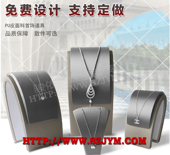 The dark base is the whole point. Vintage gold is about a matte, sandblasted feel, and a bright backing kills that calm weight. DJ48 uses a deep grey-gold velvet base with the light turned down, so the shadowed detail of the metal survives. Plenty of shops start with white and wonder why the gold suddenly looks like a different material. That grey-gold is not a simple spray; the substrate is matte-treated first, then a metallic coat goes on. Too thin and the base shows; too thick and it shines. We test panels until the film sits right.
How the modules join decides whether the layout stays true. Each module has clips on the edge, and alignment rides on locating pegs in the base plate. Off by a millimeter or two and the two pieces will not meet, leaving a seam that traps dust and will not wipe clean. We dry-fit every module before it ships, holding the peg tolerance to fractions of a millimeter, so a clerk in the store can still assemble it. The base is MDF and the pegs are CNC-machined, not hand-aligned, which keeps them consistent.
The zones are cut to the shape of the jewelry. The bangle zone is a wide channel with a soft pad so the bangle lies flat and will not roll. The necklace zone carries staggered pegs for long and short chains alike. The earring zone is a grid of small cells, pairs lined up. The trap is "looks like it fits but does not hold," so we size each cell's depth to common weights: light studs do not drift, heavy bangles do not tip.
Most failures happen in transit and in daily knocks. The modules ship separately, and a jolt on the road can loosen a clip, so the store should re-tighten on arrival. The velvet base dreads ballpoint pen and perfume; once marked it will not come off, so the counter needs a velvet cloth wiped often. We ship each set with a spare velvet base, swap it when dirty, easier than sending the whole unit back. Another failure is the wrong lamp: under cool white light the grey-gold turns blue and the gold goes cold with it; switch to warm and it returns at once.
The dark base is the whole point. Vintage gold is about a matte, sandblasted feel, and a bright backing kills that calm weight. DJ48 uses a deep grey-gold velvet base with the light turned down, so the shadowed detail of the metal survives. Plenty of shops start with white and wonder why the gold suddenly looks like a different material. That grey-gold is not a simple spray; the substrate is matte-treated first, then a metallic coat goes on. Too thin and the base shows; too thick and it shines. We test panels until the film sits right.
How the modules join decides whether the layout stays true. Each module has clips on the edge, and alignment rides on locating pegs in the base plate. Off by a millimeter or two and the two pieces will not meet, leaving a seam that traps dust and will not wipe clean. We dry-fit every module before it ships, holding the peg tolerance to fractions of a millimeter, so a clerk in the store can still assemble it. The base is MDF and the pegs are CNC-machined, not hand-aligned, which keeps them consistent.
The zones are cut to the shape of the jewelry. The bangle zone is a wide channel with a soft pad so the bangle lies flat and will not roll. The necklace zone carries staggered pegs for long and short chains alike. The earring zone is a grid of small cells, pairs lined up. The trap is "looks like it fits but does not hold," so we size each cell's depth to common weights: light studs do not drift, heavy bangles do not tip.
Most failures happen in transit and in daily knocks. The modules ship separately, and a jolt on the road can loosen a clip, so the store should re-tighten on arrival. The velvet base dreads ballpoint pen and perfume; once marked it will not come off, so the counter needs a velvet cloth wiped often. We ship each set with a spare velvet base, swap it when dirty, easier than sending the whole unit back. Another failure is the wrong lamp: under cool white light the grey-gold turns blue and the gold goes cold with it; switch to warm and it returns at once.
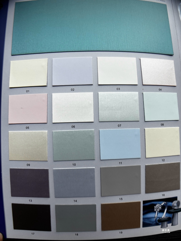 Do not judge a set by its front photo. Dark looks good, but check it against your lighting. Cool spotlights push grey-gold toward blue; warm is what brings out the gold. For a custom run, give the factory the sizes of your hero pieces and let the zones be cut to the actual items rather than trusting generic grids. The logo is usually foil-stamped low on the front edge, out of the way of the gold; too high and it steals the show.
There are two choices to settle before ordering. One is the logo process: foil stamping reads metallic but only suits small flat text, screen printing handles complex art but needs color matching; on a dark vintage set a matte gold foil is the safe pick. The other is module count. More modules mean finer zones, but also more weight to carry when the clerk sets up the counter; we normally land on four to six blocks sized to the case length and hero category.
A set like this resolves the vintage-gold dilemma: it must look precious without looking loud. Dark base under gold, modules in zones, set on the counter, and the customer naturally reads the metal as having weight.古法金这两年卖得火,配套的陈列套台也得跟上。我们给专柜做的 DJ48 这套,主调是深邃灰金,配上回纹和几何模块,整体偏暗,黄金饰品往上一摆,厚重感就出来了。它不是一个大平盘,而是几块模块拼起来的套台,手镯、项链、耳饰各有各的位置。
暗调衬底是这套的核心思路。古法金讲究哑光和磨砂质感,亮底一衬反而显不出那种沉稳。DJ48 用的是深灰金绒面打底,光线压低,金器的暗部细节才留得住。很多店一开始用白底,结果古法金看着像换了材质,就是这个道理。这层灰金不是简单喷漆,是底材先做哑光处理再上金属漆,漆膜薄了露底,厚了反光,得反复试板。
模块拼法决定分区准不准。每块模块边缘有卡扣,对位靠的是底板的定位柱,差一两毫米,两块就拼不齐,缝隙里卡灰还难擦。我们出厂前每块都试拼,定位柱的公差控制在零点几毫米,到了店里店员自己也能拼。底板是密度板,定位柱是 CNC 加工出来的,不是靠手对,所以一致性好。
分区是按饰品形态开的。手镯区是宽槽加软垫,镯子平躺不滚;项链区留了高低错落的挂杆,长链短链都能挂;耳饰区是小格阵,一对对排开。这里最怕"看着能放其实放不稳",所以我们把每格的深度按常见克重定,轻的耳钉不会飘,重的手镯不会翘。
翻车多发生在运输和日常磕碰。模块是分体发的,路上颠一下卡扣容易松,到店要先紧一遍。绒面底最怕圆珠笔和香水,沾上基本擦不掉,专柜得备块绒布勤擦。我们给每套配了替换绒面,脏了直接换,比整台返厂省事。还有种情况是灯不对,冷白光下灰金发蓝,金器跟着发冷,换暖光立刻回来。
挑套台别只看正面图。暗调的好看,但要看它和你家灯是不是搭——射灯色温偏冷,灰金会发蓝;偏暖才出金味。定做时把主推款的尺寸给厂里,分区按实物调,别迷信通用格。LOGO 一般烫在底板前侧,位置低一点不抢金器,烫太高反而压住主角。
定做这套套台,有两个取舍要先想清。一是 LOGO 工艺,烫金有金属感但只适合平面小字,丝印能上复杂图样但要调色;古法金走暗调,LOGO 用哑光金烫印最稳。二是模块数量,模块越多分区越细,但拼起来也越重,店员上柜搬动费劲,我们一般按柜台长度和主推品类定到四到六块就够。
这类套台解决的是古法金"要显贵又不能浮夸"的陈列矛盾。暗底托金,模块分区,专柜一摆,客人自然觉得这金子有分量。
Do not judge a set by its front photo. Dark looks good, but check it against your lighting. Cool spotlights push grey-gold toward blue; warm is what brings out the gold. For a custom run, give the factory the sizes of your hero pieces and let the zones be cut to the actual items rather than trusting generic grids. The logo is usually foil-stamped low on the front edge, out of the way of the gold; too high and it steals the show.
There are two choices to settle before ordering. One is the logo process: foil stamping reads metallic but only suits small flat text, screen printing handles complex art but needs color matching; on a dark vintage set a matte gold foil is the safe pick. The other is module count. More modules mean finer zones, but also more weight to carry when the clerk sets up the counter; we normally land on four to six blocks sized to the case length and hero category.
A set like this resolves the vintage-gold dilemma: it must look precious without looking loud. Dark base under gold, modules in zones, set on the counter, and the customer naturally reads the metal as having weight.古法金这两年卖得火,配套的陈列套台也得跟上。我们给专柜做的 DJ48 这套,主调是深邃灰金,配上回纹和几何模块,整体偏暗,黄金饰品往上一摆,厚重感就出来了。它不是一个大平盘,而是几块模块拼起来的套台,手镯、项链、耳饰各有各的位置。
暗调衬底是这套的核心思路。古法金讲究哑光和磨砂质感,亮底一衬反而显不出那种沉稳。DJ48 用的是深灰金绒面打底,光线压低,金器的暗部细节才留得住。很多店一开始用白底,结果古法金看着像换了材质,就是这个道理。这层灰金不是简单喷漆,是底材先做哑光处理再上金属漆,漆膜薄了露底,厚了反光,得反复试板。
模块拼法决定分区准不准。每块模块边缘有卡扣,对位靠的是底板的定位柱,差一两毫米,两块就拼不齐,缝隙里卡灰还难擦。我们出厂前每块都试拼,定位柱的公差控制在零点几毫米,到了店里店员自己也能拼。底板是密度板,定位柱是 CNC 加工出来的,不是靠手对,所以一致性好。
分区是按饰品形态开的。手镯区是宽槽加软垫,镯子平躺不滚;项链区留了高低错落的挂杆,长链短链都能挂;耳饰区是小格阵,一对对排开。这里最怕"看着能放其实放不稳",所以我们把每格的深度按常见克重定,轻的耳钉不会飘,重的手镯不会翘。
翻车多发生在运输和日常磕碰。模块是分体发的,路上颠一下卡扣容易松,到店要先紧一遍。绒面底最怕圆珠笔和香水,沾上基本擦不掉,专柜得备块绒布勤擦。我们给每套配了替换绒面,脏了直接换,比整台返厂省事。还有种情况是灯不对,冷白光下灰金发蓝,金器跟着发冷,换暖光立刻回来。
挑套台别只看正面图。暗调的好看,但要看它和你家灯是不是搭——射灯色温偏冷,灰金会发蓝;偏暖才出金味。定做时把主推款的尺寸给厂里,分区按实物调,别迷信通用格。LOGO 一般烫在底板前侧,位置低一点不抢金器,烫太高反而压住主角。
定做这套套台,有两个取舍要先想清。一是 LOGO 工艺,烫金有金属感但只适合平面小字,丝印能上复杂图样但要调色;古法金走暗调,LOGO 用哑光金烫印最稳。二是模块数量,模块越多分区越细,但拼起来也越重,店员上柜搬动费劲,我们一般按柜台长度和主推品类定到四到六块就够。
这类套台解决的是古法金"要显贵又不能浮夸"的陈列矛盾。暗底托金,模块分区,专柜一摆,客人自然觉得这金子有分量。
The dark base is the whole point. Vintage gold is about a matte, sandblasted feel, and a bright backing kills that calm weight. DJ48 uses a deep grey-gold velvet base with the light turned down, so the shadowed detail of the metal survives. Plenty of shops start with white and wonder why the gold suddenly looks like a different material. That grey-gold is not a simple spray; the substrate is matte-treated first, then a metallic coat goes on. Too thin and the base shows; too thick and it shines. We test panels until the film sits right.
How the modules join decides whether the layout stays true. Each module has clips on the edge, and alignment rides on locating pegs in the base plate. Off by a millimeter or two and the two pieces will not meet, leaving a seam that traps dust and will not wipe clean. We dry-fit every module before it ships, holding the peg tolerance to fractions of a millimeter, so a clerk in the store can still assemble it. The base is MDF and the pegs are CNC-machined, not hand-aligned, which keeps them consistent.
The zones are cut to the shape of the jewelry. The bangle zone is a wide channel with a soft pad so the bangle lies flat and will not roll. The necklace zone carries staggered pegs for long and short chains alike. The earring zone is a grid of small cells, pairs lined up. The trap is "looks like it fits but does not hold," so we size each cell's depth to common weights: light studs do not drift, heavy bangles do not tip.
Most failures happen in transit and in daily knocks. The modules ship separately, and a jolt on the road can loosen a clip, so the store should re-tighten on arrival. The velvet base dreads ballpoint pen and perfume; once marked it will not come off, so the counter needs a velvet cloth wiped often. We ship each set with a spare velvet base, swap it when dirty, easier than sending the whole unit back. Another failure is the wrong lamp: under cool white light the grey-gold turns blue and the gold goes cold with it; switch to warm and it returns at once.
Do not judge a set by its front photo. Dark looks good, but check it against your lighting. Cool spotlights push grey-gold toward blue; warm is what brings out the gold. For a custom run, give the factory the sizes of your hero pieces and let the zones be cut to the actual items rather than trusting generic grids. The logo is usually foil-stamped low on the front edge, out of the way of the gold; too high and it steals the show.
There are two choices to settle before ordering. One is the logo process: foil stamping reads metallic but only suits small flat text, screen printing handles complex art but needs color matching; on a dark vintage set a matte gold foil is the safe pick. The other is module count. More modules mean finer zones, but also more weight to carry when the clerk sets up the counter; we normally land on four to six blocks sized to the case length and hero category.
A set like this resolves the vintage-gold dilemma: it must look precious without looking loud. Dark base under gold, modules in zones, set on the counter, and the customer naturally reads the metal as having weight.古法金这两年卖得火,配套的陈列套台也得跟上。我们给专柜做的 DJ48 这套,主调是深邃灰金,配上回纹和几何模块,整体偏暗,黄金饰品往上一摆,厚重感就出来了。它不是一个大平盘,而是几块模块拼起来的套台,手镯、项链、耳饰各有各的位置。
暗调衬底是这套的核心思路。古法金讲究哑光和磨砂质感,亮底一衬反而显不出那种沉稳。DJ48 用的是深灰金绒面打底,光线压低,金器的暗部细节才留得住。很多店一开始用白底,结果古法金看着像换了材质,就是这个道理。这层灰金不是简单喷漆,是底材先做哑光处理再上金属漆,漆膜薄了露底,厚了反光,得反复试板。
模块拼法决定分区准不准。每块模块边缘有卡扣,对位靠的是底板的定位柱,差一两毫米,两块就拼不齐,缝隙里卡灰还难擦。我们出厂前每块都试拼,定位柱的公差控制在零点几毫米,到了店里店员自己也能拼。底板是密度板,定位柱是 CNC 加工出来的,不是靠手对,所以一致性好。
分区是按饰品形态开的。手镯区是宽槽加软垫,镯子平躺不滚;项链区留了高低错落的挂杆,长链短链都能挂;耳饰区是小格阵,一对对排开。这里最怕"看着能放其实放不稳",所以我们把每格的深度按常见克重定,轻的耳钉不会飘,重的手镯不会翘。
翻车多发生在运输和日常磕碰。模块是分体发的,路上颠一下卡扣容易松,到店要先紧一遍。绒面底最怕圆珠笔和香水,沾上基本擦不掉,专柜得备块绒布勤擦。我们给每套配了替换绒面,脏了直接换,比整台返厂省事。还有种情况是灯不对,冷白光下灰金发蓝,金器跟着发冷,换暖光立刻回来。
挑套台别只看正面图。暗调的好看,但要看它和你家灯是不是搭——射灯色温偏冷,灰金会发蓝;偏暖才出金味。定做时把主推款的尺寸给厂里,分区按实物调,别迷信通用格。LOGO 一般烫在底板前侧,位置低一点不抢金器,烫太高反而压住主角。
定做这套套台,有两个取舍要先想清。一是 LOGO 工艺,烫金有金属感但只适合平面小字,丝印能上复杂图样但要调色;古法金走暗调,LOGO 用哑光金烫印最稳。二是模块数量,模块越多分区越细,但拼起来也越重,店员上柜搬动费劲,我们一般按柜台长度和主推品类定到四到六块就够。
这类套台解决的是古法金"要显贵又不能浮夸"的陈列矛盾。暗底托金,模块分区,专柜一摆,客人自然觉得这金子有分量。