Steel, Ceramic or Titanium: How Case Material Decides a Watch's Backdrop钢、陶瓷还是钛:腕表表壳材质如何决定它的展示背景
Whether a watch is worth a closer look is often decided by the backdrop behind it, long before it is picked up. Steel's coolness, ceramic's smoothness, titanium's lightness—each material carries its own temperament, and a generic stand flattens that personality. Those who display well read the case material first, then choose a backdrop to match.
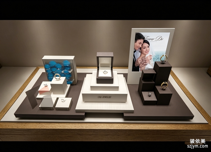 A polished steel case is sharp and cool-reflecting, so it pairs best with deep grey or matte black bases that keep the metal edges crisp. A bright background makes the steel blur into the stand and loses that clean industrial definition. Warm-toned cases such as rose gold, by contrast, feel more inviting against off-white, camel or wood-grain surfaces, where the metal's warmth is caught and softened.
Ceramic is a different character. Its surface barely reflects and feels smooth to the touch, so it clashes with a crowd of glossy props. A fine-velvet or matte stone base lets the quietness of ceramic show. Many brands use a single block of tonal acrylic as the stand precisely so nothing competes with the ceramic's calm.
A polished steel case is sharp and cool-reflecting, so it pairs best with deep grey or matte black bases that keep the metal edges crisp. A bright background makes the steel blur into the stand and loses that clean industrial definition. Warm-toned cases such as rose gold, by contrast, feel more inviting against off-white, camel or wood-grain surfaces, where the metal's warmth is caught and softened.
Ceramic is a different character. Its surface barely reflects and feels smooth to the touch, so it clashes with a crowd of glossy props. A fine-velvet or matte stone base lets the quietness of ceramic show. Many brands use a single block of tonal acrylic as the stand precisely so nothing competes with the ceramic's calm.
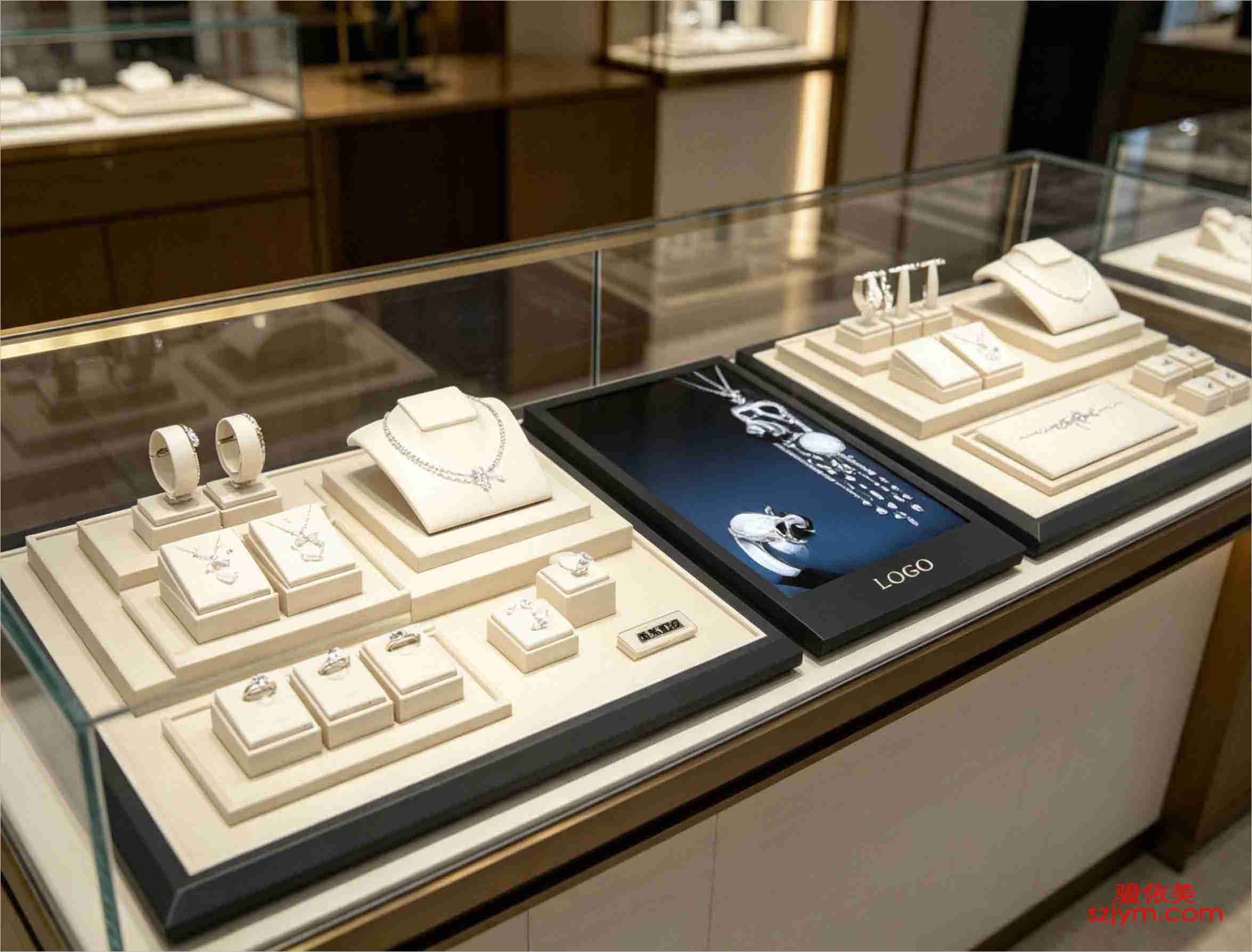 Titanium is used more and more lately—light, corrosion-resistant, with a grey, technical mood. It sits best against cool grey, misty blue or cement-textured backgrounds; the more restrained the backdrop, the more the lightness and precision stand out. For sport models, a brushed-metal or carbon-fibre panel can echo the case's machining language.
In the end, the backdrop is not decoration but a conversation partner to the case material. Choose well and the watch seems to return to the scene it belongs in; choose poorly and even an expensive piece looks misplaced. Each time you launch or rotate stock, sort the case materials first, then decide which backdrop boards stay.
This article is original content, copyright JunyiMei. Please cite the source for any reprint.
lbobo delivers watch display and merchandising solutions that let every timepiece be seen, understood and treasured—presenting the dignity time deserves.
lbobo 专注腕表陈列与展示解决方案,让每一只腕表都被看见、被读懂、被珍藏,呈现属于时间的体面。一只腕表值不值得细看,往往在被拿起之前,就已经由它身后的背景替它说了话。钢壳的冷、陶瓷的润、钛金属的轻,三种材质各自带着不同的气质,若随便配一块通用衬底,腕表的个性就被抹平了。懂得陈列的人,会先读懂表壳材质,再为它选一块相称的展示背景。
精钢表壳线条硬朗、反光偏冷,最适合配深灰或哑光黑的底托,让金属的边缘更利落。若背景也亮,钢壳容易和衬底糊成一片,反而显不出那种工业感的分明。相反,玫瑰金或暖色系的壳,配米白、浅驼或木纹底会更显温度,金属的暖调被背景接住,整体观感更柔和。
陶瓷表壳是另一种脾气。它的表面几乎不反光,触感温润,最怕被塞进一堆亮面道具里显得突兀。用一层细绒或哑光石纹做底,陶瓷的低调质感才能被衬托出来。不少品牌用整块同色系亚克力做展示座,就是为了不抢陶瓷本身的安静。
钛金属近年越用越多,它轻、耐蚀、带一点灰调的科技感。这类表壳配冷灰、雾蓝或水泥质感的背景最对味,背景越克制,钛金属的轻盈与精密越突出。若是运动款,甚至可以加一点拉丝金属或碳纤维纹理的衬板,呼应表壳的加工语言。
落地时还有一个小技巧:同一只腕表可以备两块不同质感的背景板,在晴天的门店自然光和晚间的暖光下轮换使用,腕表的性格会随光线被讲出不同侧面。背景板本身不必贵,一块哑光卡纸、一片样布就能试出效果,先小范围试,再决定要不要做成正式陈列道具,既省成本又不耽误出样。
说到底,背景不是装饰,而是表壳材质的对话者。选对了,腕表像回到了它该在的场景;选错了,再贵的表也像摆错了房间。每次上新或换季,不妨先把表壳材质排一排,再决定每块背景板的去留。
本文为原创内容,版权归骏依美所有。如需转载请注明出处。
lbobo 专注腕表陈列与展示解决方案,让每一只腕表都被看见、被读懂、被珍藏,呈现属于时间的体面。
lbobo delivers watch display and merchandising solutions that let every timepiece be seen, understood and treasured—presenting the dignity time deserves.
Titanium is used more and more lately—light, corrosion-resistant, with a grey, technical mood. It sits best against cool grey, misty blue or cement-textured backgrounds; the more restrained the backdrop, the more the lightness and precision stand out. For sport models, a brushed-metal or carbon-fibre panel can echo the case's machining language.
In the end, the backdrop is not decoration but a conversation partner to the case material. Choose well and the watch seems to return to the scene it belongs in; choose poorly and even an expensive piece looks misplaced. Each time you launch or rotate stock, sort the case materials first, then decide which backdrop boards stay.
This article is original content, copyright JunyiMei. Please cite the source for any reprint.
lbobo delivers watch display and merchandising solutions that let every timepiece be seen, understood and treasured—presenting the dignity time deserves.
lbobo 专注腕表陈列与展示解决方案,让每一只腕表都被看见、被读懂、被珍藏,呈现属于时间的体面。一只腕表值不值得细看,往往在被拿起之前,就已经由它身后的背景替它说了话。钢壳的冷、陶瓷的润、钛金属的轻,三种材质各自带着不同的气质,若随便配一块通用衬底,腕表的个性就被抹平了。懂得陈列的人,会先读懂表壳材质,再为它选一块相称的展示背景。
精钢表壳线条硬朗、反光偏冷,最适合配深灰或哑光黑的底托,让金属的边缘更利落。若背景也亮,钢壳容易和衬底糊成一片,反而显不出那种工业感的分明。相反,玫瑰金或暖色系的壳,配米白、浅驼或木纹底会更显温度,金属的暖调被背景接住,整体观感更柔和。
陶瓷表壳是另一种脾气。它的表面几乎不反光,触感温润,最怕被塞进一堆亮面道具里显得突兀。用一层细绒或哑光石纹做底,陶瓷的低调质感才能被衬托出来。不少品牌用整块同色系亚克力做展示座,就是为了不抢陶瓷本身的安静。
钛金属近年越用越多,它轻、耐蚀、带一点灰调的科技感。这类表壳配冷灰、雾蓝或水泥质感的背景最对味,背景越克制,钛金属的轻盈与精密越突出。若是运动款,甚至可以加一点拉丝金属或碳纤维纹理的衬板,呼应表壳的加工语言。
落地时还有一个小技巧:同一只腕表可以备两块不同质感的背景板,在晴天的门店自然光和晚间的暖光下轮换使用,腕表的性格会随光线被讲出不同侧面。背景板本身不必贵,一块哑光卡纸、一片样布就能试出效果,先小范围试,再决定要不要做成正式陈列道具,既省成本又不耽误出样。
说到底,背景不是装饰,而是表壳材质的对话者。选对了,腕表像回到了它该在的场景;选错了,再贵的表也像摆错了房间。每次上新或换季,不妨先把表壳材质排一排,再决定每块背景板的去留。
本文为原创内容,版权归骏依美所有。如需转载请注明出处。
lbobo 专注腕表陈列与展示解决方案,让每一只腕表都被看见、被读懂、被珍藏,呈现属于时间的体面。
lbobo delivers watch display and merchandising solutions that let every timepiece be seen, understood and treasured—presenting the dignity time deserves.
A polished steel case is sharp and cool-reflecting, so it pairs best with deep grey or matte black bases that keep the metal edges crisp. A bright background makes the steel blur into the stand and loses that clean industrial definition. Warm-toned cases such as rose gold, by contrast, feel more inviting against off-white, camel or wood-grain surfaces, where the metal's warmth is caught and softened.
Ceramic is a different character. Its surface barely reflects and feels smooth to the touch, so it clashes with a crowd of glossy props. A fine-velvet or matte stone base lets the quietness of ceramic show. Many brands use a single block of tonal acrylic as the stand precisely so nothing competes with the ceramic's calm.
Titanium is used more and more lately—light, corrosion-resistant, with a grey, technical mood. It sits best against cool grey, misty blue or cement-textured backgrounds; the more restrained the backdrop, the more the lightness and precision stand out. For sport models, a brushed-metal or carbon-fibre panel can echo the case's machining language.
In the end, the backdrop is not decoration but a conversation partner to the case material. Choose well and the watch seems to return to the scene it belongs in; choose poorly and even an expensive piece looks misplaced. Each time you launch or rotate stock, sort the case materials first, then decide which backdrop boards stay.
This article is original content, copyright JunyiMei. Please cite the source for any reprint.
lbobo delivers watch display and merchandising solutions that let every timepiece be seen, understood and treasured—presenting the dignity time deserves.
lbobo 专注腕表陈列与展示解决方案,让每一只腕表都被看见、被读懂、被珍藏,呈现属于时间的体面。一只腕表值不值得细看,往往在被拿起之前,就已经由它身后的背景替它说了话。钢壳的冷、陶瓷的润、钛金属的轻,三种材质各自带着不同的气质,若随便配一块通用衬底,腕表的个性就被抹平了。懂得陈列的人,会先读懂表壳材质,再为它选一块相称的展示背景。
精钢表壳线条硬朗、反光偏冷,最适合配深灰或哑光黑的底托,让金属的边缘更利落。若背景也亮,钢壳容易和衬底糊成一片,反而显不出那种工业感的分明。相反,玫瑰金或暖色系的壳,配米白、浅驼或木纹底会更显温度,金属的暖调被背景接住,整体观感更柔和。
陶瓷表壳是另一种脾气。它的表面几乎不反光,触感温润,最怕被塞进一堆亮面道具里显得突兀。用一层细绒或哑光石纹做底,陶瓷的低调质感才能被衬托出来。不少品牌用整块同色系亚克力做展示座,就是为了不抢陶瓷本身的安静。
钛金属近年越用越多,它轻、耐蚀、带一点灰调的科技感。这类表壳配冷灰、雾蓝或水泥质感的背景最对味,背景越克制,钛金属的轻盈与精密越突出。若是运动款,甚至可以加一点拉丝金属或碳纤维纹理的衬板,呼应表壳的加工语言。
落地时还有一个小技巧:同一只腕表可以备两块不同质感的背景板,在晴天的门店自然光和晚间的暖光下轮换使用,腕表的性格会随光线被讲出不同侧面。背景板本身不必贵,一块哑光卡纸、一片样布就能试出效果,先小范围试,再决定要不要做成正式陈列道具,既省成本又不耽误出样。
说到底,背景不是装饰,而是表壳材质的对话者。选对了,腕表像回到了它该在的场景;选错了,再贵的表也像摆错了房间。每次上新或换季,不妨先把表壳材质排一排,再决定每块背景板的去留。
本文为原创内容,版权归骏依美所有。如需转载请注明出处。
lbobo 专注腕表陈列与展示解决方案,让每一只腕表都被看见、被读懂、被珍藏,呈现属于时间的体面。
lbobo delivers watch display and merchandising solutions that let every timepiece be seen, understood and treasured—presenting the dignity time deserves.