The Color Code of Jewelry Display: How Color Psychology Drives Consumer Decisions珠宝陈列的色彩密码:色彩心理学如何驱动消费决策
The Color Code of Jewelry Display: How Color Psychology Drives Consumer Decisions
In the competitive landscape of jewelry retail, visual information begins influencing consumer judgment from the moment they step into a store. Color, as the most intuitive visual language, plays a vital role in jewelry display. A carefully designed color scheme not only highlights the natural luster and quality of jewelry but also subtly guides consumer emotions and stimulates purchasing desire. In recent years, an increasing number of jewelry brands have incorporated color psychology into their store display systems, treating it as an essential tool for improving conversion rates.
Jewelry display is not simply a matter of arranging products; it is a comprehensive art form that integrates aesthetics, psychology, and commercial strategy. In this process, the selection and coordination of colors determines the first impression jewelry makes on consumers, as well as the overall visual tone of the display area. Understanding the psychological mechanisms behind color is an indispensable skill for every jewelry display designer and brand operator.
Warm Tones and the Natural Resonance with Precious Metals
Red, orange, and gold warm tones have been used in jewelry display for generations. Research shows that warm colors evoke psychological associations of warmth, passion, and abundance, aligning naturally with the inherent properties of gold jewelry. When consumers stand before a jewelry display rack with a warm color scheme, the visual sense of temperature subtly enhances their affinity and identification with precious metals.
In practice, many jewelry stores choose warm lighting and warm-toned backdrops for their gold display areas, creating an atmosphere that is prestigious yet approachable. This strategy applies not only to gold categories but also has significant complementary effects for warm-toned gemstones such as diamonds and rubies. Thoughtful use of warm colors can make a gemstone's fire more prominent, giving consumers a stronger visual sense of quality and value.
Cool Tones and the Pure Dialogue with White Gold and Diamonds
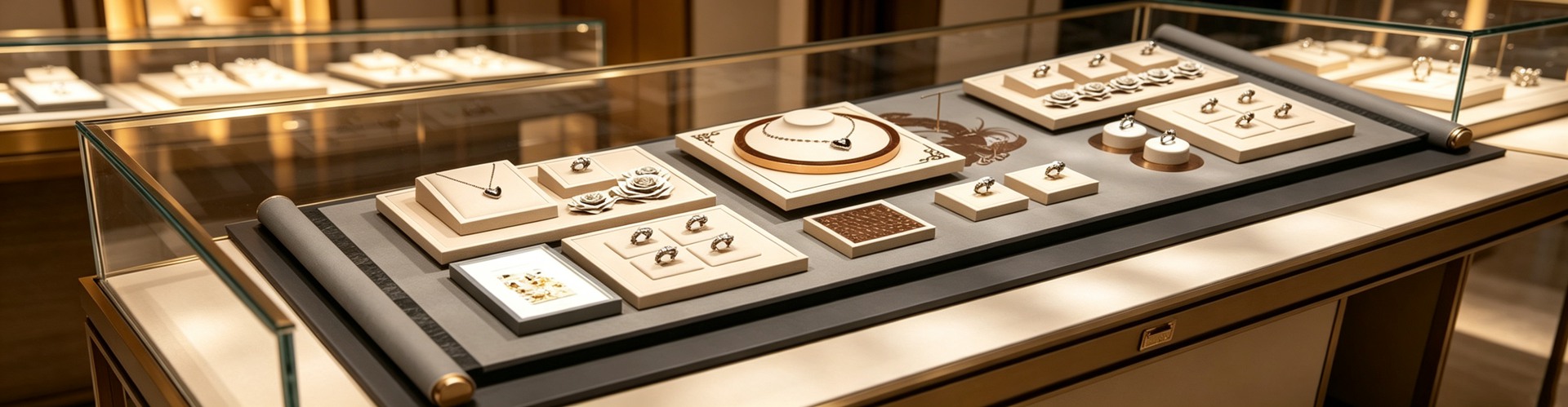
In stark contrast to warm colors, blue, purple, and silver-white cool tones carry psychological associations of calmness, purity, and luxury. Cool tones form a natural harmony with white gold, platinum, and diamond jewelry. In the design of jewelry display stands, the use of cool tones can create a refined and elegant spatial feel, keeping consumers in a state of rational focus when appreciating high-value jewelry.
Taking diamond display as an example, many premium brands prefer deep blue velvet as the lining material. Deep blue not only creates a strong visual contrast with the white brilliance of diamonds but also conveys a brand character of composure and eternity on a psychological level. This cool-tone strategy is equally applicable to the display of cool-toned gemstones such as sapphires and tanzanite, effectively enhancing the saturation and depth of the gemstone's own color.
The Bridging Role of Neutral Colors and Spatial Hierarchy
Between warm and cool colors, neutral tones such as gray, beige, and black play an indispensable bridging role. Neutral colors do not carry strong emotional direction themselves, but it is precisely this restrained quality that makes them the safest background colors in jewelry display. Whether as the inner lining of jewelry boxes or the surface treatment of display props, neutral colors leave sufficient visual focus for the jewelry itself, preventing colors from overshadowing the main subject.
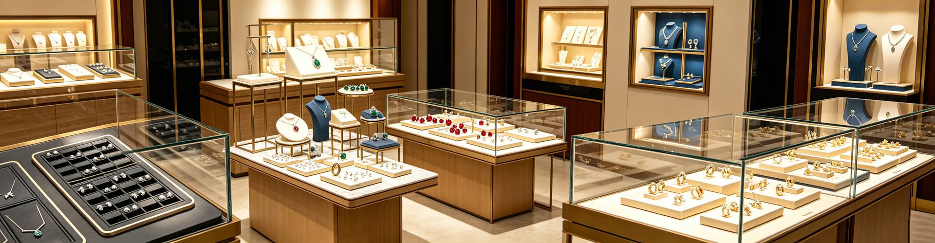
In the overall color planning of a store, neutral colors also serve the important function of connecting different category display areas. When the warm colors of the gold section and the cool colors of the diamond section need to coexist in the same space, neutral-colored transition zones can effectively ease color conflicts and create a smooth visual flow for consumers. Many successful jewelry store design cases show that maintaining a ratio of approximately seven-to-three between neutral colors and accent colors achieves the best visual balance.
Color Contrast and Visual Dwell Time
An important concept in color psychology is the effect of contrast on attention. In the design of jewelry display racks, high-contrast color combinations can effectively extend consumers' visual dwell time. When bright jewelry is placed against a dark background, the visual system is automatically attracted by the brightness difference, thereby increasing the time consumers spend observing product details. This strategy is particularly common in the design of watch display props, where the high contrast between dark leather or suede and metal dials can significantly enhance the perceived quality of timepieces.
However, the use of contrast requires careful calibration. Excessively high contrast may cause visual fatigue, making consumers feel uncomfortable in a short period. Therefore, experienced display designers typically seek a delicate balance between contrast and harmony, creating visual effects that are both eye-catching and comfortable through layered variations of lightness within the same color family.
Seasonal Color Strategies and Consumption Milestones
Jewelry consumption has distinct seasonal characteristics, and color preferences vary significantly across different times of the year. The soft pink tones of spring, the refreshing colors of summer, the warm golden hues of autumn, and the deep rich colors of winter all subtly influence consumer purchasing decisions. By making seasonal adjustments to jewelry boxes, display props, and overall display color schemes, jewelry brands can precisely echo consumers' emotional cycles and achieve higher sales conversion at key consumption milestones.
For example, during the peak wedding season, many brands choose romantic and festive red and pink tones as their primary display colors, pairing them with exquisite jewelry pouches and custom packaging to create a sense of ceremony in the shopping atmosphere. This strategy of deeply binding color psychology with consumption scenarios is becoming an important means of differentiated competition in jewelry retail. For professional jewelry packaging suppliers, understanding brands' color needs and providing precise design and customization services is the key to earning brand trust.
This article is original content, copyrighted by Shenzhen Junyimei. Please indicate the source when reprinting.
Junyimei — Making every piece of jewelry and watch presented better. Specializing in jewelry boxes, jewelry display stands, watch display props. Shenzhen-owned factory, custom design supported. Inquiries welcome!
珠宝陈列的色彩密码:色彩心理学如何驱动消费决策
在珠宝零售的竞争环境中,消费者从踏入门店的第一刻起,视觉信息便开始影响他们的判断与选择。色彩作为最直观的视觉语言,在珠宝陈列中扮演着至关重要的角色。一段精心设计的色彩搭配不仅能够凸显珠宝本身的光泽与品质,还能在无形中引导消费者的情绪走向,激发购买欲望。近年来,越来越多的珠宝品牌开始将色彩心理学纳入门店陈列体系,将其作为提升转化率的重要工具。
珠宝陈列并非简单的摆放组合,而是一门融合了美学、心理学与商业策略的综合艺术。在这个过程中,色彩的选择与搭配决定了珠宝在消费者眼中的第一印象,也决定了整个陈列区域的视觉调性。理解色彩背后的心理机制,是每一位珠宝陈列师和品牌经营者不可或缺的基本功。
暖色系与贵金属的天然共鸣
红色、橙色和金色等暖色调在珠宝陈列中的应用由来已久。研究表明,暖色系能够引发温暖、热烈和富足的心理联想,与黄金饰品的天然属性高度契合。当消费者置身于以暖色为基调的珠宝陈列架前,视觉上的温度感会潜移默化地增强对贵金属的认同与亲近。
在实际操作中,许多珠宝门店选择在黄金陈列区域使用暖色灯光和暖色调背板,营造出尊贵而不失亲和力的氛围。这种策略不仅适用于黄金品类,对于钻石、红宝石等暖色调宝石同样具有显著的衬托效果。合理的暖色运用能够使宝石的火彩更加突出,让消费者在视觉上感受到更强的品质感和价值感。
冷色系与白金钻石的纯净对话
与暖色系形成鲜明对比的是蓝色、紫色和银白色等冷色调。冷色系在心理学上代表冷静、纯洁与高端,与白金、铂金及钻石类饰品形成天然的和谐。在珠宝摆台的设计中,冷色调的运用往往能够营造出清冷而高雅的空间感,使消费者在欣赏高价值珠宝时保持理性专注的状态。
以钻石陈列为例,许多高端品牌偏好使用深蓝色丝绒作为衬底材料。深蓝色不仅能够与钻石的白色光芒形成强烈的视觉对比,还能在心理层面传递出沉稳与永恒的品牌调性。这种冷色系的运用策略同样适用于蓝宝石、坦桑石等冷色调宝石的展示,能够有效增强宝石本身色彩的饱和度与深度。
中性色的桥梁作用与空间层次
在暖色与冷色之间,灰色、米色和黑色等中性色扮演着不可或缺的桥梁角色。中性色本身不具备强烈的情感指向,但正是这种克制特性使其成为珠宝陈列中最安全的背景色。无论是作为首饰盒的内衬色,还是作为展示道具的表面处理,中性色都能为珠宝本身留出足够的视觉焦点,避免色彩喧宾夺主。
在门店的整体色彩规划中,中性色还承担着连接不同品类陈列区域的重要职能。当黄金区的暖色与钻石区的冷色需要在同一空间内共存时,中性色的过渡区能够有效缓解色彩冲突,为消费者创造流畅的视觉动线。许多成功的珠宝门店设计案例表明,中性色与重点色的比例控制在七比三左右,能够达到最佳的视觉平衡效果。
色彩对比度与视觉停留时间
色彩心理学中一个重要的概念是对比度对注意力的影响。在珠宝陈列架的设计中,高对比度的色彩组合能够有效延长消费者的视觉停留时间。当明亮的珠宝置于深色背景之上时,视觉系统会自动被亮度差异所吸引,从而增加消费者对产品细节的观察时间。这种策略在手表陈列道具的设计中尤为常见,深色皮革或绒面与金属表盘之间的高对比度能够显著提升腕表的质感表现力。
然而,对比度的运用需要把握好分寸。过高的对比度可能造成视觉疲劳,使消费者在短时间内产生不适感。因此,经验丰富的陈列师通常会在对比与和谐之间寻找微妙的平衡点,通过同色系不同明度的层次变化来营造既醒目又舒适的视觉效果。
季节性色彩策略与消费节点
珠宝消费具有明显的季节性特征,不同时节的色彩偏好也存在显著差异。春季的粉嫩色调、夏季的清凉色彩、秋季的暖金色调以及冬季的深邃色系,都在潜移默化中影响着消费者的购买决策。珠宝品牌通过在首饰盒、珠宝道具和整体陈列色调上做季节性调整,能够精准地呼应消费者的情绪周期,在关键消费节点创造更高的销售转化。
例如,在婚庆旺季,许多品牌会选择象征浪漫与喜庆的红色和粉色系作为陈列主色调,配合精美的首饰袋和定制包装,营造出仪式感十足的购物氛围。这种将色彩心理与消费场景深度绑定的策略,正在成为珠宝零售差异化竞争的重要手段。对于专业的珠宝包装供应商而言,理解品牌的色彩需求并提供精准的设计与定制服务,是赢得品牌信赖的关键所在。
本文为原创内容,版权归深圳骏依美所有,转载请注明出处。
骏依美——让每一件珠宝与腕表,都被更好地呈现。专注珠宝盒、首饰盒、珠宝陈列架、手表陈列道具等包装产品的设计与生产,深圳自有工厂,支持来图定制打样,欢迎咨询合作!