Color Psychology in Jewelry Packaging: How Color Affects the Perceived Value of Jewelry珠宝包装的色彩心理学:色彩如何影响首饰的感知价值
1. Introduction: Color — The Underestimated Language in Jewelry Packaging
When a consumer walks into a jewelry store, before seeing the gemstones themselves, they first perceive color. The tone of jewelry boxes, the color scheme of jewelry pouches, the background color of jewelry display stands — these visual inputs form the initial judgment about the brand and products in the consumer's mind within milliseconds. In 2026, with deeper research into consumer psychology, an increasing number of jewelry brands are recognizing the strategic importance of color in packaging design — it is not merely decoration, but a silent sales language.
Color psychology research shows that human perception of color is a thousand times faster than text. In jewelry retail scenarios, packaging color directly influences consumer judgments about product value, quality, and style. The classic and composed impression conveyed by a deep blue velvet jewelry box, the luxury and elegance created by a champagne gold display platform, the modern and restrained feel presented by Morandi gray wholesale jewelry boxes — each color choice silently defines the brand's tone. However, many jewelry brands still remain at the "follow your intuition" stage in packaging color decisions, lacking a systematic color strategy. This article explores how to use scientific color schemes to enhance the perceived value of jewelry packaging from a color psychology perspective.
2. Color Temperature and Best Match with Jewelry Categories
Different categories of jewelry have different optimal color matching schemes for packaging. Diamond products perform most brilliantly against cool-toned backgrounds — deep blue, navy, and cool gray tones can effectively complement the white fire of diamonds, making them visually more dazzling. When designing jewelry display props for diamond brands, Junyimei typically recommends a deep blue velvet lining paired with silver metallic frames, a combination that maximizes the visual impact of diamonds.
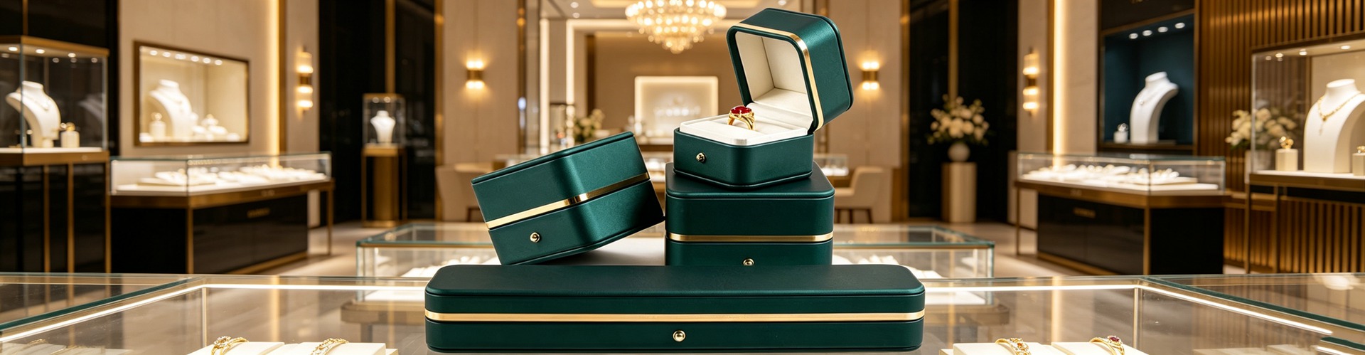
Gold products are quite different. Warm-toned packaging can enhance the warm quality of gold. Burgundy red, deep brown, and ivory white are classic pairing colors for gold jewelry. A burgundy red jewelry box not only makes gold jewelry appear warmer and fuller but also evokes emotional associations with traditional craftsmanship and family heritage. Color packaging choices for colored gemstone products are more complex, requiring complementary color matching based on the main stone color — rubies suit deep green backgrounds, sapphires are complemented by champagne gold, while jadeite requires pure white backgrounds to highlight its translucency.
Color strategies for watch display props are also particular. Display bases for complicated watches should use dark color schemes to create a professional and composed impression; fashion watches can boldly use bright-colored props to convey a youthful and energetic brand attitude. In the design and customization of watch display props, Junyimei provides targeted color matching recommendations based on the dial color, material, and target customer group of the watch.
3. Cultural Context Differences in Color Preferences
When developing packaging color strategies, jewelry brands cannot ignore the profound influence of cultural context on color perception. In Chinese culture, red symbolizes celebration and auspiciousness, so for jewelry boxes targeting the wedding market, red or gold is the preferred color scheme. But in Western markets, red packaging may be associated with Christmas or Valentine's Day limited editions rather than everyday choices.
The meaning of purple varies even more significantly across cultures. In traditional Chinese culture, purple symbolizes nobility — "purple air coming from the east" is an auspicious omen. But in some European markets, purple is associated with mourning, requiring cautious use in jewelry packaging. Similarly, white is associated with funerals in traditional Chinese context, but in Western markets, white packaging conveys purity and minimalism, making it a common choice for wedding jewelry.
For brands with overseas expansion needs, Junyimei recommends adjusting standard color schemes in jewelry box wholesale and custom orders based on target markets. Middle Eastern markets favor gold and jewel blue, Japanese markets prefer soft pink and beige, and Southeast Asian markets show high acceptance of vibrant red and green. Incorporating cultural color strategies at the design and customization stage can avoid cultural friction in later marketing.
4. Color Trends and Brand Identity System
The annual representative colors published by international color authorities each year have a significant impact on jewelry packaging design. In the 2026 color trends, natural tones and digital tones coexist — the stability conveyed by earth tones and the avant-garde conveyed by cyber purple represent two distinctly different consumer aesthetic directions. Jewelry brands need to determine which trend better aligns with their positioning, avoiding blindly chasing trending colors at the expense of brand recognition.
Establishing an exclusive color identity system is key to long-term brand building. When providing design and customization services for jewelry brands, Junyimei assists brands in determining a set of "brand colors" — typically including one primary color, one to two secondary colors, and one accent color. This color set will run through all brand packaging touchpoints, from jewelry boxes to jewelry pouches, from jewelry display stands to display cards, forming a unified visual language. When consumers see a specific color combination at retail terminals, they can identify the brand without seeing the logo — this is the ultimate goal of a color identity system.
Maintaining color consistency also requires supply chain cooperation. Color batch variation in jewelry packaging is a common industry issue — the same jewelry box model may show color differences across different production batches. The key to solving this problem lies in establishing strict color standards and quality control processes to ensure that colors in every jewelry box wholesale delivery are within acceptable range.
5. Conclusion: Telling Brand Stories with Color
Color is the most expressive element in jewelry packaging. It can convey a brand's history, emotion, and values without using a single word. From the background color of jewelry display props to the lining color of jewelry boxes, from the base color of watch display props to the decorative color of display platforms, every color choice is a silent dialogue between the brand and the consumer.
In 2026, competition in the jewelry industry has extended from the products themselves to how they are presented. In this dimension, color strategy will become a key weapon for brand differentiation. Brands that can systematically apply color psychology, establish exclusive color identity systems, and ensure color consistency throughout the supply chain will occupy a more favorable position in consumers' minds. Junyimei specializes in the design and customization of jewelry packaging, firmly believing that every color has its strategic significance, making every piece of jewelry better presented.
This article is original content, copyrighted by Shenzhen Junyimei. Please indicate the source when reprinting.
Junyimei — Making every piece of jewelry and watch presented better. Specializing in jewelry boxes, jewelry display stands, watch display props. Shenzhen-owned factory, custom design supported. Inquiries welcome!
一、引言:色彩——珠宝包装中被低估的语言
当消费者走进一家珠宝店,在看到宝石本身之前,首先感知到的是色彩。珠宝盒的色调、首饰袋的配色、珠宝陈列架的背景色彩,这些视觉信息在毫秒之间就在消费者的大脑中形成了对品牌和产品的初步判断。2026年,随着消费心理学研究的深入,越来越多的珠宝品牌开始认识到色彩在包装设计中的战略地位——它不仅是装饰,更是一种无声的销售语言。
色彩心理学研究表明,人对色彩的感知速度比文字快千倍。在珠宝零售场景中,包装色彩直接影响消费者对产品价值、品质和风格的判断。一只深蓝色丝绒首饰盒传递的经典与沉稳,一只香槟金珠宝摆台营造的奢华与优雅,一只莫兰迪灰色珠宝盒批发产品所呈现的现代与克制,每一种色彩选择都在无声地定义品牌调性。然而,许多珠宝品牌在包装色彩决策上仍停留在跟随直觉的阶段,缺乏系统的色彩策略。本文将从色彩心理学角度,探讨如何用科学的色彩方案提升珠宝包装的感知价值。
二、色彩温度与珠宝品类的最佳匹配
不同品类的珠宝对包装色彩有着不同的最佳匹配方案。钻石类产品在冷色调背景下的火彩表现最为出色——深蓝、藏青和冷灰色调能有效衬托钻石的白色火彩,让其在视觉上更加耀眼。骏依美在为钻石品牌设计珠宝道具时,通常推荐使用深蓝丝绒内衬搭配银色金属边框的方案,这种组合能够最大化钻石的视觉冲击力。
黄金类产品则截然不同。暖色调的包装能强化黄金的温暖质感,勃艮第红、深棕和象牙白是与黄金饰品的经典搭配色。一只勃艮第红色的首饰盒不仅能让黄金饰品看起来更加温润饱满,还能唤起消费者对传统工艺和家族传承的情感联想。彩色宝石类产品的包装色彩选择更为复杂,需要根据主石颜色进行互补色搭配——红宝石适合深绿色背景,蓝宝石适合香槟金色衬托,而翡翠则需要纯白色背景来凸显其水头。
手表陈列道具的色彩策略也有讲究。复杂功能腕表的陈列底座宜用深色系,营造专业和沉稳的观感;而时尚腕表则可以大胆使用亮色系道具,传递年轻和活力的品牌态度。骏依美在手表陈列道具的设计与定制中,会根据腕表的表盘颜色、材质和目标客群,提供针对性的色彩搭配建议。
三、文化语境下的色彩偏好差异
珠宝品牌在制定包装色彩策略时,不能忽视文化语境对色彩感知的深刻影响。在中国文化中,红色象征着喜庆和吉祥,因此面向婚庆市场的首饰盒,红色或金色是首选配色。但在西方市场,红色包装可能被联想为圣诞节或情人节限定,而非日常选择。
紫色在不同文化中的含义差异更为显著。在中国传统文化中,紫色象征高贵——紫气东来是吉祥的象征。但在部分欧洲市场,紫色与哀悼相关联,在珠宝包装中需谨慎使用。同样,白色在中国传统语境中与丧葬有关,但在西方市场,白色包装传递的是纯洁和简约,是婚嫁珠宝的常见选择。
对于有出海需求的品牌,骏依美建议在珠宝盒批发和定制订单中,根据目标市场调整标准配色方案。中东市场偏爱金色和宝石蓝,日本市场偏好淡雅的粉色和米色,东南亚市场对鲜艳的红色和绿色接受度高。在设计与定制阶段就把文化色彩策略纳入考量,可以避免后期市场推广中的文化摩擦。
四、色彩趋势与品牌识别系统的建立
每年国际色彩权威机构发布的年度代表色,都会对珠宝包装设计产生显著影响。2026年的年度色彩趋势中,自然色调和数字色调并存——大地色系传递的沉稳与赛博紫色传递的前卫,分别代表了两种截然不同的消费审美走向。珠宝品牌需要判断哪种趋势更契合自身定位,避免盲目追逐流行色而丧失品牌识别度。
建立专属的色彩识别系统是长期品牌建设的关键。骏依美在为珠宝品牌提供设计与定制服务时,会协助品牌确定一组品牌色——通常包含一个主色调、一至两个辅助色和一个点缀色。这组色彩将贯穿品牌的所有包装触点,从珠宝盒到首饰袋,从珠宝陈列架到展示卡片,形成统一的视觉语言。当消费者在终端看到特定色彩组合时,无需看到标志就能识别出品牌,这就是色彩识别系统的终极目标。
色彩一致性的维护也需要供应链的配合。珠宝包装的色彩批次差异是行业常见问题,同一款首饰盒在不同批次生产中可能出现色差。解决这一问题的关键在于建立严格的色彩标准和品控流程,确保每一次珠宝盒批发交付的色彩都在可接受范围内。
五、结语:用色彩讲述品牌故事
色彩是珠宝包装中最具表现力的元素,它能够在不使用一个文字的情况下,传递品牌的历史、情感和价值观。从珠宝道具的背景色到首饰盒的内衬色,从手表陈列道具的底座色到珠宝摆台的装饰色,每一处色彩选择都是品牌与消费者之间的一次无声对话。
2026年,珠宝行业的竞争已经从产品本身延伸到了产品的呈现方式。在这个维度上,色彩策略将成为品牌差异化的关键武器。那些能够系统运用色彩心理学、建立专属色彩识别系统、并在供应链中确保色彩一致性的品牌,将在消费者的心智中占据更有利的位置。骏依美专注珠宝包装的设计与定制,深信每一抹色彩都有其战略意义,让每一件珠宝都被更好地呈现。
本文为原创内容,版权归深圳骏依美所有,转载请注明出处。
骏依美——让每一件珠宝与腕表,都被更好地呈现。专注珠宝盒、首饰盒、珠宝陈列架、手表陈列道具等包装产品的设计与生产,深圳自有工厂,支持来图定制打样,欢迎咨询合作!