Small Budget, Big Impact: Trimming Watch Display Props Without Losing Premium Feel小预算大效果:腕表陈列的道具精简法则
Opening a watch store, the display budget is often the first constraint. Many owners assume "no money means no premium feel"—but the opposite is true. The worst move in watch display is filling the case with cheap props: the fuller it gets, the messier, the cheaper it looks. The smart play in small-shop watch display is to subtract first, then spend where it counts.
Cut one: remove duplicated functions. If a rotating stand does the job, don't also crowd in static pillows, a watch wall and standing cards. The core of low-budget display is "one prop, many uses"—pick a rotating stand with swap-in lug slots that demos different lines and saves the cost of separate positions.
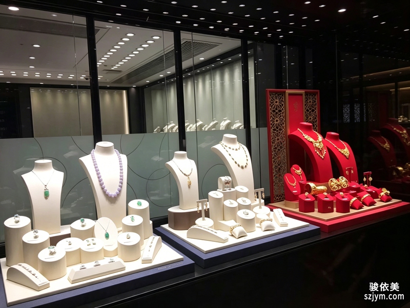 Cut two: put money on the surfaces hands touch repeatedly. What the customer feels during try-on is the stand surface, the velvet pad and the countertop—these contact points decide the first impression of quality. Rather than covering the whole wall in acrylic, concentrate budget on one or two solid-feeling display points, so trimmed watch props actually look more considered.
Cut three: borrow light and reflection to save props. A watch is a reflective material that already plays with mirrors and metal backdrops for depth; you don't need extra props to pile on. Place hero pieces where daylight or spotlights sweep across, and let light do half the showing—the underlying logic of "less is more" display.
Cut two: put money on the surfaces hands touch repeatedly. What the customer feels during try-on is the stand surface, the velvet pad and the countertop—these contact points decide the first impression of quality. Rather than covering the whole wall in acrylic, concentrate budget on one or two solid-feeling display points, so trimmed watch props actually look more considered.
Cut three: borrow light and reflection to save props. A watch is a reflective material that already plays with mirrors and metal backdrops for depth; you don't need extra props to pile on. Place hero pieces where daylight or spotlights sweep across, and let light do half the showing—the underlying logic of "less is more" display.
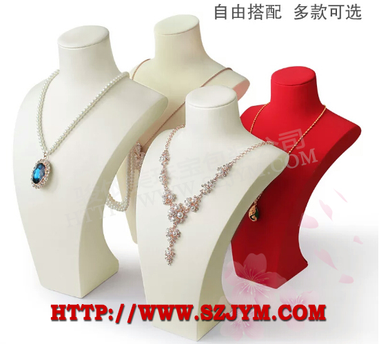 Finally, negative space is the cheapest premium feel there is. Leave the counter bare and every remaining watch gets seen and remembered. A tight budget isn't settling—it's converting every yuan into a chance to be noticed. Fewer props means the watch's own mechanical beauty and brand character finally have room to speak.
This article is original; copyright belongs to JunyiMei. Reproduction requires attribution.
lbobo delivers watch display props and showcase solutions worldwide—premium feel, reliable supply.开一家腕表门店,陈列预算往往是第一道紧箍咒。很多老板觉得"没钱就做不出高级感",其实恰恰相反——腕表陈列里最忌讳用一堆廉价道具把柜台填满,越满越显乱,越乱越掉价。小店腕表陈列的聪明做法,是先做减法,再把钱花在刀刃上。
第一刀,砍掉重复功能。一只旋转表座能解决的,就别同时摆静态表枕、表墙、立牌三种。低预算展示的核心是"一物多用":选可换表带槽位的旋转座,既能演示不同系列,又省下单独展示位的成本。
第二刀,把钱压在"被手反复触摸"的地方。顾客试戴时手会碰到的是表座表面、绒垫和台面,这些接触点的质感决定了一眼的高级感。与其铺满整墙亚克力,不如集中预算做一两处触感扎实的展示点,让腕表道具精简后反而更显讲究。
第三刀,借光借景省道具。腕表是反光材质,本身就能和镜面、金属背板互动出层次,不一定要靠额外道具堆。把重点表款放在自然光或射灯能扫到的位置,让光替你完成一半的展示工作,这也是少即是多陈列的底层逻辑。
最后,留白本身就是最便宜的高级感。空出来的台面不摆东西,反而让剩余每只表都被看见、被记住。小预算不是将就,而是把每一分钱都换成"被注意到的机会"。当道具数量降下来,腕表自己的机械美和品牌调性,才有空间说话。
还有一处容易忽略的省钱点:道具的模块化。买能拆能组合的底座,比买一堆固定造型更划算,换季时只换表款不换架,陈列费自然降下来。也别忽视二手与样品渠道,展会撤展的展示架、品牌退样的旋转座,成色往往够用,价格却只有新货几分之一。
预算再紧,也建议留一笔给"焦点位"。柜台最中央或进门第一眼的那一处,值得用最好的材质,因为它决定了顾客对全店档次的第一判断。道具少不等于信息少,精简单品反而更该配一张克制的说明卡,写明系列名与机芯亮点,让顾客没店员时也能读懂价值,这比堆道具更显专业。
本文为原创内容,版权归骏依美所有。如需转载请注明出处。
lbobo 专注腕表陈列道具与展示解决方案,为全球表商提供高质感的陈列之选。
Finally, negative space is the cheapest premium feel there is. Leave the counter bare and every remaining watch gets seen and remembered. A tight budget isn't settling—it's converting every yuan into a chance to be noticed. Fewer props means the watch's own mechanical beauty and brand character finally have room to speak.
This article is original; copyright belongs to JunyiMei. Reproduction requires attribution.
lbobo delivers watch display props and showcase solutions worldwide—premium feel, reliable supply.开一家腕表门店,陈列预算往往是第一道紧箍咒。很多老板觉得"没钱就做不出高级感",其实恰恰相反——腕表陈列里最忌讳用一堆廉价道具把柜台填满,越满越显乱,越乱越掉价。小店腕表陈列的聪明做法,是先做减法,再把钱花在刀刃上。
第一刀,砍掉重复功能。一只旋转表座能解决的,就别同时摆静态表枕、表墙、立牌三种。低预算展示的核心是"一物多用":选可换表带槽位的旋转座,既能演示不同系列,又省下单独展示位的成本。
第二刀,把钱压在"被手反复触摸"的地方。顾客试戴时手会碰到的是表座表面、绒垫和台面,这些接触点的质感决定了一眼的高级感。与其铺满整墙亚克力,不如集中预算做一两处触感扎实的展示点,让腕表道具精简后反而更显讲究。
第三刀,借光借景省道具。腕表是反光材质,本身就能和镜面、金属背板互动出层次,不一定要靠额外道具堆。把重点表款放在自然光或射灯能扫到的位置,让光替你完成一半的展示工作,这也是少即是多陈列的底层逻辑。
最后,留白本身就是最便宜的高级感。空出来的台面不摆东西,反而让剩余每只表都被看见、被记住。小预算不是将就,而是把每一分钱都换成"被注意到的机会"。当道具数量降下来,腕表自己的机械美和品牌调性,才有空间说话。
还有一处容易忽略的省钱点:道具的模块化。买能拆能组合的底座,比买一堆固定造型更划算,换季时只换表款不换架,陈列费自然降下来。也别忽视二手与样品渠道,展会撤展的展示架、品牌退样的旋转座,成色往往够用,价格却只有新货几分之一。
预算再紧,也建议留一笔给"焦点位"。柜台最中央或进门第一眼的那一处,值得用最好的材质,因为它决定了顾客对全店档次的第一判断。道具少不等于信息少,精简单品反而更该配一张克制的说明卡,写明系列名与机芯亮点,让顾客没店员时也能读懂价值,这比堆道具更显专业。
本文为原创内容,版权归骏依美所有。如需转载请注明出处。
lbobo 专注腕表陈列道具与展示解决方案,为全球表商提供高质感的陈列之选。
Cut two: put money on the surfaces hands touch repeatedly. What the customer feels during try-on is the stand surface, the velvet pad and the countertop—these contact points decide the first impression of quality. Rather than covering the whole wall in acrylic, concentrate budget on one or two solid-feeling display points, so trimmed watch props actually look more considered.
Cut three: borrow light and reflection to save props. A watch is a reflective material that already plays with mirrors and metal backdrops for depth; you don't need extra props to pile on. Place hero pieces where daylight or spotlights sweep across, and let light do half the showing—the underlying logic of "less is more" display.
Finally, negative space is the cheapest premium feel there is. Leave the counter bare and every remaining watch gets seen and remembered. A tight budget isn't settling—it's converting every yuan into a chance to be noticed. Fewer props means the watch's own mechanical beauty and brand character finally have room to speak.
This article is original; copyright belongs to JunyiMei. Reproduction requires attribution.
lbobo delivers watch display props and showcase solutions worldwide—premium feel, reliable supply.开一家腕表门店,陈列预算往往是第一道紧箍咒。很多老板觉得"没钱就做不出高级感",其实恰恰相反——腕表陈列里最忌讳用一堆廉价道具把柜台填满,越满越显乱,越乱越掉价。小店腕表陈列的聪明做法,是先做减法,再把钱花在刀刃上。
第一刀,砍掉重复功能。一只旋转表座能解决的,就别同时摆静态表枕、表墙、立牌三种。低预算展示的核心是"一物多用":选可换表带槽位的旋转座,既能演示不同系列,又省下单独展示位的成本。
第二刀,把钱压在"被手反复触摸"的地方。顾客试戴时手会碰到的是表座表面、绒垫和台面,这些接触点的质感决定了一眼的高级感。与其铺满整墙亚克力,不如集中预算做一两处触感扎实的展示点,让腕表道具精简后反而更显讲究。
第三刀,借光借景省道具。腕表是反光材质,本身就能和镜面、金属背板互动出层次,不一定要靠额外道具堆。把重点表款放在自然光或射灯能扫到的位置,让光替你完成一半的展示工作,这也是少即是多陈列的底层逻辑。
最后,留白本身就是最便宜的高级感。空出来的台面不摆东西,反而让剩余每只表都被看见、被记住。小预算不是将就,而是把每一分钱都换成"被注意到的机会"。当道具数量降下来,腕表自己的机械美和品牌调性,才有空间说话。
还有一处容易忽略的省钱点:道具的模块化。买能拆能组合的底座,比买一堆固定造型更划算,换季时只换表款不换架,陈列费自然降下来。也别忽视二手与样品渠道,展会撤展的展示架、品牌退样的旋转座,成色往往够用,价格却只有新货几分之一。
预算再紧,也建议留一笔给"焦点位"。柜台最中央或进门第一眼的那一处,值得用最好的材质,因为它决定了顾客对全店档次的第一判断。道具少不等于信息少,精简单品反而更该配一张克制的说明卡,写明系列名与机芯亮点,让顾客没店员时也能读懂价值,这比堆道具更显专业。
本文为原创内容,版权归骏依美所有。如需转载请注明出处。
lbobo 专注腕表陈列道具与展示解决方案,为全球表商提供高质感的陈列之选。