Why The Color Of Jewelry Packaging Sells More珠宝盒配色有讲究
Before a jewelry box is even opened, the customer has often already decided with their eyes. In a category like jewelry—bought first with the eyes, high in ticket price, and heavy on emotion—the color of packaging and display is not mere aesthetics. It is a silent language of closing the sale.
Q1: Does color really affect whether jewelry sells?
Multiple independent studies say yes, and they agree strikingly. Colorcom research shows that about 85% of consumers name "color" as the primary reason they pick one product over another. The CCICOLOR Institute adds that, within the first 90 seconds of seeing something, 62%–90% of a person's snap judgment is based on color alone. Put that in a jewelry context: the moment a shopper glances at your jewelry packaging and jewelry box across a counter or a screen, the brain finishes its first "is this premium, is this worth it" assessment in roughly 0.15 seconds. Adobe's 2025 survey goes further, noting that 42% of impulse purchases are triggered directly by color cues on the shelf, and that a coordinated point-of-sale color scheme can lift purchase intent by an average of 38%. In short, color speaks for you before the sale ever happens.
Q2: What color family suits high-end jewelry?
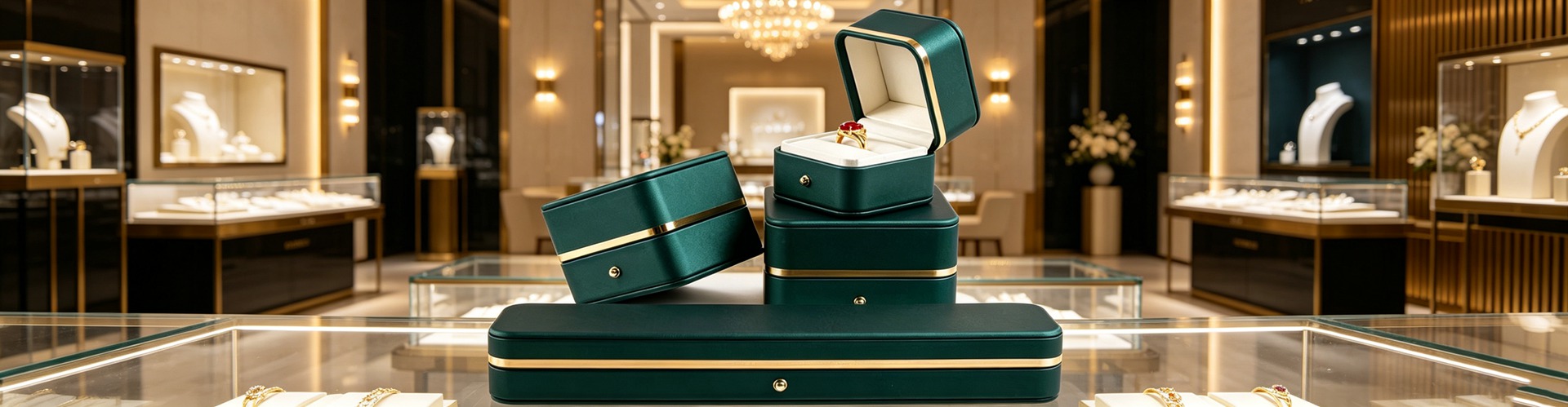
Black and gold is the repeatedly proven "luxury combination." A 2025 study at HAW Hamburg found that 48% of respondents read black packaging as a signal of luxury and exclusivity; the Pantone Color Institute notes black packaging can make a product feel 20%–30% more expensive. That is exactly why so many high-ticket jewelry boxes use deep-black velvet lining, gold foil logos, and matte outer cases—black holds down the sense of price, gold only punctuates, never competes. Shenzhen Junyimei, in its custom jewelry box service, typically guides affordable-luxury brands toward a "black-and-gold" or "ivory-white plus low-saturation gold" route, so the packaging becomes an extension of brand tone rather than a mere container.
Q3: Won't green packaging look less luxurious?
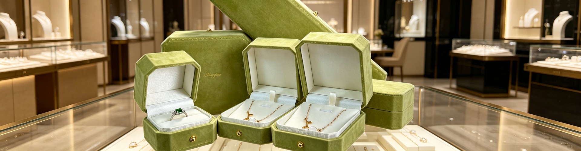
Quite the opposite—among younger buyers, green is appreciating. In that same HAW study, 62% linked green with "health and sustainability," and McKinsey's 2024 data shows green packaging is perceived as 34% more sustainable, while over 60% of consumers will pay a 10%–15% premium for eco-friendly packaging. For independent jewelry brands built on a sustainability story, switching from plastic lamination to natural pulp or recycled paper with understated foil stamping actually strengthens a brand personality of "honest, restrained, and principled." Good jewelry packaging design uses color to say clearly who you are, instead of blindly chasing "expensive."
Q4: How should display props be colored so they don't steal the show?
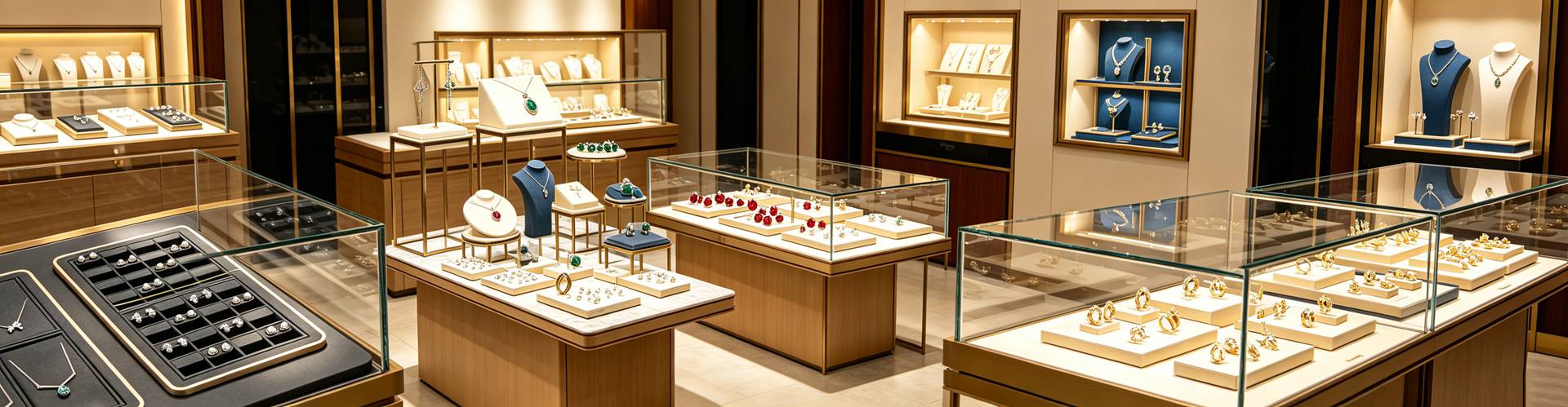
The job of jewelry display props is to support, not to shout. The Henley Centre reports that 73% of purchasing decisions are made in-store, and the in-store first impression is again heavily visual. That is why jewelry display stands and jewelry showcase platforms should use low-saturation neutrals—stone grey, misty blue, warm white, charcoal—so the diamond and colored stones remain the only true protagonists. The same logic applies to watch display props: a dark acrylic or wood-grain base makes a timepiece's metallic sheen look even more refined. One rule worth memorizing: if the display stand's color is louder than the product, it has failed its job.
Q5: Can a single color system actually compound in value?
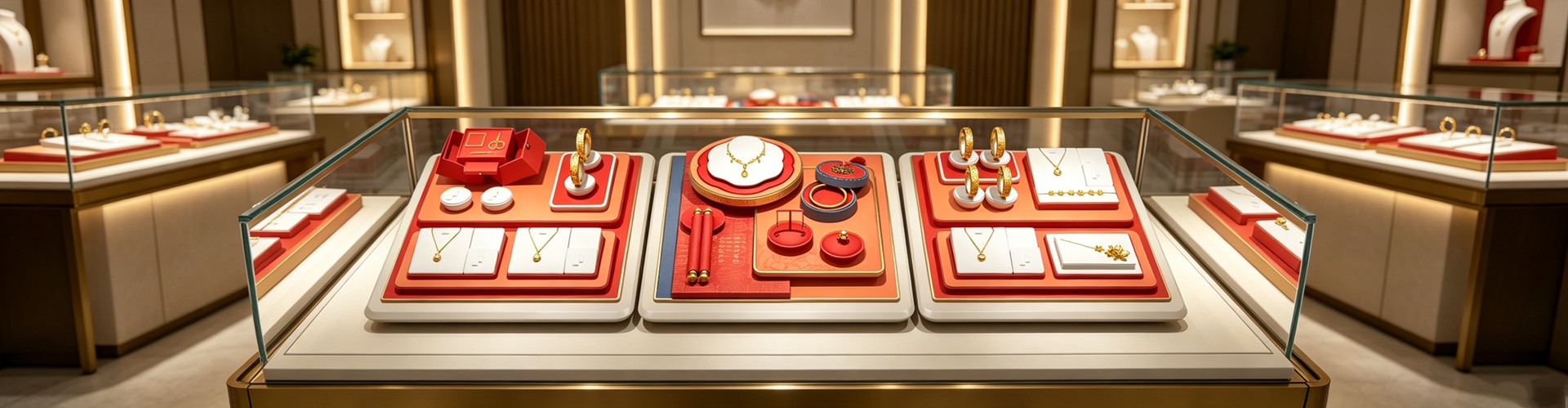
Yes, and the compounding is considerable. Loyola University research shows consistent use of a brand color can raise brand recognition by up to 80%. A 2025 consumer survey is even more pointed: 78% of people remember a brand's color, yet only 43% remember its name. For a jewelry brand, threading a signature color through the jewelry box, the jewelry pouch, the jewelry display stand, and the online product page is a way of accumulating an asset of "instant recognition." Keeping jewelry gift boxes and jewelry display racks in one consistent palette also lowers the visual-management cost across chain stores. This is precisely why jewelry box factories and jewelry box wholesalers now insist on "color-card proofing"—lock the color first, then lock production, to avoid batch-to-sample mismatch.
Q6: Should the online page and the physical box match in color?
They must, and the stricter the better. As noted, the human brain processes color in about 150 milliseconds—far faster than it reads words. The instant the "premium gold" seen online arrives as "dull yellow" in hand, trust drops and return risk climbs. The practical move is to fix a standard color value (Pantone or CMYK) during the custom jewelry box stage and share that exact card with the photographer, the page designer, and the jewelry display rack proofing team. Treating color as a managed brand asset—rather than something everyone does their own way—is one of the most overlooked gaps between a mature jewelry brand and a generic white-label seller.
This is original content. Copyright belongs to Shenzhen Junyimei.
Junyimei — present every jewel and timepiece at its best.
一只珠宝盒还没被打开,顾客往往已经用颜色替你做好了决定。在珠宝这类"先看后买、高客单价、强情感"的品类里,包装与陈列的色彩不只是审美,而是一套沉默的成交语言。
Q1:颜色真的会影响珠宝的成交吗?
多项独立研究给出惊人一致的答案——会,而且影响很大。Colorcom 的研究显示,约 85% 的消费者把"颜色"列为选择某款产品而非另一款的首要原因;CCICOLOR 研究院则指出,人们在最初 90 秒内的潜意识判断中,有 62%–90% 仅基于颜色。放到珠宝场景:当顾客隔着柜台或屏幕扫过你的珠宝包装与首饰盒,大脑在 0.15 秒内就完成了第一轮"值不值、高级不高级"的评估。Adobe 2025 年的调查还提到,42% 的冲动购买由货架上的色彩线索直接触发,协调的卖场配色更能把购买意愿平均拉高 38%。换句话说,配色是成交发生之前,最先替你说话的那个人。
Q2:高端珠宝适合什么色系?
黑与金,是被反复验证的"贵气组合"。汉堡应用科技大学(HAW Hamburg)2025 年的研究发现,48% 的受访者将黑色包装视为"奢华与专属感"的标志;Pantone 色彩研究院也指出,黑色包装会让消费者觉得产品价格高出 20%–30%。这也是许多高客单价首饰盒采用深黑绒衬、烫金 Logo、哑光外盒的原因——黑色压得住价格感,金色只做点睛,不喧宾夺主。深圳骏依美在珠宝盒定制服务中常建议轻奢品牌走"黑金"或"象牙白 + 低饱和金"路线,让包装本身成为品牌调性的延伸,而非单纯的容器。
Q3:绿色包装会不会显得不够贵气?
恰恰相反,在年轻客群里绿色正在升值。同一项研究里,62% 的人把绿色与"健康、可持续"关联;麦肯锡 2024 年的数据也显示,绿色包装被感知的可持续性高出 34%,而超六成消费者愿意为环保包装多付 10%–15% 溢价。这对主张环保的独立珠宝品牌是利好:用本色纸浆、再生纸搭配素雅烫印替代塑料覆膜,反而强化了"诚实、克制、有态度"的品牌人格。好的珠宝包装设计,是用颜色讲清楚你是谁,而不是盲目追"贵"。
Q4:陈列道具的颜色怎么配才不抢戏?
珠宝陈列道具的核心任务是"托"而非"抢"。Henley Centre 的研究表明,73% 的购买决策发生在店内;而人在店内的第一判断同样高度依赖视觉。因此珠宝摆台、首饰展台宜用低饱和的中性色——米灰、雾蓝、暖白、炭黑——让钻石与彩宝成为画面里唯一的主角。手表陈列道具同理,深色亚克力或木纹底座能把腕表的金属光泽衬得更高级。记住一条原则:陈列架的颜色如果比产品更跳,它就失职了。
Q5:一套配色体系能带来复利吗?
能,而且复利可观。Loyola 大学的研究显示,稳定使用品牌色可使品牌识别度提升最高 80%;一项 2025 消费者调查更直接:78% 的人记得品牌的颜色,却只有 43% 记得品牌名。对珠宝品牌而言,把专属色贯穿首饰盒、首饰袋、珠宝展示架与线上详情页,是在持续累积"一眼可辨"的资产。饰品包装盒与珠宝陈列架统一色调,还能降低连锁门店的视觉管理成本。这也是为什么珠宝盒工厂与首饰盒批发商如今都强调"色卡打样"——先定色,再定产,避免大货与样盒出现色差。
Q6:线上详情页和实物包装,颜色要一致吗?
必须一致,而且越严格越好。前面提到,人类处理颜色只需约 150 毫秒,远快于阅读文字;一旦线上看到的"高级金"与到手实物偏成"土黄",信任感会瞬间打折,退货与差评风险随之上升。建议在珠宝盒定制阶段就锁定标准色值(Pantone 或 CMYK),并把同一套色卡同步给摄影师、详情页设计与珠宝陈列架打样方。把颜色当作品牌资产来管控,而不是各做各的,这是成熟珠宝品牌与白牌之间最容易被忽略的差距。
本文为原创内容,版权归深圳骏依美所有,转载请注明出处。
骏依美——让每一件珠宝与腕表,都被更好地呈现。