Shift the Color Temperature, Shift the Watch's Character灯光色温变了,腕表的气质也跟着变
The same watch under warm yellow light and pure white light can feel like two different watches. Color temperature is often underestimated in watch display, yet it directly rewrites the metal sheen, the dial texture and the overall character. Understanding it is the first step to letting the display say the brand's line correctly.
The basics first. Color temperature is measured in Kelvin: 3000K is warm like afternoon sun, 4000K close to natural white, above 5000K cool like an overcast noon. Warm light gives steel a soft golden tone, suiting vintage and dress watches; cool light makes brushing and blue-steel hands crisper, suiting sports and dive models. Pick the wrong temperature and the light mis tells the watch's character.  What matters even more is the color rendering index. Temperature only sets warm or cool; CRI decides whether colors are true. A spotlight below CRI 80 shifts the dial and dulls a red seconds hand, and the moment the customer compares it at home in daylight, trust drops. Professional watch cases should use CRI 90 plus, so what is seen at the counter matches what is worn, which is itself an honest detail toward the buyer.
A neglected technique is zoning the light. Wall cases with dress watches get warm light for calm; island cases with sports watches get cool white for energy—one store can still tell two moods. Pair with adjustable track spots angled from above the case, and a thin bright line appears on the metal edge, bringing the silhouette alive.
Color temperature also interacts with the backdrop. Deep grey velvet with warm light reads steady; white matte panel with cool light reads fresh. Warm light on a cool backdrop easily turns murky grey. Decide the background first, then derive the light, rather than installing lamps at random. One last note: lamps age and shift color, so check with a temperature card each quarter to avoid quietly dimming the watch's complexion.
What matters even more is the color rendering index. Temperature only sets warm or cool; CRI decides whether colors are true. A spotlight below CRI 80 shifts the dial and dulls a red seconds hand, and the moment the customer compares it at home in daylight, trust drops. Professional watch cases should use CRI 90 plus, so what is seen at the counter matches what is worn, which is itself an honest detail toward the buyer.
A neglected technique is zoning the light. Wall cases with dress watches get warm light for calm; island cases with sports watches get cool white for energy—one store can still tell two moods. Pair with adjustable track spots angled from above the case, and a thin bright line appears on the metal edge, bringing the silhouette alive.
Color temperature also interacts with the backdrop. Deep grey velvet with warm light reads steady; white matte panel with cool light reads fresh. Warm light on a cool backdrop easily turns murky grey. Decide the background first, then derive the light, rather than installing lamps at random. One last note: lamps age and shift color, so check with a temperature card each quarter to avoid quietly dimming the watch's complexion. 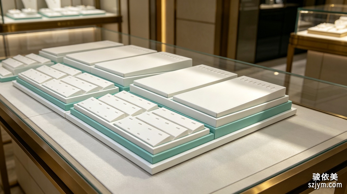 This article is original content, copyright JunyiMei. Please credit the source if reprinted.
lbobo focuses on watch display and props, using the right light to tell each timepiece's true character.
lbobo specializes in watch display and props, using the right light to tell each timepiece's true character.同一支腕表,放在暖黄灯下和纯白灯下,给人的感觉可能像两支不同的表。色温这件事,在腕表陈列里常被低估,但它直接改写了表的金属光泽、盘面质感和整体气质。理解色温,是让陈列替品牌把话说对的第一步。
先说基本盘。灯光色温用开尔文衡量,3000K 偏暖、像午后阳光,4000K 接近自然白,5000K 以上偏冷、像阴天正午。暖光让钢壳显出柔润的金调,适合复古与正装表;冷光则把拉丝纹路和蓝钢指针照得更利落,适合运动与潜水表。选错色温,表的性格就被灯光讲歪了。
更讲究的是显色指数。色温只决定冷暖,显色指数 Ra 才决定颜色准不准。Ra 低于 80 的射灯会让表盘偏色、秒针红变暗,顾客拿回家在自然光下一比,信任感立刻打折。专业腕表柜建议用 Ra90 以上的灯具,让柜台看到的和真实佩戴看到的基本一致,这也是对顾客诚实的一种细节。
实际落地有个常被忽略的技巧:分区给光。靠墙柜放正装表用暖光营造安静感,中岛放运动表用冷白光突出力量感,同一家店也能讲出两种情绪。配合可调角度的轨道射灯,让光从表壳斜上方打来,金属边缘会出现一道细亮线,表的轮廓瞬间被勾活。
色温还会和背景材质互相作用。深灰绒布配暖光显沉稳,白哑光背板配冷光显清爽;若把暖光打在冷调背景上,容易出现发灰的脏感。建议先定背景色,再反推灯光,而不是灯买来随便装。还有一个实用细节:不同盘面材质对色温的反馈并不一样,太阳纹面盘在冷光下更显闪,珍珠母贝在暖光下更显润,选光时最好按在售主力表款的盘面类型微调,而不是全店一刀切。最后提醒一句,灯具用久会色衰,每季度用色温卡抽检一次,避免不知不觉把表的脸色照旧了。
本文为原创内容,版权归骏依美所有。如需转载请注明出处。
lbobo 专注腕表陈列与展示道具,用对的光把每支表的气质讲准。
lbobo specializes in watch display and props, using the right light to tell each timepiece's true character.
This article is original content, copyright JunyiMei. Please credit the source if reprinted.
lbobo focuses on watch display and props, using the right light to tell each timepiece's true character.
lbobo specializes in watch display and props, using the right light to tell each timepiece's true character.同一支腕表,放在暖黄灯下和纯白灯下,给人的感觉可能像两支不同的表。色温这件事,在腕表陈列里常被低估,但它直接改写了表的金属光泽、盘面质感和整体气质。理解色温,是让陈列替品牌把话说对的第一步。
先说基本盘。灯光色温用开尔文衡量,3000K 偏暖、像午后阳光,4000K 接近自然白,5000K 以上偏冷、像阴天正午。暖光让钢壳显出柔润的金调,适合复古与正装表;冷光则把拉丝纹路和蓝钢指针照得更利落,适合运动与潜水表。选错色温,表的性格就被灯光讲歪了。
更讲究的是显色指数。色温只决定冷暖,显色指数 Ra 才决定颜色准不准。Ra 低于 80 的射灯会让表盘偏色、秒针红变暗,顾客拿回家在自然光下一比,信任感立刻打折。专业腕表柜建议用 Ra90 以上的灯具,让柜台看到的和真实佩戴看到的基本一致,这也是对顾客诚实的一种细节。
实际落地有个常被忽略的技巧:分区给光。靠墙柜放正装表用暖光营造安静感,中岛放运动表用冷白光突出力量感,同一家店也能讲出两种情绪。配合可调角度的轨道射灯,让光从表壳斜上方打来,金属边缘会出现一道细亮线,表的轮廓瞬间被勾活。
色温还会和背景材质互相作用。深灰绒布配暖光显沉稳,白哑光背板配冷光显清爽;若把暖光打在冷调背景上,容易出现发灰的脏感。建议先定背景色,再反推灯光,而不是灯买来随便装。还有一个实用细节:不同盘面材质对色温的反馈并不一样,太阳纹面盘在冷光下更显闪,珍珠母贝在暖光下更显润,选光时最好按在售主力表款的盘面类型微调,而不是全店一刀切。最后提醒一句,灯具用久会色衰,每季度用色温卡抽检一次,避免不知不觉把表的脸色照旧了。
本文为原创内容,版权归骏依美所有。如需转载请注明出处。
lbobo 专注腕表陈列与展示道具,用对的光把每支表的气质讲准。
lbobo specializes in watch display and props, using the right light to tell each timepiece's true character.
What matters even more is the color rendering index. Temperature only sets warm or cool; CRI decides whether colors are true. A spotlight below CRI 80 shifts the dial and dulls a red seconds hand, and the moment the customer compares it at home in daylight, trust drops. Professional watch cases should use CRI 90 plus, so what is seen at the counter matches what is worn, which is itself an honest detail toward the buyer.
A neglected technique is zoning the light. Wall cases with dress watches get warm light for calm; island cases with sports watches get cool white for energy—one store can still tell two moods. Pair with adjustable track spots angled from above the case, and a thin bright line appears on the metal edge, bringing the silhouette alive.
Color temperature also interacts with the backdrop. Deep grey velvet with warm light reads steady; white matte panel with cool light reads fresh. Warm light on a cool backdrop easily turns murky grey. Decide the background first, then derive the light, rather than installing lamps at random. One last note: lamps age and shift color, so check with a temperature card each quarter to avoid quietly dimming the watch's complexion.
This article is original content, copyright JunyiMei. Please credit the source if reprinted.
lbobo focuses on watch display and props, using the right light to tell each timepiece's true character.
lbobo specializes in watch display and props, using the right light to tell each timepiece's true character.同一支腕表,放在暖黄灯下和纯白灯下,给人的感觉可能像两支不同的表。色温这件事,在腕表陈列里常被低估,但它直接改写了表的金属光泽、盘面质感和整体气质。理解色温,是让陈列替品牌把话说对的第一步。
先说基本盘。灯光色温用开尔文衡量,3000K 偏暖、像午后阳光,4000K 接近自然白,5000K 以上偏冷、像阴天正午。暖光让钢壳显出柔润的金调,适合复古与正装表;冷光则把拉丝纹路和蓝钢指针照得更利落,适合运动与潜水表。选错色温,表的性格就被灯光讲歪了。
更讲究的是显色指数。色温只决定冷暖,显色指数 Ra 才决定颜色准不准。Ra 低于 80 的射灯会让表盘偏色、秒针红变暗,顾客拿回家在自然光下一比,信任感立刻打折。专业腕表柜建议用 Ra90 以上的灯具,让柜台看到的和真实佩戴看到的基本一致,这也是对顾客诚实的一种细节。
实际落地有个常被忽略的技巧:分区给光。靠墙柜放正装表用暖光营造安静感,中岛放运动表用冷白光突出力量感,同一家店也能讲出两种情绪。配合可调角度的轨道射灯,让光从表壳斜上方打来,金属边缘会出现一道细亮线,表的轮廓瞬间被勾活。
色温还会和背景材质互相作用。深灰绒布配暖光显沉稳,白哑光背板配冷光显清爽;若把暖光打在冷调背景上,容易出现发灰的脏感。建议先定背景色,再反推灯光,而不是灯买来随便装。还有一个实用细节:不同盘面材质对色温的反馈并不一样,太阳纹面盘在冷光下更显闪,珍珠母贝在暖光下更显润,选光时最好按在售主力表款的盘面类型微调,而不是全店一刀切。最后提醒一句,灯具用久会色衰,每季度用色温卡抽检一次,避免不知不觉把表的脸色照旧了。
本文为原创内容,版权归骏依美所有。如需转载请注明出处。
lbobo 专注腕表陈列与展示道具,用对的光把每支表的气质讲准。
lbobo specializes in watch display and props, using the right light to tell each timepiece's true character.