What the Fine Print on a Jewelry Box Reveals包装上的字见真章
Half the value of a piece of jewelry is in the stone; the other half is in the box. And the few lines of small print on that box often do more to earn a customer's trust than the foil logo ever will.
Q: What text actually belongs on a jewelry box?
At minimum, three blocks: brand and origin, material composition and the standard it meets, and care plus certificate access. For pieces worn against the skin — silver, gold alloy, plated settings — the material must be stated. Under the EU's REACH rules, nickel release from items in long contact is capped at 0.5 micrograms per square centimeter per week, and children's jewelry faces hard limits on lead and cadmium. A clear "ingredients list" is migrating from food onto the jewelry box.
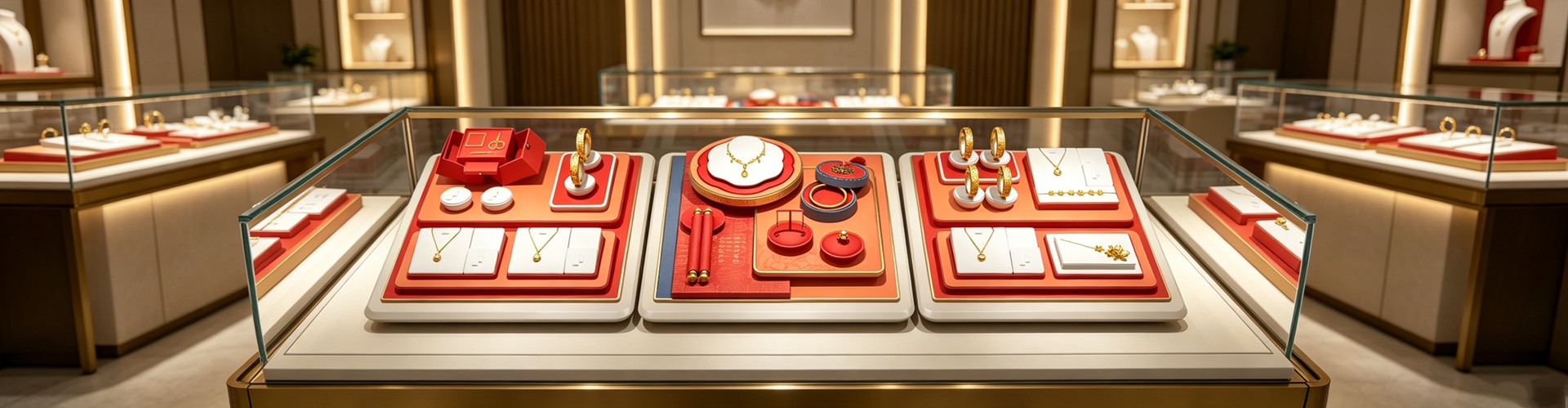
This is not box-ticking. In an empirical study of 250 shoppers, vague or misleading labels cut trust by 68%. Clear, certified small print shrank decision time from 18.5 seconds to 7.2 and lifted purchase-intent scores from 2.5 to 4.6 out of 5. Printed correctly, the box becomes a credibility certificate — exactly what good jewelry packaging should secure before the customer even opens it.
Q: Why do the most expensive brands use the smallest, quietest type?
Because a crowded surface reads as cheap. Luxury brands treat "print less" as grammar: one clean mark, a few necessary lines, everything else left as silence. But small is not the same as blurry. Hong Kong's food-safety authority tested 100 small packages and found 63% failed basic readability guidance; the tiniest letter measured just 0.48 mm — invisible to the naked eye.
The guidance actually sets a floor: letter x-height at least 1.2 mm (never below 0.8 mm), Chinese characters no shorter than 1.8 mm, high contrast (black on white or white on black), and generous spacing. Making type "small but legible" is a precision job, not a cost cut. Shenzhen Junyimei writes minimum size and contrast into its sampling checklist, so every line on the jewelry box survives a magnifier.
Q: Foil, embossing, or screen print — which text looks most premium?
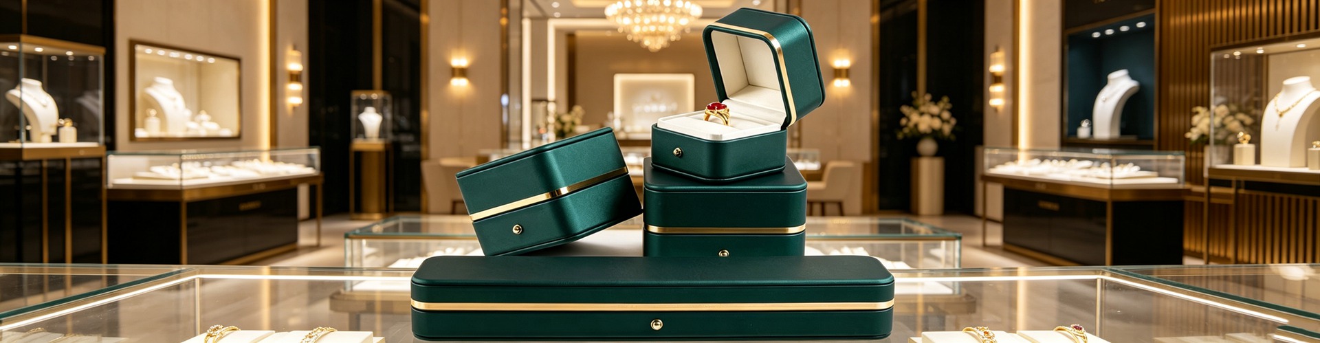
All three make text "seen," but send different signals. Foil uses reflection to pull the eye to what matters — logo, name, certification. Blind embossing needs no color; its raised feel does the talking, and fits minimalism best. A Sappi–Clemson experiment is telling: handling a premium package twice lifted purchase intent by 50%, and four times by 90%, while plain packaging needed three touches to reach the same point. Embellished boxes triggered 95% more positive feeling on opening.
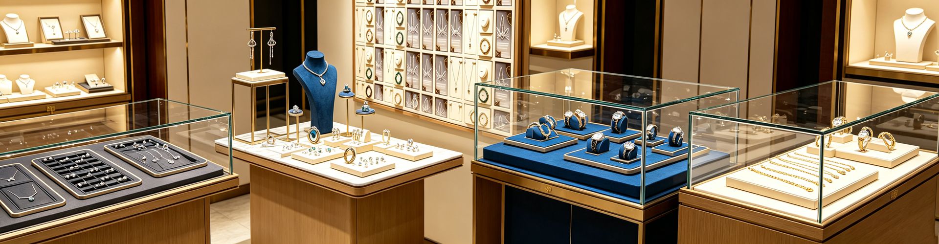
The lesson is "less is more": all-over foil dilutes focus into noise. In that same study, embellished packaging won 93% to 7%. Spend the craft on one logo and one certification mark; leave the rest quiet. Display props follow the same rule — the text on them should be few and exact, so the product stays the hero.
Q: High-end minimalist packaging is said to win customers more easily — what does that have to do with the text on the box?
Everything. A busy surface hides the brand name and the material fine print inside patterns and low contrast; in hand, the customer can't tell "what this is, what it contains, is it genuine," and trust leaks right there. Minimalism does the opposite: a plain matte base, one clear blind-pressed mark as the hero, and the necessary information set in small, well-spaced, high-contrast type that actually reads.
What's hard isn't printing less — it's moving budget from surface ornament to print precision and structural tolerance: minimum type at 1.2 mm x-height, no cramped spacing, fold error under 0.2 mm, batch color difference within Delta E 1.5. Customers never see those numbers, but they feel "is the text clear, is the box straight" the moment they pick it up. Shenzhen Junyimei writes this text standard into its jewelry packaging design sampling: minimalism isn't the cheap option, it's spending where the customer can read.
Q: Certificates, numbered cards, QR codes — where should the text live?
Rule of thumb: fixed info on the box, changing info on a card. Brand, material, origin print directly; promotions, verification, care videos go on a detachable numbered card or a QR code inside the lid. The code is becoming the box's new door: global packaging scans rose 57% year on year in 2025, and about 60% of shoppers scan for product info before buying. Connected packaging averages roughly a 14% scan rate — orders of magnitude above a 0.01% digital-ad click — with near-3-minute dwell and sales lifts up to 30%. GS1 plans to move checkout barcodes to 2D by 2027.
Put the code inside the lid or on a separate card, never over the hero mark. It should be "scan for a bonus," not "blocks the logo." That's the clean spot a jewelry box customization should reserve — a place the finger finds, patterns don't bury.
Q: Tight budget — how does a small brand get the text right?
Three tiers, no wasted spend. Free tier: clear material fine print, tidy brand type, and price stickers or invoices kept off the box. Tens-of-yuan tier: add a detachable numbered card with a QR link to verification and care. Hundred-yuan tier: work with Shenzhen Junyimei on small-batch flexible sampling — check the type before scaling, foil and emboss only in one place. The jewelry display box follows the same order: get the information right, then make it pretty.
Three traps are most common: type too small and too pale, so low contrast equals not printed; busy patterns burying key information; and wrong or missing material composition, which crosses a compliance line. The text on the box is the brand's last word in the customer's hand — clear beats pretty.
This is original content. Copyright belongs to Shenzhen Junyimei.
Junyimei — present every jewel and timepiece at its best.
一件珠宝的价值,一半写在货上,一半写在盒上。而盒面上那几行小字,往往比烫金logo更决定顾客信不信你——它们是品牌在顾客手里说的"最后一段话"。
问:珠宝包装上到底该印哪些字?
至少三块信息不能省:品牌与产地、材质成分与执行标准、保养与证书入口。尤其是贴身佩戴的银饰、K金、合金件,材质必须写清楚——欧盟REACH法规把长期接触件的镍释放限在每周每平方厘米0.5微克以内,儿童饰品更有总铅、总镉红线。一个被写清的"成分表",正从食品行业蔓延到珠宝盒。
这不是形式主义。一项覆盖250位消费者的实证研究发现,模糊或误导性的标签会让消费者信任度直接下降68%;而清晰、带认证的小字,把决策时间从18.5秒压到7.2秒,购买意愿评分也从2.5升到4.6(满分5分)。字印得对,盒子就成了一张"可信凭证"。这正是一家好珠宝包装该替顾客想在前面的事。
问:为什么越贵的品牌,字反而越小、越克制?
因为版面越满,高级感越薄。高端品牌把"少印"当成一种语法:一枚干净标识,加几行必要小字,其余交给留白。但"小"不等于"糊"——香港食物安全中心曾抽检100件小包装,63%连可读性指引都达不到,最细的英文字母只有0.48毫米,肉眼根本辨不清。
行业指引其实给过底线:字母x高度至少1.2毫米(最小不低于0.8毫米),中文整字高不低于1.8毫米;字与背景要高对比(白底黑字或黑底白字),字距充足不挤不叠。把字做"小而清楚",靠的是印刷精度,不是偷工。深圳骏依美在打样验收里就把最小字号和对比度写进指标,首饰盒上的每一行字都要经得起放大镜看。
问:烫金、压凹、丝印,哪一种字更显贵?
三种都是"让字被看见"的工艺,但信号不同。烫金用反光把视线引向最重要的信息——logo、品名、认证标;压凹(盲压)不靠颜色,靠凸起的手感说话,最贴极简高级。一项Sappi与克莱姆森大学的实验很说明问题:消费者把玩premium包装两次,购买意愿就+50%,把玩四次冲到+90%;而普通包装要摸三次才到同一水平。开盒时带工艺的包装让人正面情绪多95%。
但关键一课是"Less is More":满版烫金细花,反而把焦点稀释成一团噪点。同一研究里,带工艺的包装被选中比例是93%对7%。所以工艺要用在刀刃上——一处logo、一处认证,其余留白。珠宝陈列道具同理:道具上的字也该少而准,让货当主角。
问:都说高端简约的珠宝包装设计,更容易被顾客青睐,这跟"盒上的字"有什么关系?
关系很大。繁复盒面把品牌字和材质小字藏进花纹与低对比里,顾客拿在手里看不清"这是什么、含什么、保不保真",信任就从这里漏掉。高端简约的做法相反:纯色哑面打底,一枚清晰盲压标识做主角,必要信息用小字规整排布、对比充足、读得明白。
它难的不是"少印",是把预算从表面花纹挪到印刷精度与结构公差——最小字号卡在1.2毫米x高度、字距不挤、折边误差小于0.2毫米、批次色差Delta E不超过1.5。这些数字顾客看不见,但"字清不清楚、盒正不正"他们一上手就懂。深圳骏依美把这套"字的标准"写进珠宝包装设计的打样验收:简约不是省钱方案,是把钱花在顾客读得懂的地方。
问:证书、编号卡、二维码,盒上的字到底该往哪放?
原则是"固定的印盒上,活动的放卡上"。品牌名、材质、产地这类不变信息直接印;促销、验真、保养视频这类常变内容,交给一张可拆编号卡或盒盖内的二维码。二维码正在成为盒子上的新入口:2025年全球包装扫码量同比涨57%,约60%的顾客会在购买前扫二维码查信息;连接式包装平均扫码率约14%,是数字广告点击率的千倍级,单次互动停留近3分钟,销售提升最高达30%。GS1更计划在2027年把收银台条码全面升级为2D码。
建议二维码落在盒盖内侧或独立卡,别压在主视觉上——它该是"扫了有惊喜",不是"挡住logo"。这正是珠宝盒定制时该预留的一块干净位置:一个可被手指找到、不被花纹淹没的落点。
问:小品牌预算有限,怎么把"字"做对?
三档起步,不花冤枉钱。零成本档:清晰材质小字+规整品牌字+价签发票另封(别把价格痕迹印在盒上);几十元档:加一张可拆编号卡,印二维码链到验真页与保养说明;百元级:找深圳骏依美做小批量柔性打样,先校字再放量,烫金压凹只落一处。饰品包装盒也一样——先把信息做对,再谈好看。
三个坑最常见:字太小、色太浅,对比度不足等于没印;繁复花纹盖住关键信息;材质成分写错或漏写,踩到合规红线。盒上的字,是品牌在顾客手里说的最后一段话——说清楚,比说漂亮更要紧。
本文为原创内容,版权归深圳骏依美所有,转载请注明出处。
骏依美——让每一件珠宝与腕表,都被更好地呈现。