Enamel's Brilliant Comeback in Fine Jewelry珐琅的第二次绽放
On August 2, 2026, Van Cleef & Arpels changed the colour of a clover. For the first time since 1968, the maison added a brand-new enamel colourway to its permanent Alhambra line — a translucent pink sitting somewhere between raspberry and fuchsia, paired with warm yellow gold. The telling detail: this is the first manufactured material ever admitted to the permanent Alhambra catalogue, where every other motif is a natural stone or shell. Reportedly the house spent years perfecting the technique, deliberately retaining micro-bubbles inside the enamel to scatter light and create depth. Early reactions are split — some collectors are captivated by the colour and the technical achievement, others question whether a manufactured material should command the same price as the brand's stones. It is the kind of debate that tends to ripple through the secondary market. The launch also reframes a longer argument about what earns a permanent place in a line: a manufactured material holding its own beside malachite, onyx and mother-of-pearl signals that technique, not provenance alone, can win a permanent seat. A top-tier jewelry house, betting again on the ancient craft of fusing glass to metal, and willing to defend that bet in public. That move points to a quieter trend: colour is returning to fine jewelry — and it is doing so under the banner of craft.
Enamel is not new. The GIA traces the practice back to 1400 BCE, flourishing in Mycenae, ancient Greece and Byzantium. The recipe is almost stubbornly simple: blend silica powder with pigments, lay it on gold or silver, fire it in a kiln at 750–850°C, repeat, and let it cool into a glassy sheen. The difficulty is exactly there. Vitreous, or grand feu, enamel demands multiple firings; kiln temperature, thermal expansion and pigment stability must all cooperate, or the piece cracks, warps or loses its clarity. Red is notoriously unpredictable. The finest enamel is expensive not because the material is rare, but because the maker gambles with every pass through the heat — and a single flawed firing can undo hours of work. That is why grand feu jewels often carry the aura of one-off objects even when they belong to a series.
Precisely because it can fail, enamel became a test of hands. Cloisonné builds tiny cells with fine wires before filling them with colour. Champlevé carves troughs into the metal and fills the recesses. Basse-taille lets light move across engraved relief beneath translucent enamel. And plique-à-jour — the near-mythic one — leaves the enamel without a backing, so light passes through it like miniature stained glass. The V&A describes plique-à-jour as backless and translucent, literally "letting in daylight" — which is why it remains one of the great feats of jewelled lightness. Van Cleef & Arpels' recent Coccinelles ladybug clip and ring use champlevé, firing layer after layer onto a rounded, three-dimensional hemisphere that makes application brutally hard; the maison even developed a specific shade of red for the body, a colour composed for that single motif. Such pieces carry the aura of one-offs, even inside a collection, because the métier resists repetition.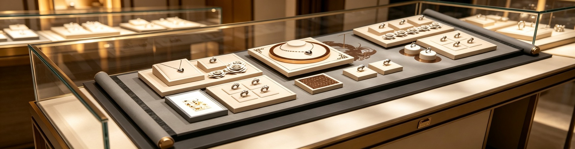 Why now? The demand underneath is shifting. Vogue Business' luxury analysis notes that nature-inspired high-jewelry categories have seen client requests rise about 22% year over year, driven by a hunger for unique, non-replicable statement pieces. Enamel lets a designer "paint with metal": titanium can be anodized into iridescence, but enamel reads deeper — more like porcelain, lacquer, silk. The wider 2026 mood moves toward pieces that feel intentional, signalling personal taste over generic luxury; buyers are choosing objects that carry a story in their making rather than their price tag. As consumers pivot from logo-forward pieces toward taste-forward ones, a material that carries savoir-faire without leaning on carat weight is being rediscovered. SK Jewellery puts it plainly: colour has quietly returned to fine jewellery, in a considered, craft-forward form rather than a maximalist one.
China tells the liveliest version of the story. Chow Tai Seng has turned "ancient-method solid-gold enamel" into the backbone of its guochao narrative — the Oriental Blue-and-White series hand-paints pale celadon enamel to replicate the glaze of Ming porcelain; the Qianli Jiangshan 2.0 uses layered green-gradient enamel to suggest distant mountains, with CNC engraving laying down the texture of an old scroll. Lukfook, with the Tang Palace collection, translates Tang relics through high-temperature enamel and lustrous colour; Chow Tai Seng's National Treasure collaboration turns Forbidden City glazes into best-sellers via grand feu enamel. Laopu Gold's high-temperature enamel work rides the same wave. In China, enamel has become the "colour-without-stones" answer to cultural revival — it freezes blue-and-white porcelain and green landscapes into small gold objects. That is a layer of tellable Eastern story that mere carats cannot supply, and it is why enamel sits so naturally inside the guochao moment.
Why now? The demand underneath is shifting. Vogue Business' luxury analysis notes that nature-inspired high-jewelry categories have seen client requests rise about 22% year over year, driven by a hunger for unique, non-replicable statement pieces. Enamel lets a designer "paint with metal": titanium can be anodized into iridescence, but enamel reads deeper — more like porcelain, lacquer, silk. The wider 2026 mood moves toward pieces that feel intentional, signalling personal taste over generic luxury; buyers are choosing objects that carry a story in their making rather than their price tag. As consumers pivot from logo-forward pieces toward taste-forward ones, a material that carries savoir-faire without leaning on carat weight is being rediscovered. SK Jewellery puts it plainly: colour has quietly returned to fine jewellery, in a considered, craft-forward form rather than a maximalist one.
China tells the liveliest version of the story. Chow Tai Seng has turned "ancient-method solid-gold enamel" into the backbone of its guochao narrative — the Oriental Blue-and-White series hand-paints pale celadon enamel to replicate the glaze of Ming porcelain; the Qianli Jiangshan 2.0 uses layered green-gradient enamel to suggest distant mountains, with CNC engraving laying down the texture of an old scroll. Lukfook, with the Tang Palace collection, translates Tang relics through high-temperature enamel and lustrous colour; Chow Tai Seng's National Treasure collaboration turns Forbidden City glazes into best-sellers via grand feu enamel. Laopu Gold's high-temperature enamel work rides the same wave. In China, enamel has become the "colour-without-stones" answer to cultural revival — it freezes blue-and-white porcelain and green landscapes into small gold objects. That is a layer of tellable Eastern story that mere carats cannot supply, and it is why enamel sits so naturally inside the guochao moment. The craft is also being re-armed by material science. New glass formulations improve colour stability and match the thermal expansion of modern gold alloys, lowering failure rates and permitting more ambitious designs. Lead-free recipes are now standard, and recycled glass is entering the powder — while enamel's decades-long durability aligns neatly with sustainable consumption. At the other end, cold enamel (resin or lacquer, no high-heat kiln) delivers sharp graphic blocks and repeatable brightness, turning enamel from museum reverence into fashion language. Asian markets are pushing micro-enamel work that rewards magnification; the Middle Eastern luxury market has embraced enamel as a backdrop that makes diamonds and coloured stones appear more brilliant by comparison. Generational taste helps explain the surge. Millennials and Gen Z treat enamel as an "unprecious" way to show individuality rather than status — pairing a bold piece with casual looks and favouring its eco-story as an alternative to mined stones. That attitude is precisely what turns a heritage craft into a social-feed staple, and what lets a centuries-old métier read as thoroughly contemporary. Vivid enamel is sweeping social media and increasingly entering high jewelry; National Jeweler describes enamel as enjoying renewed industry prominence precisely because it allows colour experiments gemstones struggle to provide. Price-wise the market spans wide: entry accents from $300–500, mid-range statement pieces at $1,500–5,000, and luxury work from $8,000 into six figures where every surface earns individual attention.
The men's side is opening, too. Cufflinks, signet rings and watch-adjacent pieces have long carried enamel quietly; now deeper, more masculine palettes — forest green, navy, oxblood — translate the technique into everyday professional wear without shouting. That expansion matters because it pulls enamel out of the "occasion-only" drawer and into the working wardrobe, the same register SK Jewellery identifies as the gap buyers most want filled. Watches had already placed enamel on a pedestal: grand feu dials and métiers d'art craftsmanship have long been a quiet reverence in horology, and collectors treat them as heirlooms. Now that fire is migrating from dials to rings and pendants. When an enamel watch can be passed down generations, jewelry naturally claims enamel as "a painting you can wear." Colour is no longer mere accent — it becomes a piece's identity.
Yet the more enamel is treated as the protagonist, the more its presentation matters. Enamel is glass fused to metal: thin edges are brittle and corners fear hard knocks. A jewelry box whose lining does not fit, whose clasp presses on the glaze, can chip the surface within a few openings. Shenzhen Junyimei, in its custom jewelry-box work, often designs for enamel pieces as objects that must be cradled — lining with zero gap to the product, fixed compartments, no pressure points. At the counter, the job of display props is to stay out of the way. Enamel is one saturated field of colour; a prop busy with pattern or harsh reflection eats that colour alive. A matte, neutral, low-gloss surface is what lets that pink — or that green — become the focal point. For a maison shipping enamel across climates, that same cradle also buffers against the thermal shock that can craze a thin glaze, which is another reason structure — not ornament — earns the budget. Jewelry packaging design, consequently, should be restrained: the box is not there to out-shout the enamel, but to carry the colour out cleanly. This is the logic of quiet luxury — moving the budget from surface ornament to structure and tolerance.
Enamel's return is not nostalgia's afterglow; it is a re-statement of value. When scarcity is no longer defined only by carats, craft and colour can become reasons to collect. The houses betting on enamel are, in effect, betting that the next luxury heirloom may be coloured rather than carved — and that a surface fired by hand will outlast a surface merely set with stone. Next time you pause before a case, look at the hue tamed by fire and glass — it may outlast a stone in how it rewards a second, closer look.
This is original content. Copyright belongs to Shenzhen Junyimei.
The craft is also being re-armed by material science. New glass formulations improve colour stability and match the thermal expansion of modern gold alloys, lowering failure rates and permitting more ambitious designs. Lead-free recipes are now standard, and recycled glass is entering the powder — while enamel's decades-long durability aligns neatly with sustainable consumption. At the other end, cold enamel (resin or lacquer, no high-heat kiln) delivers sharp graphic blocks and repeatable brightness, turning enamel from museum reverence into fashion language. Asian markets are pushing micro-enamel work that rewards magnification; the Middle Eastern luxury market has embraced enamel as a backdrop that makes diamonds and coloured stones appear more brilliant by comparison. Generational taste helps explain the surge. Millennials and Gen Z treat enamel as an "unprecious" way to show individuality rather than status — pairing a bold piece with casual looks and favouring its eco-story as an alternative to mined stones. That attitude is precisely what turns a heritage craft into a social-feed staple, and what lets a centuries-old métier read as thoroughly contemporary. Vivid enamel is sweeping social media and increasingly entering high jewelry; National Jeweler describes enamel as enjoying renewed industry prominence precisely because it allows colour experiments gemstones struggle to provide. Price-wise the market spans wide: entry accents from $300–500, mid-range statement pieces at $1,500–5,000, and luxury work from $8,000 into six figures where every surface earns individual attention.
The men's side is opening, too. Cufflinks, signet rings and watch-adjacent pieces have long carried enamel quietly; now deeper, more masculine palettes — forest green, navy, oxblood — translate the technique into everyday professional wear without shouting. That expansion matters because it pulls enamel out of the "occasion-only" drawer and into the working wardrobe, the same register SK Jewellery identifies as the gap buyers most want filled. Watches had already placed enamel on a pedestal: grand feu dials and métiers d'art craftsmanship have long been a quiet reverence in horology, and collectors treat them as heirlooms. Now that fire is migrating from dials to rings and pendants. When an enamel watch can be passed down generations, jewelry naturally claims enamel as "a painting you can wear." Colour is no longer mere accent — it becomes a piece's identity.
Yet the more enamel is treated as the protagonist, the more its presentation matters. Enamel is glass fused to metal: thin edges are brittle and corners fear hard knocks. A jewelry box whose lining does not fit, whose clasp presses on the glaze, can chip the surface within a few openings. Shenzhen Junyimei, in its custom jewelry-box work, often designs for enamel pieces as objects that must be cradled — lining with zero gap to the product, fixed compartments, no pressure points. At the counter, the job of display props is to stay out of the way. Enamel is one saturated field of colour; a prop busy with pattern or harsh reflection eats that colour alive. A matte, neutral, low-gloss surface is what lets that pink — or that green — become the focal point. For a maison shipping enamel across climates, that same cradle also buffers against the thermal shock that can craze a thin glaze, which is another reason structure — not ornament — earns the budget. Jewelry packaging design, consequently, should be restrained: the box is not there to out-shout the enamel, but to carry the colour out cleanly. This is the logic of quiet luxury — moving the budget from surface ornament to structure and tolerance.
Enamel's return is not nostalgia's afterglow; it is a re-statement of value. When scarcity is no longer defined only by carats, craft and colour can become reasons to collect. The houses betting on enamel are, in effect, betting that the next luxury heirloom may be coloured rather than carved — and that a surface fired by hand will outlast a surface merely set with stone. Next time you pause before a case, look at the hue tamed by fire and glass — it may outlast a stone in how it rewards a second, closer look.
This is original content. Copyright belongs to Shenzhen Junyimei.
Junyimei — present every jewel and timepiece at its best.2026年8月2日,梵克雅宝为一枚四叶草换了一种颜色。自1968年以来,Alhambra 系列第一次加入全新珐琅色——半透明粉调,介于树莓与洋红之间。更耐人寻味的是,这不是又一颗天然石,而是该系列永久线里迎来的第一种"人造材料"。为了这抹粉,工坊据说耗费数年,刻意保留珐琅里微小的气泡以散射光线、做出厚度。一个顶级珠宝世家,愿意为"玻璃熔在金属上"这门古老手艺重新押注一次。这背后是一条正在回潮的暗线:颜色,正以工艺的名义,重新回到高级珠宝的中央。 珐琅不是新事物。GIA 将其源头追至公元前1400年的迈锡尼、古希腊与拜占庭。它的本质简单到近乎顽固——把二氧化硅粉末与颜料混好,敷在金或银上,送进750至850摄氏度的窑里反复烧,冷却后成为一层玻璃质的光泽。可难也难在这里:热珐琅(grand feu)每一层都要烧,窑温、膨胀系数、色料稳定性,任何一步失手,裂纹、翘曲、褪色便随之而来。红色尤其难伺候。于是最好的珐琅贵,不是贵在料,而是贵在它向失败下注——每一炉都是一场赌。 也正因为"会失败",珐琅成了手艺的试金石。掐丝(cloisonné)用细金线隔出小格再填色;内填(champlevé)在金属上挖槽填入;凹雕(basse-taille)让透光在雕纹下流动;而最神秘的透光珐琅(plique-à-jour)干脆不要背板,让光像穿过教堂彩窗一样穿过宝石般的釉面。梵克雅宝新出的 Coccinelles 瓢虫胸针与戒指,用的正是内填珐琅,为那只圆鼓鼓的半球体反复施釉、反复入窑。这类作品往往带着"孤品"的气场,即便它属于某个系列。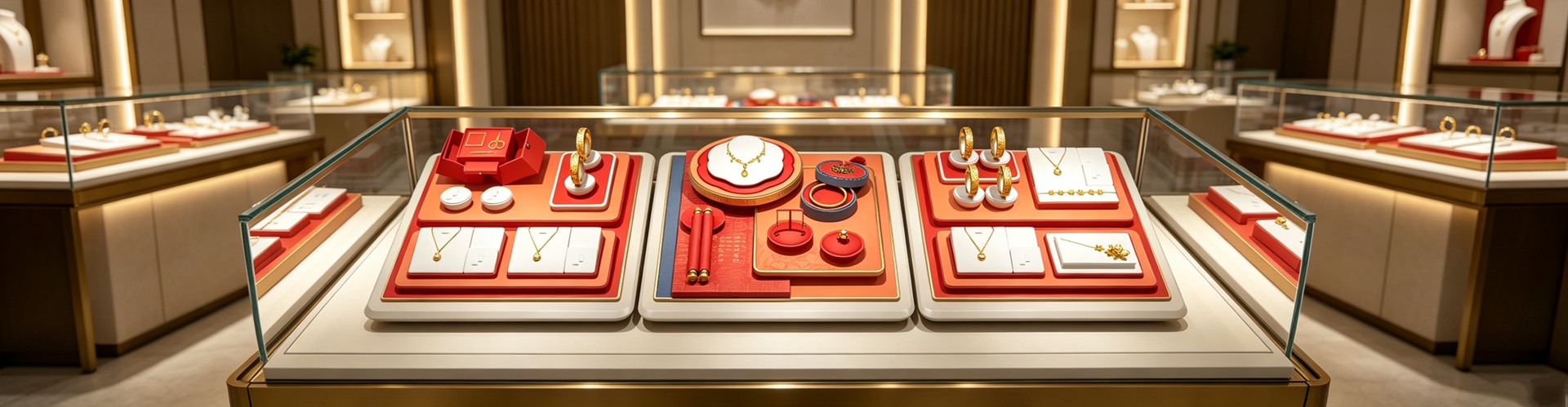 为什么是现在?一条清晰的需求正在改变。Vogue Business 的奢侈品分析提到,受自然灵感驱动的高级珠宝,客户咨询量同比涨了约22%——买家要的是独特、不可复制、能讲故事的 statement piece。而珐琅恰好能"用金属作画":钛金属可以阳极氧化出虹彩,但珐琅的色彩更沉、更像瓷、更像漆、更像丝绸。当消费者从"显 logo"转向"显品味",一种有手艺、有来历、又不靠克拉数说话的材料,自然被重新看见。SK Jewellery 的观察很直接:颜色正以"克制而工艺先行"的方式,悄悄回到高级珠宝。
中国市场给出了最生动的注脚。周大生把"古法足金珐琅"做成了国潮叙事的主心骨——东方·青花系列用淡青珐琅手绘填色,复刻青花瓷的釉感;千里江山 2.0 用分层青绿渐变珐琅模拟山色,CNC 精雕铺陈古卷肌理。六福携手《唐宫夜宴》,用高温珐琅与鎏彩转译唐代文物;周大生与《国家宝藏》的联名,更把高温珐琅上色的故宫釉彩直接做成主打。珐琅在中国,成了"不用石头也能上色"的国潮答案——它把青花、青绿山水这些文化 IP,凝固进方寸金器。这比单纯堆克拉,多了一层可被讲述的东方故事。
为什么是现在?一条清晰的需求正在改变。Vogue Business 的奢侈品分析提到,受自然灵感驱动的高级珠宝,客户咨询量同比涨了约22%——买家要的是独特、不可复制、能讲故事的 statement piece。而珐琅恰好能"用金属作画":钛金属可以阳极氧化出虹彩,但珐琅的色彩更沉、更像瓷、更像漆、更像丝绸。当消费者从"显 logo"转向"显品味",一种有手艺、有来历、又不靠克拉数说话的材料,自然被重新看见。SK Jewellery 的观察很直接:颜色正以"克制而工艺先行"的方式,悄悄回到高级珠宝。
中国市场给出了最生动的注脚。周大生把"古法足金珐琅"做成了国潮叙事的主心骨——东方·青花系列用淡青珐琅手绘填色,复刻青花瓷的釉感;千里江山 2.0 用分层青绿渐变珐琅模拟山色,CNC 精雕铺陈古卷肌理。六福携手《唐宫夜宴》,用高温珐琅与鎏彩转译唐代文物;周大生与《国家宝藏》的联名,更把高温珐琅上色的故宫釉彩直接做成主打。珐琅在中国,成了"不用石头也能上色"的国潮答案——它把青花、青绿山水这些文化 IP,凝固进方寸金器。这比单纯堆克拉,多了一层可被讲述的东方故事。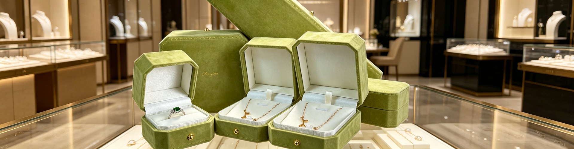 这门手艺也在被材料科学重新武装。新一代玻璃配方提升了色彩稳定性,与黄金合金的热膨胀更兼容,失败率下降,设计也更敢做大。无铅配方已成行规,回收玻璃进釉料也开始出现,珐琅"能用几十年"的耐久,恰好与可持续消费同频。另一端,冷珐琅(树脂或漆)不走高温窑,换来锐利色块与可复制的亮色,让珐琅从博物馆敬意变成时尚语言——社交媒体上,鲜亮珐琅正加速涌入高级珠宝。National Jeweler 因此把珐琅称为"行业重拾关注",因为它提供了宝石难以轻易给出的色彩实验。
腕表其实早把珐琅供在神坛上:大明火表盘、métiers d'art 工艺,一直是藏家心中的静默崇高。如今这股"火"正从表盘蔓延到戒面与吊坠。当一只珐琅腕表能被代代相传,珠宝也顺理成章地把珐琅当作"可以佩戴的画"来收藏。颜色不再只是点缀,而成了一件作品的身份。
但珐琅越是被当作主角,它的呈现就越讲究。珐琅是熔在金属上的玻璃,薄处脆、边角怕硬碰——一只首饰盒如果内衬不服帖、卡扣压到釉面,开合几次就可能崩口。深圳骏依美在做珠宝盒定制时,常把珐琅件当作"需要被托住"的物件来设计:内衬与产品零间隙、隔断固定、避免任何压力点。而在柜台,珠宝陈列道具的任务是"不抢戏"——珐琅本身是一整片饱和色,道具若花纹繁复、反光强烈,反而把颜色吃掉;哑光、中性、低光泽的陈列面,才让那抹粉或那片青绿成为视觉焦点。珠宝包装设计也因此更该克制:盒子不是要和珐琅比艳,而是把颜色稳稳托出场。这恰恰是高级简约的逻辑——预算从表面花纹,挪到结构与公差。
珐琅的回归,不是复古的回光,而是一次价值的重申:当稀缺不再只由克拉定义,手艺与色彩也能成为被收藏的理由。下一次在柜台前停步,不妨看看那抹被火与玻璃驯服的颜色——它可能比一颗石头,更经得起时间的打量。
本文为原创内容,版权归深圳骏依美所有,转载请注明出处。
这门手艺也在被材料科学重新武装。新一代玻璃配方提升了色彩稳定性,与黄金合金的热膨胀更兼容,失败率下降,设计也更敢做大。无铅配方已成行规,回收玻璃进釉料也开始出现,珐琅"能用几十年"的耐久,恰好与可持续消费同频。另一端,冷珐琅(树脂或漆)不走高温窑,换来锐利色块与可复制的亮色,让珐琅从博物馆敬意变成时尚语言——社交媒体上,鲜亮珐琅正加速涌入高级珠宝。National Jeweler 因此把珐琅称为"行业重拾关注",因为它提供了宝石难以轻易给出的色彩实验。
腕表其实早把珐琅供在神坛上:大明火表盘、métiers d'art 工艺,一直是藏家心中的静默崇高。如今这股"火"正从表盘蔓延到戒面与吊坠。当一只珐琅腕表能被代代相传,珠宝也顺理成章地把珐琅当作"可以佩戴的画"来收藏。颜色不再只是点缀,而成了一件作品的身份。
但珐琅越是被当作主角,它的呈现就越讲究。珐琅是熔在金属上的玻璃,薄处脆、边角怕硬碰——一只首饰盒如果内衬不服帖、卡扣压到釉面,开合几次就可能崩口。深圳骏依美在做珠宝盒定制时,常把珐琅件当作"需要被托住"的物件来设计:内衬与产品零间隙、隔断固定、避免任何压力点。而在柜台,珠宝陈列道具的任务是"不抢戏"——珐琅本身是一整片饱和色,道具若花纹繁复、反光强烈,反而把颜色吃掉;哑光、中性、低光泽的陈列面,才让那抹粉或那片青绿成为视觉焦点。珠宝包装设计也因此更该克制:盒子不是要和珐琅比艳,而是把颜色稳稳托出场。这恰恰是高级简约的逻辑——预算从表面花纹,挪到结构与公差。
珐琅的回归,不是复古的回光,而是一次价值的重申:当稀缺不再只由克拉定义,手艺与色彩也能成为被收藏的理由。下一次在柜台前停步,不妨看看那抹被火与玻璃驯服的颜色——它可能比一颗石头,更经得起时间的打量。
本文为原创内容,版权归深圳骏依美所有,转载请注明出处。
骏依美——让每一件珠宝与腕表,都被更好地呈现。
Why now? The demand underneath is shifting. Vogue Business' luxury analysis notes that nature-inspired high-jewelry categories have seen client requests rise about 22% year over year, driven by a hunger for unique, non-replicable statement pieces. Enamel lets a designer "paint with metal": titanium can be anodized into iridescence, but enamel reads deeper — more like porcelain, lacquer, silk. The wider 2026 mood moves toward pieces that feel intentional, signalling personal taste over generic luxury; buyers are choosing objects that carry a story in their making rather than their price tag. As consumers pivot from logo-forward pieces toward taste-forward ones, a material that carries savoir-faire without leaning on carat weight is being rediscovered. SK Jewellery puts it plainly: colour has quietly returned to fine jewellery, in a considered, craft-forward form rather than a maximalist one.
China tells the liveliest version of the story. Chow Tai Seng has turned "ancient-method solid-gold enamel" into the backbone of its guochao narrative — the Oriental Blue-and-White series hand-paints pale celadon enamel to replicate the glaze of Ming porcelain; the Qianli Jiangshan 2.0 uses layered green-gradient enamel to suggest distant mountains, with CNC engraving laying down the texture of an old scroll. Lukfook, with the Tang Palace collection, translates Tang relics through high-temperature enamel and lustrous colour; Chow Tai Seng's National Treasure collaboration turns Forbidden City glazes into best-sellers via grand feu enamel. Laopu Gold's high-temperature enamel work rides the same wave. In China, enamel has become the "colour-without-stones" answer to cultural revival — it freezes blue-and-white porcelain and green landscapes into small gold objects. That is a layer of tellable Eastern story that mere carats cannot supply, and it is why enamel sits so naturally inside the guochao moment.
The craft is also being re-armed by material science. New glass formulations improve colour stability and match the thermal expansion of modern gold alloys, lowering failure rates and permitting more ambitious designs. Lead-free recipes are now standard, and recycled glass is entering the powder — while enamel's decades-long durability aligns neatly with sustainable consumption. At the other end, cold enamel (resin or lacquer, no high-heat kiln) delivers sharp graphic blocks and repeatable brightness, turning enamel from museum reverence into fashion language. Asian markets are pushing micro-enamel work that rewards magnification; the Middle Eastern luxury market has embraced enamel as a backdrop that makes diamonds and coloured stones appear more brilliant by comparison. Generational taste helps explain the surge. Millennials and Gen Z treat enamel as an "unprecious" way to show individuality rather than status — pairing a bold piece with casual looks and favouring its eco-story as an alternative to mined stones. That attitude is precisely what turns a heritage craft into a social-feed staple, and what lets a centuries-old métier read as thoroughly contemporary. Vivid enamel is sweeping social media and increasingly entering high jewelry; National Jeweler describes enamel as enjoying renewed industry prominence precisely because it allows colour experiments gemstones struggle to provide. Price-wise the market spans wide: entry accents from $300–500, mid-range statement pieces at $1,500–5,000, and luxury work from $8,000 into six figures where every surface earns individual attention.
The men's side is opening, too. Cufflinks, signet rings and watch-adjacent pieces have long carried enamel quietly; now deeper, more masculine palettes — forest green, navy, oxblood — translate the technique into everyday professional wear without shouting. That expansion matters because it pulls enamel out of the "occasion-only" drawer and into the working wardrobe, the same register SK Jewellery identifies as the gap buyers most want filled. Watches had already placed enamel on a pedestal: grand feu dials and métiers d'art craftsmanship have long been a quiet reverence in horology, and collectors treat them as heirlooms. Now that fire is migrating from dials to rings and pendants. When an enamel watch can be passed down generations, jewelry naturally claims enamel as "a painting you can wear." Colour is no longer mere accent — it becomes a piece's identity.
Yet the more enamel is treated as the protagonist, the more its presentation matters. Enamel is glass fused to metal: thin edges are brittle and corners fear hard knocks. A jewelry box whose lining does not fit, whose clasp presses on the glaze, can chip the surface within a few openings. Shenzhen Junyimei, in its custom jewelry-box work, often designs for enamel pieces as objects that must be cradled — lining with zero gap to the product, fixed compartments, no pressure points. At the counter, the job of display props is to stay out of the way. Enamel is one saturated field of colour; a prop busy with pattern or harsh reflection eats that colour alive. A matte, neutral, low-gloss surface is what lets that pink — or that green — become the focal point. For a maison shipping enamel across climates, that same cradle also buffers against the thermal shock that can craze a thin glaze, which is another reason structure — not ornament — earns the budget. Jewelry packaging design, consequently, should be restrained: the box is not there to out-shout the enamel, but to carry the colour out cleanly. This is the logic of quiet luxury — moving the budget from surface ornament to structure and tolerance.
Enamel's return is not nostalgia's afterglow; it is a re-statement of value. When scarcity is no longer defined only by carats, craft and colour can become reasons to collect. The houses betting on enamel are, in effect, betting that the next luxury heirloom may be coloured rather than carved — and that a surface fired by hand will outlast a surface merely set with stone. Next time you pause before a case, look at the hue tamed by fire and glass — it may outlast a stone in how it rewards a second, closer look.
This is original content. Copyright belongs to Shenzhen Junyimei.Junyimei — present every jewel and timepiece at its best.2026年8月2日,梵克雅宝为一枚四叶草换了一种颜色。自1968年以来,Alhambra 系列第一次加入全新珐琅色——半透明粉调,介于树莓与洋红之间。更耐人寻味的是,这不是又一颗天然石,而是该系列永久线里迎来的第一种"人造材料"。为了这抹粉,工坊据说耗费数年,刻意保留珐琅里微小的气泡以散射光线、做出厚度。一个顶级珠宝世家,愿意为"玻璃熔在金属上"这门古老手艺重新押注一次。这背后是一条正在回潮的暗线:颜色,正以工艺的名义,重新回到高级珠宝的中央。 珐琅不是新事物。GIA 将其源头追至公元前1400年的迈锡尼、古希腊与拜占庭。它的本质简单到近乎顽固——把二氧化硅粉末与颜料混好,敷在金或银上,送进750至850摄氏度的窑里反复烧,冷却后成为一层玻璃质的光泽。可难也难在这里:热珐琅(grand feu)每一层都要烧,窑温、膨胀系数、色料稳定性,任何一步失手,裂纹、翘曲、褪色便随之而来。红色尤其难伺候。于是最好的珐琅贵,不是贵在料,而是贵在它向失败下注——每一炉都是一场赌。 也正因为"会失败",珐琅成了手艺的试金石。掐丝(cloisonné)用细金线隔出小格再填色;内填(champlevé)在金属上挖槽填入;凹雕(basse-taille)让透光在雕纹下流动;而最神秘的透光珐琅(plique-à-jour)干脆不要背板,让光像穿过教堂彩窗一样穿过宝石般的釉面。梵克雅宝新出的 Coccinelles 瓢虫胸针与戒指,用的正是内填珐琅,为那只圆鼓鼓的半球体反复施釉、反复入窑。这类作品往往带着"孤品"的气场,即便它属于某个系列。
为什么是现在?一条清晰的需求正在改变。Vogue Business 的奢侈品分析提到,受自然灵感驱动的高级珠宝,客户咨询量同比涨了约22%——买家要的是独特、不可复制、能讲故事的 statement piece。而珐琅恰好能"用金属作画":钛金属可以阳极氧化出虹彩,但珐琅的色彩更沉、更像瓷、更像漆、更像丝绸。当消费者从"显 logo"转向"显品味",一种有手艺、有来历、又不靠克拉数说话的材料,自然被重新看见。SK Jewellery 的观察很直接:颜色正以"克制而工艺先行"的方式,悄悄回到高级珠宝。
中国市场给出了最生动的注脚。周大生把"古法足金珐琅"做成了国潮叙事的主心骨——东方·青花系列用淡青珐琅手绘填色,复刻青花瓷的釉感;千里江山 2.0 用分层青绿渐变珐琅模拟山色,CNC 精雕铺陈古卷肌理。六福携手《唐宫夜宴》,用高温珐琅与鎏彩转译唐代文物;周大生与《国家宝藏》的联名,更把高温珐琅上色的故宫釉彩直接做成主打。珐琅在中国,成了"不用石头也能上色"的国潮答案——它把青花、青绿山水这些文化 IP,凝固进方寸金器。这比单纯堆克拉,多了一层可被讲述的东方故事。
这门手艺也在被材料科学重新武装。新一代玻璃配方提升了色彩稳定性,与黄金合金的热膨胀更兼容,失败率下降,设计也更敢做大。无铅配方已成行规,回收玻璃进釉料也开始出现,珐琅"能用几十年"的耐久,恰好与可持续消费同频。另一端,冷珐琅(树脂或漆)不走高温窑,换来锐利色块与可复制的亮色,让珐琅从博物馆敬意变成时尚语言——社交媒体上,鲜亮珐琅正加速涌入高级珠宝。National Jeweler 因此把珐琅称为"行业重拾关注",因为它提供了宝石难以轻易给出的色彩实验。
腕表其实早把珐琅供在神坛上:大明火表盘、métiers d'art 工艺,一直是藏家心中的静默崇高。如今这股"火"正从表盘蔓延到戒面与吊坠。当一只珐琅腕表能被代代相传,珠宝也顺理成章地把珐琅当作"可以佩戴的画"来收藏。颜色不再只是点缀,而成了一件作品的身份。
但珐琅越是被当作主角,它的呈现就越讲究。珐琅是熔在金属上的玻璃,薄处脆、边角怕硬碰——一只首饰盒如果内衬不服帖、卡扣压到釉面,开合几次就可能崩口。深圳骏依美在做珠宝盒定制时,常把珐琅件当作"需要被托住"的物件来设计:内衬与产品零间隙、隔断固定、避免任何压力点。而在柜台,珠宝陈列道具的任务是"不抢戏"——珐琅本身是一整片饱和色,道具若花纹繁复、反光强烈,反而把颜色吃掉;哑光、中性、低光泽的陈列面,才让那抹粉或那片青绿成为视觉焦点。珠宝包装设计也因此更该克制:盒子不是要和珐琅比艳,而是把颜色稳稳托出场。这恰恰是高级简约的逻辑——预算从表面花纹,挪到结构与公差。
珐琅的回归,不是复古的回光,而是一次价值的重申:当稀缺不再只由克拉定义,手艺与色彩也能成为被收藏的理由。下一次在柜台前停步,不妨看看那抹被火与玻璃驯服的颜色——它可能比一颗石头,更经得起时间的打量。
本文为原创内容,版权归深圳骏依美所有,转载请注明出处。骏依美——让每一件珠宝与腕表,都被更好地呈现。