The Breathing Room: How Negative Space Amplifies a Watch柜台里的呼吸感:留白如何放大腕表的存在感
Most watch counters make the same mistake from day one: they try to fill every inch of surface. New models, classics, and limited editions line up shoulder to shoulder, with a promo card wedged into every gap. The result? Shoppers leave after three seconds—not because the watches are poor, but because their eyes don't know where to land. Negative space in display is never 'empty'; it is an active design language that decides what customers see first and remember most.
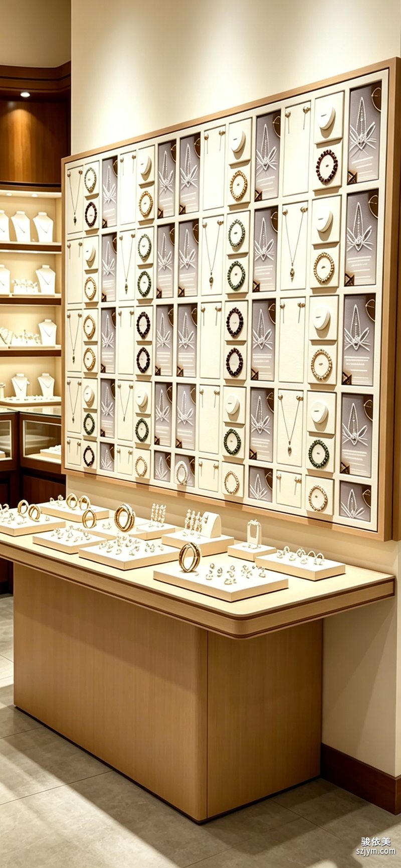 The first role of negative space is to give the watch its presence. What makes a mechanical watch captivating is the play of light across the dial and the quiet breath of the seconds hand. Crowd the surroundings and that finesse vanishes; instead, leave twice the watch's footprint of clear counter, and it reads as if spotlit, its presence magnified. Showing one fewer watch often looks more premium than showing three more.
The second role is in the flow. A cramped counter gives the eye no place to rest, so the feet don't linger; measured negative space creates breathing gaps that let the gaze drift naturally between focal groups, lengthening dwell time. Those extra seconds are frequently the seconds that close a sale.
The first role of negative space is to give the watch its presence. What makes a mechanical watch captivating is the play of light across the dial and the quiet breath of the seconds hand. Crowd the surroundings and that finesse vanishes; instead, leave twice the watch's footprint of clear counter, and it reads as if spotlit, its presence magnified. Showing one fewer watch often looks more premium than showing three more.
The second role is in the flow. A cramped counter gives the eye no place to rest, so the feet don't linger; measured negative space creates breathing gaps that let the gaze drift naturally between focal groups, lengthening dwell time. Those extra seconds are frequently the seconds that close a sale.
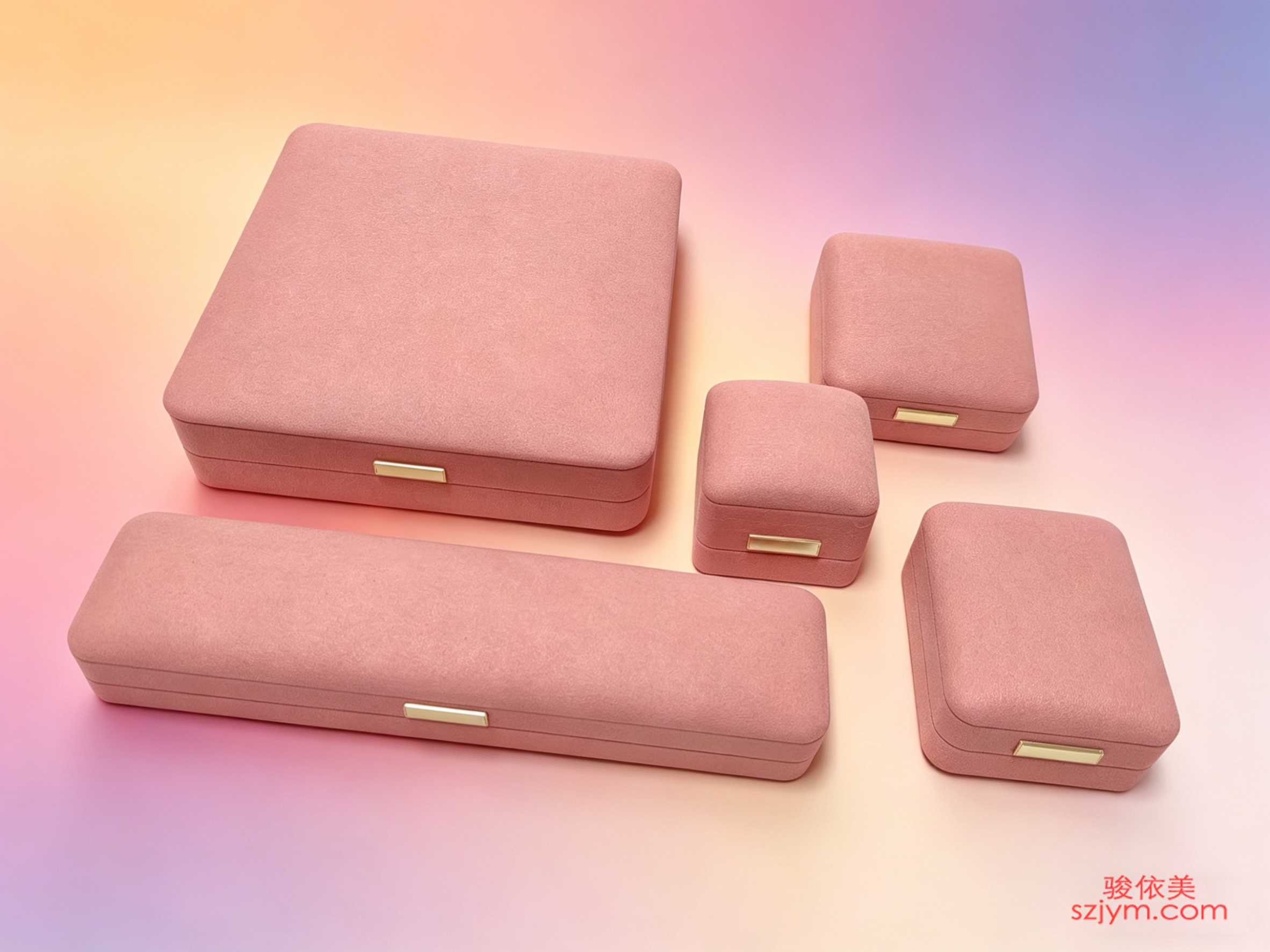 In practice, negative space is not bareness. A narrow velvet lip as a base and a matte back panel to gather the eye give emptiness texture rather than shabbiness. Within one set, the hero watch owns the visual center while supporting pieces recede to the sides, spaced far enough to stand alone. For showrooms serving overseas buyers, restrained space also signals professionalism and confidence—strength proved without clutter, where the void itself is a kind of assurance.
Remember this gauge: the moment you wonder whether one more piece could still fit, that is precisely the sign you have left too little. Give the counter back its breathing room, and the watch is truly seen. Less is more—in display, never a slogan, but the other face of conversion.
This article is original content, copyrighted by Junyimei. Please cite the source if reprinted.
LBOBO specializes in watch display and props, helping every timepiece be seen and remembered worldwide.
LBOBO delivers watch display solutions that make every timepiece seen and remembered.很多腕表柜台一上手就犯同一个错:恨不得把每寸台面都铺满。新款、经典款、限量表一字排开,连间隙都要塞进一张促销卡。结果顾客站定三秒就走——不是因为表不够好,而是眼睛不知道该落在哪。陈列里的留白,从来不是没放东西,而是一种主动的设计语言:它替你决定顾客先看什么、记住什么。有经验的陈列师会先定下一组里唯一的主角,其余皆为陪衬,用留白把视线强行收束到那一个点上。
留白的第一重作用,是替腕表让出存在感。新手常误以为留白等于空,其实留的是秩序,空的是干扰。一只机械腕表最迷人的,是表盘上的光影流转与秒针的那点呼吸。当周围被杂物挤满,这份细腻就被淹没了;反之,给单只表留出两倍于自身体量的空台面,它反而像被聚光灯罩住,存在感陡增。少放一只表,往往比多放三只更显高级。这份克制,恰恰是国际大牌门店最舍得下本钱的地方。
第二重作用在动线。柜台若密不透风,顾客视线无处停歇,脚步也不会停留;适度留白制造了呼吸的间隙,让目光自然地在几组重点之间游移,停留时间随之拉长。这多出来的几秒,常常就是成交的那几秒。
实操上,留白不等于空荡。可以用一条窄边丝绒作底、用一面哑光背板收束视线,让空有质感而非寒酸。同一组陈列里,主角表占视觉重心,陪衬款退到侧后,间距拉开到能各自成画。对面向海外买家的展厅而言,克制的留白还传递出专业与自信——不必用堆砌证明实力,留白本身就是一种底气。
记住一个尺度:当你好奇是不是还能再塞一块,那恰恰说明已经留得不够。把呼吸感还给柜台,腕表才真正被看见。少即是多,在陈列里从来不是口号,而是转化率的另一面。留白也是一种节奏的安排,让顾客的目光有起有伏,而不是被密密麻麻的表款疲劳轰炸。
本文为原创内容,版权归骏依美所有。如需转载请注明出处。
LBOBO专注腕表陈列与展示道具,以国际视野助力每一只腕表被看见、被铭记。
LBOBO delivers watch display solutions that make every timepiece seen and remembered.
In practice, negative space is not bareness. A narrow velvet lip as a base and a matte back panel to gather the eye give emptiness texture rather than shabbiness. Within one set, the hero watch owns the visual center while supporting pieces recede to the sides, spaced far enough to stand alone. For showrooms serving overseas buyers, restrained space also signals professionalism and confidence—strength proved without clutter, where the void itself is a kind of assurance.
Remember this gauge: the moment you wonder whether one more piece could still fit, that is precisely the sign you have left too little. Give the counter back its breathing room, and the watch is truly seen. Less is more—in display, never a slogan, but the other face of conversion.
This article is original content, copyrighted by Junyimei. Please cite the source if reprinted.
LBOBO specializes in watch display and props, helping every timepiece be seen and remembered worldwide.
LBOBO delivers watch display solutions that make every timepiece seen and remembered.很多腕表柜台一上手就犯同一个错:恨不得把每寸台面都铺满。新款、经典款、限量表一字排开,连间隙都要塞进一张促销卡。结果顾客站定三秒就走——不是因为表不够好,而是眼睛不知道该落在哪。陈列里的留白,从来不是没放东西,而是一种主动的设计语言:它替你决定顾客先看什么、记住什么。有经验的陈列师会先定下一组里唯一的主角,其余皆为陪衬,用留白把视线强行收束到那一个点上。
留白的第一重作用,是替腕表让出存在感。新手常误以为留白等于空,其实留的是秩序,空的是干扰。一只机械腕表最迷人的,是表盘上的光影流转与秒针的那点呼吸。当周围被杂物挤满,这份细腻就被淹没了;反之,给单只表留出两倍于自身体量的空台面,它反而像被聚光灯罩住,存在感陡增。少放一只表,往往比多放三只更显高级。这份克制,恰恰是国际大牌门店最舍得下本钱的地方。
第二重作用在动线。柜台若密不透风,顾客视线无处停歇,脚步也不会停留;适度留白制造了呼吸的间隙,让目光自然地在几组重点之间游移,停留时间随之拉长。这多出来的几秒,常常就是成交的那几秒。
实操上,留白不等于空荡。可以用一条窄边丝绒作底、用一面哑光背板收束视线,让空有质感而非寒酸。同一组陈列里,主角表占视觉重心,陪衬款退到侧后,间距拉开到能各自成画。对面向海外买家的展厅而言,克制的留白还传递出专业与自信——不必用堆砌证明实力,留白本身就是一种底气。
记住一个尺度:当你好奇是不是还能再塞一块,那恰恰说明已经留得不够。把呼吸感还给柜台,腕表才真正被看见。少即是多,在陈列里从来不是口号,而是转化率的另一面。留白也是一种节奏的安排,让顾客的目光有起有伏,而不是被密密麻麻的表款疲劳轰炸。
本文为原创内容,版权归骏依美所有。如需转载请注明出处。
LBOBO专注腕表陈列与展示道具,以国际视野助力每一只腕表被看见、被铭记。
LBOBO delivers watch display solutions that make every timepiece seen and remembered.
The first role of negative space is to give the watch its presence. What makes a mechanical watch captivating is the play of light across the dial and the quiet breath of the seconds hand. Crowd the surroundings and that finesse vanishes; instead, leave twice the watch's footprint of clear counter, and it reads as if spotlit, its presence magnified. Showing one fewer watch often looks more premium than showing three more.
The second role is in the flow. A cramped counter gives the eye no place to rest, so the feet don't linger; measured negative space creates breathing gaps that let the gaze drift naturally between focal groups, lengthening dwell time. Those extra seconds are frequently the seconds that close a sale.
In practice, negative space is not bareness. A narrow velvet lip as a base and a matte back panel to gather the eye give emptiness texture rather than shabbiness. Within one set, the hero watch owns the visual center while supporting pieces recede to the sides, spaced far enough to stand alone. For showrooms serving overseas buyers, restrained space also signals professionalism and confidence—strength proved without clutter, where the void itself is a kind of assurance.
Remember this gauge: the moment you wonder whether one more piece could still fit, that is precisely the sign you have left too little. Give the counter back its breathing room, and the watch is truly seen. Less is more—in display, never a slogan, but the other face of conversion.
This article is original content, copyrighted by Junyimei. Please cite the source if reprinted.
LBOBO specializes in watch display and props, helping every timepiece be seen and remembered worldwide.
LBOBO delivers watch display solutions that make every timepiece seen and remembered.很多腕表柜台一上手就犯同一个错:恨不得把每寸台面都铺满。新款、经典款、限量表一字排开,连间隙都要塞进一张促销卡。结果顾客站定三秒就走——不是因为表不够好,而是眼睛不知道该落在哪。陈列里的留白,从来不是没放东西,而是一种主动的设计语言:它替你决定顾客先看什么、记住什么。有经验的陈列师会先定下一组里唯一的主角,其余皆为陪衬,用留白把视线强行收束到那一个点上。
留白的第一重作用,是替腕表让出存在感。新手常误以为留白等于空,其实留的是秩序,空的是干扰。一只机械腕表最迷人的,是表盘上的光影流转与秒针的那点呼吸。当周围被杂物挤满,这份细腻就被淹没了;反之,给单只表留出两倍于自身体量的空台面,它反而像被聚光灯罩住,存在感陡增。少放一只表,往往比多放三只更显高级。这份克制,恰恰是国际大牌门店最舍得下本钱的地方。
第二重作用在动线。柜台若密不透风,顾客视线无处停歇,脚步也不会停留;适度留白制造了呼吸的间隙,让目光自然地在几组重点之间游移,停留时间随之拉长。这多出来的几秒,常常就是成交的那几秒。
实操上,留白不等于空荡。可以用一条窄边丝绒作底、用一面哑光背板收束视线,让空有质感而非寒酸。同一组陈列里,主角表占视觉重心,陪衬款退到侧后,间距拉开到能各自成画。对面向海外买家的展厅而言,克制的留白还传递出专业与自信——不必用堆砌证明实力,留白本身就是一种底气。
记住一个尺度:当你好奇是不是还能再塞一块,那恰恰说明已经留得不够。把呼吸感还给柜台,腕表才真正被看见。少即是多,在陈列里从来不是口号,而是转化率的另一面。留白也是一种节奏的安排,让顾客的目光有起有伏,而不是被密密麻麻的表款疲劳轰炸。
本文为原创内容,版权归骏依美所有。如需转载请注明出处。
LBOBO专注腕表陈列与展示道具,以国际视野助力每一只腕表被看见、被铭记。
LBOBO delivers watch display solutions that make every timepiece seen and remembered.