When Glass Glare Blocks the View: Letting Customers See the Watch展柜反光:腕表怎么看得清
A customer leans in to read a dial, and what they meet instead is their own reflection and the ceiling light tubes — that awkward moment is everywhere in watch counters. The problem is rarely that the light is too dim. It is that the glass and the light have not yet agreed on where to point, and the watch pays the price.
Start with the glass. Ordinary ultra-clear glass transmits well head-on but flares the moment you tilt. The Jewelry Wall Cabinet DG1 we fit with anti-glare ultra-clear glass, its surface etched to scatter direct light into a soft wash, so a visitor standing square sees little of themselves. Anti-glare is not magic, though. If the light strip runs parallel and faces the glass, no coating saves you. The linear strip built into DG1 we usually tilt about fifteen degrees downward, so the light lands on the dial, not the pane. A ten-minute angle change can fix what a thousand-yuan glass upgrade could not. For most stores, buying a whole cabinet of anti-glare glass is not the first move; getting the strip angle right is the cheapest, fastest win.
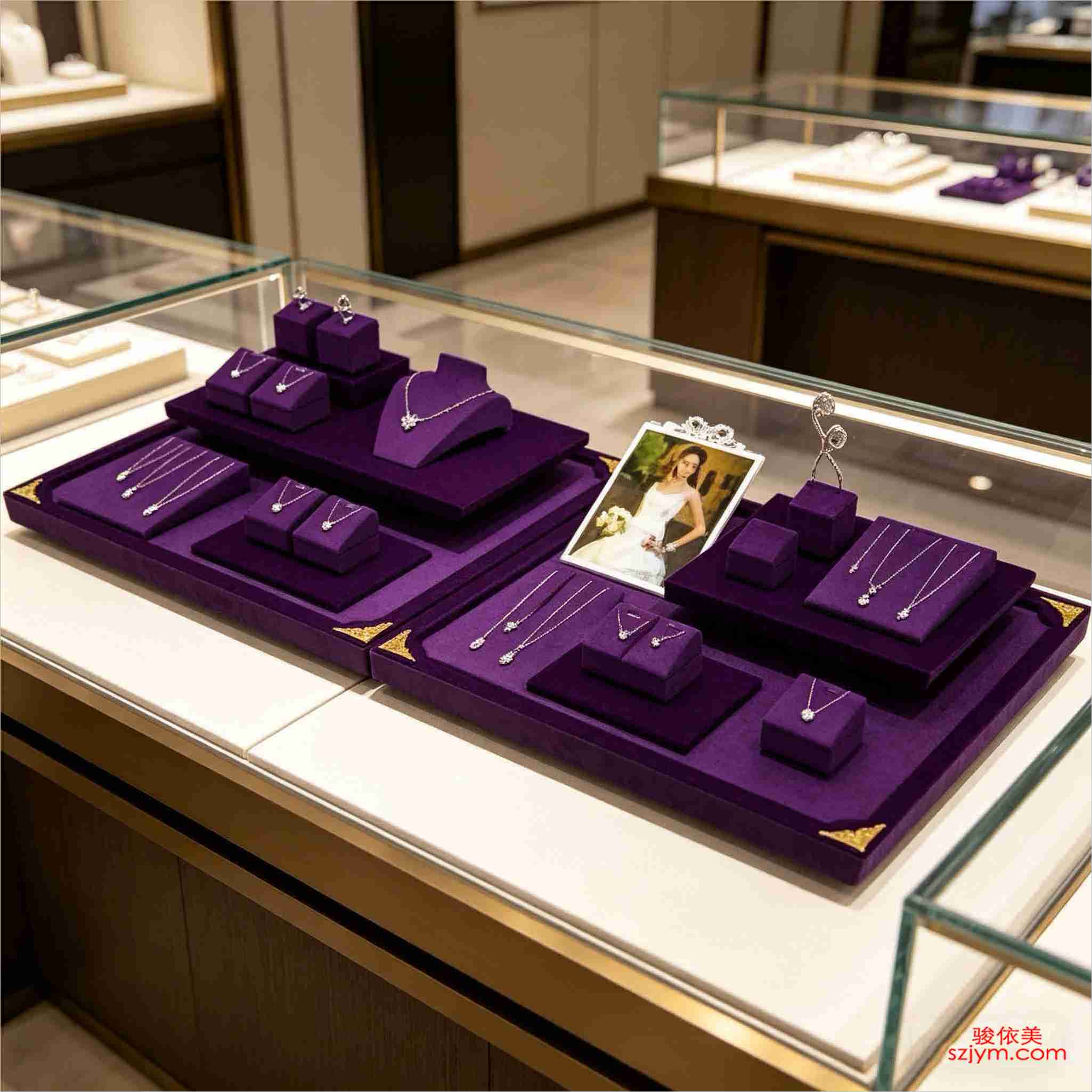 From the customer's side, the worst glare often comes not from the counter spotlights but from the mall atrium's high-power downlights and LED screens. They lean in, and half of what they see is the dial while the other half is a rainbow reflection of an advertisement. In those cases anti-glare glass only helps so much; the internal spots must be bright and aimed precisely enough to pull attention back to the watch. We often recommend a grey anti-glare film on the inner cabinet wall — inexpensive, and it soaks up stray light. Lamp position beats lamp color. Many counters mount spots directly above, light drops straight down, the dial lights up and so does the glass — the customer sees a blob of brightness, not a watch. We switched to front-side lighting: two small spots from the left-front and right-front of the cushion, each throwing a diagonal highlight across the face. Depth appears, the bezel edge catches a line of light, and the glare gets pushed to the corners. A watch sells on metal sheen and dial detail; once the light behaves, the feel changes at once. We have watched the same watch look "cheap" under top-light and "worth it" under side-light, with nothing else moved.
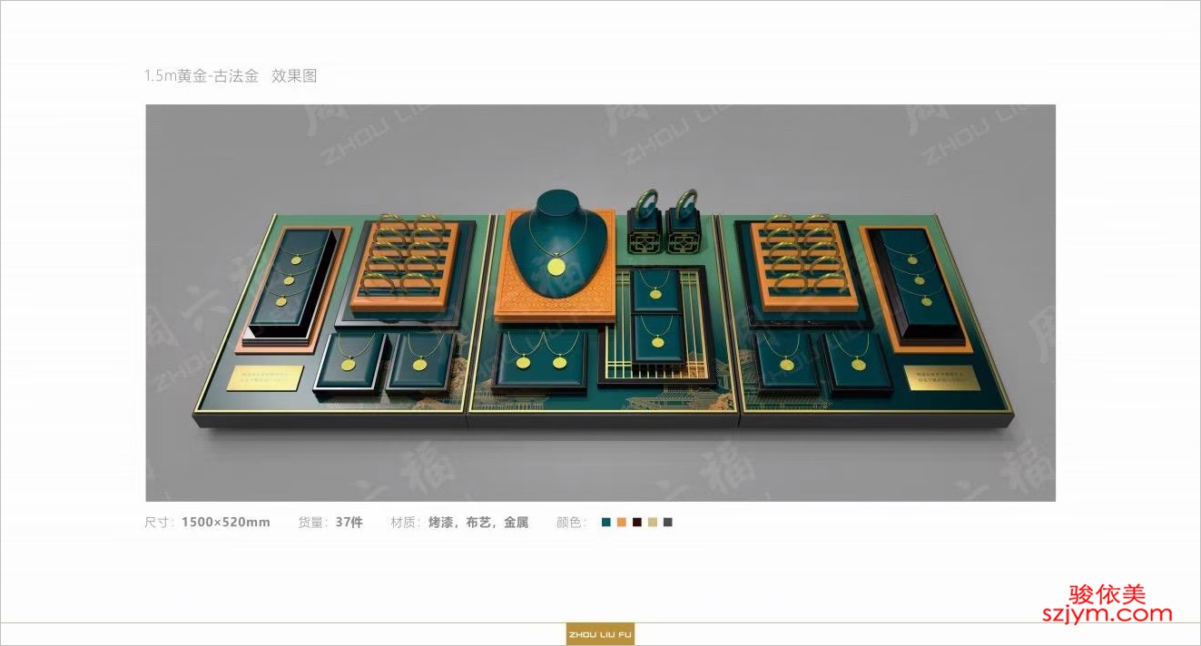 Then the gap between tray and watch. The Jewelry Tray TP17 sits on a light-green velvet base meant to flatter the case, yet some shops pack the cushions tight, watch against watch, and the eye gets squeezed until no single piece reads. We leave a finger's width between each, give the hero piece its own cell with empty space beside it — and suddenly it looks expensive. Velvet tone matters too: light green or cream holds steadier than true red, which makes a cheap watch look cheaper and a good one look loud. The tray is not just a holder; it is the frame around the picture.
A final note on glass care. Even the best anti-glare glass, once covered with fingerprints and powder marks, reflects in streaks. When we plan a display scheme for a client, we include a lint-free lens cloth in the cabinet drawer and ask staff to wipe the front glass every two hours. Do not underestimate it — a clean pane beats adding another spotlight. With a large wall cabinet like DG1, the glass area is big, and prints show up faster.
One more: do not lay a glossy floor tile square in front of the glass. Many mall atriums are mirrored stone; a customer steps up and the floor shadow and lights pour into the case, erasing the watch behind the glare. Where we cannot avoid it, we set a matte mat before the cabinet or slide the key pieces deeper in, out of that reflection band. Sometimes the fix is a thirty-dollar mat, not a new cabinet. Only when they can see clearly will they linger. And lingering is where a sale begins — no one buys a watch they could not quite make out.
This is original content. Copyright belongs to Shenzhen Junyimei.
Then the gap between tray and watch. The Jewelry Tray TP17 sits on a light-green velvet base meant to flatter the case, yet some shops pack the cushions tight, watch against watch, and the eye gets squeezed until no single piece reads. We leave a finger's width between each, give the hero piece its own cell with empty space beside it — and suddenly it looks expensive. Velvet tone matters too: light green or cream holds steadier than true red, which makes a cheap watch look cheaper and a good one look loud. The tray is not just a holder; it is the frame around the picture.
A final note on glass care. Even the best anti-glare glass, once covered with fingerprints and powder marks, reflects in streaks. When we plan a display scheme for a client, we include a lint-free lens cloth in the cabinet drawer and ask staff to wipe the front glass every two hours. Do not underestimate it — a clean pane beats adding another spotlight. With a large wall cabinet like DG1, the glass area is big, and prints show up faster.
One more: do not lay a glossy floor tile square in front of the glass. Many mall atriums are mirrored stone; a customer steps up and the floor shadow and lights pour into the case, erasing the watch behind the glare. Where we cannot avoid it, we set a matte mat before the cabinet or slide the key pieces deeper in, out of that reflection band. Sometimes the fix is a thirty-dollar mat, not a new cabinet. Only when they can see clearly will they linger. And lingering is where a sale begins — no one buys a watch they could not quite make out.
This is original content. Copyright belongs to Shenzhen Junyimei.
Junyimei — present every jewel and timepiece at its best.客人凑近想看清一只表的盘面,玻璃上却映出自己的人影和头顶的灯管——这种尴尬在珠宝腕表柜台太常见。问题往往不在灯不够亮,而在玻璃和灯的位置没谈拢。 先说玻璃。普通超白玻璃正面透光好,侧面一斜就反光。我们给「珠宝壁柜吊柜DG1」配的是超白防眩玻璃,表面做了雾化处理,把直射光打散成柔光,客人站正了看,基本看不到自己。但防眩不是万能,灯带如果正对玻璃面平行打,再防眩也救不回来。DG1内嵌的线性灯带我们一般调成斜下十五度,光落在表盘而不是玻璃上。十几分钟调个角度,有时比换一块高价玻璃更管用。普通门店不一定买得起整柜换防眩玻璃,先把灯带角度调对,是成本最低、见效最快的办法。
从客人那边看,反光最恼人的还不是顶灯,而是商场中庭那些大功率筒灯和LED大屏。客人头一低,眼前一半是表盘,一半是广告屏的彩色反光。这种情况下,防眩玻璃也只能救一部分,柜内射灯必须够亮、方向够准,才能把客人的注意力抢回来。我们常建议柜台内侧贴一层灰度吸光膜,不贵,但能吃掉不少杂散光。灯位比灯色更先决。很多柜台把射灯装在柜体正上方,光垂直砸下来,表盘亮了,玻璃也亮了——客人看见的是一片光斑,不是表。后来我们改成侧前方布光,两只小射灯从表枕左前和右前各打一束,在盘面形成一条斜向高光,立体感出来,玻璃反光被压到边角。腕表本来就是靠金属光泽和盘面细节说话,光一顺,质感立刻不同。我们见过同一只表在顶光下显"廉价",侧光下立刻"值当",别的什么都没动。
再就是托盘和腕表的间距。「首饰托盘TP17」用的浅绿绒布底,本来是为了衬托表壳,可有的店把表枕塞得太满,表与表挨着,客人视线被挤住,反倒看不清单只。我们习惯每只之间留一指宽,主推款单独占一格,旁边空着,反而显得贵。绒布颜色也别太跳,浅绿、米白都比正红稳,正红容易把便宜表衬得更便宜,把好表衬得太喧闹。托盘不是只托表,它是画框。
最后得说一句玻璃清洁。再贵的防眩玻璃,落了指纹和粉底印,反光都会变花。我们帮客户做陈列方案时,会配一块无绒眼镜布放在柜内抽屉里,要求店员每两小时擦一次正面玻璃。别小看这动作,一块干净的玻璃,抵得上多装一盏灯。尤其是DG1这种大面积吊柜,玻璃面大,指纹也更显眼。
还有个细节:柜前别铺亮面地砖正对玻璃。很多商场中庭是镜面砖,客人一站,地影和灯全映进柜里。遇到这种位置,我们会在柜前加一道哑光地垫,或者把重点款往柜体深处挪,避开那道反射带。有时解决问题的不是换柜子,是一块几十块钱的垫。看得清,客人才愿意多停一会儿;多停一会儿,成交才有可能。没人会买一只他看不太明白的表。
本文为原创内容,版权归深圳骏依美所有。如需转载请注明出处。
骏依美——让腕表的光,落在该落的地方。
From the customer's side, the worst glare often comes not from the counter spotlights but from the mall atrium's high-power downlights and LED screens. They lean in, and half of what they see is the dial while the other half is a rainbow reflection of an advertisement. In those cases anti-glare glass only helps so much; the internal spots must be bright and aimed precisely enough to pull attention back to the watch. We often recommend a grey anti-glare film on the inner cabinet wall — inexpensive, and it soaks up stray light. Lamp position beats lamp color. Many counters mount spots directly above, light drops straight down, the dial lights up and so does the glass — the customer sees a blob of brightness, not a watch. We switched to front-side lighting: two small spots from the left-front and right-front of the cushion, each throwing a diagonal highlight across the face. Depth appears, the bezel edge catches a line of light, and the glare gets pushed to the corners. A watch sells on metal sheen and dial detail; once the light behaves, the feel changes at once. We have watched the same watch look "cheap" under top-light and "worth it" under side-light, with nothing else moved.
Then the gap between tray and watch. The Jewelry Tray TP17 sits on a light-green velvet base meant to flatter the case, yet some shops pack the cushions tight, watch against watch, and the eye gets squeezed until no single piece reads. We leave a finger's width between each, give the hero piece its own cell with empty space beside it — and suddenly it looks expensive. Velvet tone matters too: light green or cream holds steadier than true red, which makes a cheap watch look cheaper and a good one look loud. The tray is not just a holder; it is the frame around the picture.
A final note on glass care. Even the best anti-glare glass, once covered with fingerprints and powder marks, reflects in streaks. When we plan a display scheme for a client, we include a lint-free lens cloth in the cabinet drawer and ask staff to wipe the front glass every two hours. Do not underestimate it — a clean pane beats adding another spotlight. With a large wall cabinet like DG1, the glass area is big, and prints show up faster.
One more: do not lay a glossy floor tile square in front of the glass. Many mall atriums are mirrored stone; a customer steps up and the floor shadow and lights pour into the case, erasing the watch behind the glare. Where we cannot avoid it, we set a matte mat before the cabinet or slide the key pieces deeper in, out of that reflection band. Sometimes the fix is a thirty-dollar mat, not a new cabinet. Only when they can see clearly will they linger. And lingering is where a sale begins — no one buys a watch they could not quite make out.
This is original content. Copyright belongs to Shenzhen Junyimei.Junyimei — present every jewel and timepiece at its best.客人凑近想看清一只表的盘面,玻璃上却映出自己的人影和头顶的灯管——这种尴尬在珠宝腕表柜台太常见。问题往往不在灯不够亮,而在玻璃和灯的位置没谈拢。 先说玻璃。普通超白玻璃正面透光好,侧面一斜就反光。我们给「珠宝壁柜吊柜DG1」配的是超白防眩玻璃,表面做了雾化处理,把直射光打散成柔光,客人站正了看,基本看不到自己。但防眩不是万能,灯带如果正对玻璃面平行打,再防眩也救不回来。DG1内嵌的线性灯带我们一般调成斜下十五度,光落在表盘而不是玻璃上。十几分钟调个角度,有时比换一块高价玻璃更管用。普通门店不一定买得起整柜换防眩玻璃,先把灯带角度调对,是成本最低、见效最快的办法。
从客人那边看,反光最恼人的还不是顶灯,而是商场中庭那些大功率筒灯和LED大屏。客人头一低,眼前一半是表盘,一半是广告屏的彩色反光。这种情况下,防眩玻璃也只能救一部分,柜内射灯必须够亮、方向够准,才能把客人的注意力抢回来。我们常建议柜台内侧贴一层灰度吸光膜,不贵,但能吃掉不少杂散光。灯位比灯色更先决。很多柜台把射灯装在柜体正上方,光垂直砸下来,表盘亮了,玻璃也亮了——客人看见的是一片光斑,不是表。后来我们改成侧前方布光,两只小射灯从表枕左前和右前各打一束,在盘面形成一条斜向高光,立体感出来,玻璃反光被压到边角。腕表本来就是靠金属光泽和盘面细节说话,光一顺,质感立刻不同。我们见过同一只表在顶光下显"廉价",侧光下立刻"值当",别的什么都没动。
再就是托盘和腕表的间距。「首饰托盘TP17」用的浅绿绒布底,本来是为了衬托表壳,可有的店把表枕塞得太满,表与表挨着,客人视线被挤住,反倒看不清单只。我们习惯每只之间留一指宽,主推款单独占一格,旁边空着,反而显得贵。绒布颜色也别太跳,浅绿、米白都比正红稳,正红容易把便宜表衬得更便宜,把好表衬得太喧闹。托盘不是只托表,它是画框。
最后得说一句玻璃清洁。再贵的防眩玻璃,落了指纹和粉底印,反光都会变花。我们帮客户做陈列方案时,会配一块无绒眼镜布放在柜内抽屉里,要求店员每两小时擦一次正面玻璃。别小看这动作,一块干净的玻璃,抵得上多装一盏灯。尤其是DG1这种大面积吊柜,玻璃面大,指纹也更显眼。
还有个细节:柜前别铺亮面地砖正对玻璃。很多商场中庭是镜面砖,客人一站,地影和灯全映进柜里。遇到这种位置,我们会在柜前加一道哑光地垫,或者把重点款往柜体深处挪,避开那道反射带。有时解决问题的不是换柜子,是一块几十块钱的垫。看得清,客人才愿意多停一会儿;多停一会儿,成交才有可能。没人会买一只他看不太明白的表。
本文为原创内容,版权归深圳骏依美所有。如需转载请注明出处。骏依美——让腕表的光,落在该落的地方。