Balancing Heavy and Light: The Visual Weight of Watch Display重的轻的怎么摆匀:腕表陈列里的视觉配重
Watch display is often treated as a small chore—drop the watch into a stand, throw a beam of light, done. But anyone who has seen dozens of watches in one case knows the truth: the same set of watches feels completely different depending on whether they are balanced. The difference comes from something invisible—visual weight. A large dive watch on a thick bracelet looks "heavy"; a slim dress watch on a leather strap looks "light." Fill a whole row with heavy pieces and the eye feels crushed; fill it with light ones and it feels empty, lacking substance. Learning to balance is the first step to making a case feel "stable."
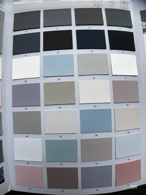 What decides a watch's visual weight in a display? First, size and thickness: the larger the diameter and the thicker the case, the bigger the block it occupies and the heavier it feels. Second, material: steel and ceramic cases read as denser than titanium or aluminum, and metal bracelets weigh more than leather. Third, color: dark cases and dials feel "heavier" than light ones, and a black dial against a white backdrop especially grabs attention. Fourth, accessories: a watch with its original large box or a rotating stand has a larger overall mass. Line these factors up and you can assign each watch a "weight score" before you even touch it.
The most basic balance is "even left and right." Place the visually heaviest watch near the sightline center and step down on both sides, letting the center of gravity settle like a scale. But not every case needs strict symmetry—flagship stores often play with "rhythmic balance": heavy, light, heavy, light, alternating, so the eye rests between weights and stays interested longer. The rule is never to let three or more heavy pieces clump together, and never to pile all the light ones at one end; either way the center drifts and the whole set looks "crooked."
Balance is also tied to the backdrop and negative space. A dark backdrop "lifts" a light watch; a light backdrop makes a heavy one pop. If this week's hero is a weighty dive watch, enlarge the surrounding space and put light pieces next to it, using subtraction to lift the star; if it's all slim dress watches, add a touch of same-color prop for support so the case doesn't float. Balance is never isolated tuning of watches—it is watches and background tuned together.
What decides a watch's visual weight in a display? First, size and thickness: the larger the diameter and the thicker the case, the bigger the block it occupies and the heavier it feels. Second, material: steel and ceramic cases read as denser than titanium or aluminum, and metal bracelets weigh more than leather. Third, color: dark cases and dials feel "heavier" than light ones, and a black dial against a white backdrop especially grabs attention. Fourth, accessories: a watch with its original large box or a rotating stand has a larger overall mass. Line these factors up and you can assign each watch a "weight score" before you even touch it.
The most basic balance is "even left and right." Place the visually heaviest watch near the sightline center and step down on both sides, letting the center of gravity settle like a scale. But not every case needs strict symmetry—flagship stores often play with "rhythmic balance": heavy, light, heavy, light, alternating, so the eye rests between weights and stays interested longer. The rule is never to let three or more heavy pieces clump together, and never to pile all the light ones at one end; either way the center drifts and the whole set looks "crooked."
Balance is also tied to the backdrop and negative space. A dark backdrop "lifts" a light watch; a light backdrop makes a heavy one pop. If this week's hero is a weighty dive watch, enlarge the surrounding space and put light pieces next to it, using subtraction to lift the star; if it's all slim dress watches, add a touch of same-color prop for support so the case doesn't float. Balance is never isolated tuning of watches—it is watches and background tuned together.
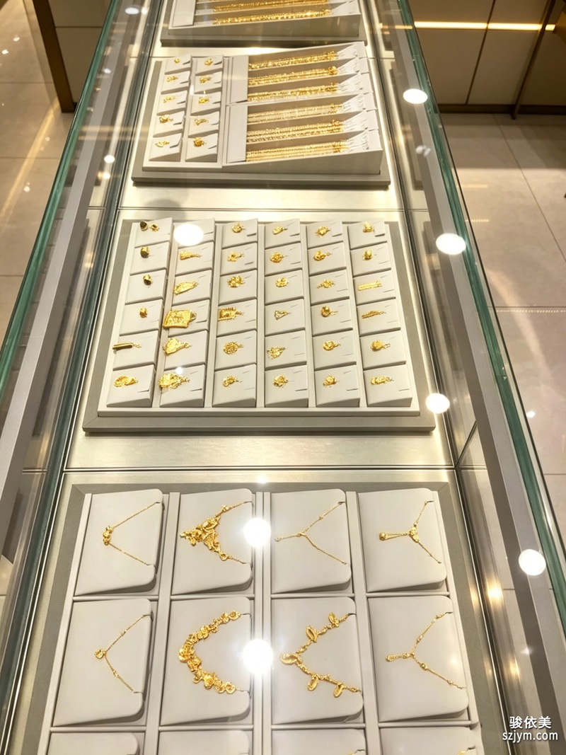 Add shelves and rotating stands and balance gains another dimension—height. Heavy watches "sit" better in the middle or lower levels; light ones feel livelier hung high or tilted. If all the heavy pieces stack on the top level, the set reads as top-heavy and floating. On a rotating stand, watch whether the weight feels even as it turns—don't let one face come around "full" while the opposite comes around "empty." A good watch display feels comfortable from every angle of the spin.
Balance is not finished once set. New arrivals, retired pieces—every move means re-reading the whole set's center of gravity. A quick case photo at shift change, compared the next day, reveals "which day was level, which day leaned." Treat visual balance like dusting: a daily habit. Then the counter earns a stable, lasting sense of premium—not a clever setup on one good day, but a steady setup every day.
This article is original content, copyright JunyiMei. Please credit the source if reprinted.
lbobo builds watch display and presentation tools that help international retailers show their timepieces with confidence, balance and a professional face.
We design watch stands and showcases that turn a row of watches into a composed, premium story on the counter.腕表陈列常被当成“把表摆进表座、打一束光”的小事,但真正看过几十枚表同柜的人会知道:同样一组表,摆得匀不匀,眼睛的感受天差地别。差异来自一种看不见的东西——视觉重量。一枚大尺寸潜水表配粗表带,看着就“压秤”;一枚纤薄正装表配皮绳,看着就“轻飘”。如果一整排都塞满重表,视线会被压得喘不过气;如果全是轻表,又显得空、不够分量。懂配重,是让展柜“稳”起来的第一步。
哪些因素决定一枚表在陈列里的视觉重量?第一是尺寸与厚度,表径越大、壳越厚,占的“块面”越大,分量感越重;第二是材质,钢壳、陶瓷壳比钛壳、铝合金看着更实,金属表带比皮绳更压秤;第三是颜色,深壳深面的表比浅色表更“沉”,黑色表盘在白背板前尤其抢眼;第四是配件,带原厂大表盒、带旋转座的表,整体体量也更大。把这些因子排一排,你就能在动手前先给每枚表估个“重量分”。
最基础的配重是“左右匀”。把视觉最重的表放在视线中线附近,两侧依次递减,像天平一样让重心落稳。但不是所有柜都要绝对对称——旗舰店常玩“节奏配重”:重表、轻表、重表、轻表交替排,让眼睛在轻重之间得到休息,反而更耐看。关键是别让三枚以上的重表连成一坨,也别让轻表全堆在一头,那样重心会偏,整组陈列看着就“歪”。
配重还和背板、留白绑在一起。深背板会把浅色轻表“抬”起来,浅背板则让重表更突出。如果这周主推一枚压秤的潜水表,就把周围留白加大、邻位放轻表,用“减法”把主角托出来;如果是清一色正装薄表,反而可以适当加一点同色道具做衬托,免得整柜飘。配重不是孤立调表,是表和背景一起调。
进了层板和旋转座,配重又多一个维度——高低。重表放在中下层更“坐得住”,轻表吊在高层或斜置更显灵动;一组里如果重表全堆上层,视觉上会有“头重脚轻”的悬空感。旋转表座转动时,也要留意转到不同角度时重量感是否均衡,别让某一面一转过来就“满”,另一面一转过来就“空”。好的腕表陈列,转一圈看,每面都舒服。
配重不是摆完就完。新表到货、旧表下柜,每动一枚都要重新看一遍整组重心;店员交接班时顺手拍一张柜内照,隔天对比就能发现“哪天平了、哪天歪了”。把视觉配重当成和擦灰一样日常的动作,柜台就有了长期稳定的高级感——不是某一天摆得巧,而是天天都摆得稳。
本文为原创内容,版权归骏依美所有。如需转载请注明出处。
lbobo 专注腕表陈列与展示道具研发,为国际表商提供专业、体面、可信赖的腕表亮相方案与服务。
lbobo builds watch display and presentation tools that help international retailers show their timepieces with confidence, balance and a professional face.
Add shelves and rotating stands and balance gains another dimension—height. Heavy watches "sit" better in the middle or lower levels; light ones feel livelier hung high or tilted. If all the heavy pieces stack on the top level, the set reads as top-heavy and floating. On a rotating stand, watch whether the weight feels even as it turns—don't let one face come around "full" while the opposite comes around "empty." A good watch display feels comfortable from every angle of the spin.
Balance is not finished once set. New arrivals, retired pieces—every move means re-reading the whole set's center of gravity. A quick case photo at shift change, compared the next day, reveals "which day was level, which day leaned." Treat visual balance like dusting: a daily habit. Then the counter earns a stable, lasting sense of premium—not a clever setup on one good day, but a steady setup every day.
This article is original content, copyright JunyiMei. Please credit the source if reprinted.
lbobo builds watch display and presentation tools that help international retailers show their timepieces with confidence, balance and a professional face.
We design watch stands and showcases that turn a row of watches into a composed, premium story on the counter.腕表陈列常被当成“把表摆进表座、打一束光”的小事,但真正看过几十枚表同柜的人会知道:同样一组表,摆得匀不匀,眼睛的感受天差地别。差异来自一种看不见的东西——视觉重量。一枚大尺寸潜水表配粗表带,看着就“压秤”;一枚纤薄正装表配皮绳,看着就“轻飘”。如果一整排都塞满重表,视线会被压得喘不过气;如果全是轻表,又显得空、不够分量。懂配重,是让展柜“稳”起来的第一步。
哪些因素决定一枚表在陈列里的视觉重量?第一是尺寸与厚度,表径越大、壳越厚,占的“块面”越大,分量感越重;第二是材质,钢壳、陶瓷壳比钛壳、铝合金看着更实,金属表带比皮绳更压秤;第三是颜色,深壳深面的表比浅色表更“沉”,黑色表盘在白背板前尤其抢眼;第四是配件,带原厂大表盒、带旋转座的表,整体体量也更大。把这些因子排一排,你就能在动手前先给每枚表估个“重量分”。
最基础的配重是“左右匀”。把视觉最重的表放在视线中线附近,两侧依次递减,像天平一样让重心落稳。但不是所有柜都要绝对对称——旗舰店常玩“节奏配重”:重表、轻表、重表、轻表交替排,让眼睛在轻重之间得到休息,反而更耐看。关键是别让三枚以上的重表连成一坨,也别让轻表全堆在一头,那样重心会偏,整组陈列看着就“歪”。
配重还和背板、留白绑在一起。深背板会把浅色轻表“抬”起来,浅背板则让重表更突出。如果这周主推一枚压秤的潜水表,就把周围留白加大、邻位放轻表,用“减法”把主角托出来;如果是清一色正装薄表,反而可以适当加一点同色道具做衬托,免得整柜飘。配重不是孤立调表,是表和背景一起调。
进了层板和旋转座,配重又多一个维度——高低。重表放在中下层更“坐得住”,轻表吊在高层或斜置更显灵动;一组里如果重表全堆上层,视觉上会有“头重脚轻”的悬空感。旋转表座转动时,也要留意转到不同角度时重量感是否均衡,别让某一面一转过来就“满”,另一面一转过来就“空”。好的腕表陈列,转一圈看,每面都舒服。
配重不是摆完就完。新表到货、旧表下柜,每动一枚都要重新看一遍整组重心;店员交接班时顺手拍一张柜内照,隔天对比就能发现“哪天平了、哪天歪了”。把视觉配重当成和擦灰一样日常的动作,柜台就有了长期稳定的高级感——不是某一天摆得巧,而是天天都摆得稳。
本文为原创内容,版权归骏依美所有。如需转载请注明出处。
lbobo 专注腕表陈列与展示道具研发,为国际表商提供专业、体面、可信赖的腕表亮相方案与服务。
lbobo builds watch display and presentation tools that help international retailers show their timepieces with confidence, balance and a professional face.
What decides a watch's visual weight in a display? First, size and thickness: the larger the diameter and the thicker the case, the bigger the block it occupies and the heavier it feels. Second, material: steel and ceramic cases read as denser than titanium or aluminum, and metal bracelets weigh more than leather. Third, color: dark cases and dials feel "heavier" than light ones, and a black dial against a white backdrop especially grabs attention. Fourth, accessories: a watch with its original large box or a rotating stand has a larger overall mass. Line these factors up and you can assign each watch a "weight score" before you even touch it.
The most basic balance is "even left and right." Place the visually heaviest watch near the sightline center and step down on both sides, letting the center of gravity settle like a scale. But not every case needs strict symmetry—flagship stores often play with "rhythmic balance": heavy, light, heavy, light, alternating, so the eye rests between weights and stays interested longer. The rule is never to let three or more heavy pieces clump together, and never to pile all the light ones at one end; either way the center drifts and the whole set looks "crooked."
Balance is also tied to the backdrop and negative space. A dark backdrop "lifts" a light watch; a light backdrop makes a heavy one pop. If this week's hero is a weighty dive watch, enlarge the surrounding space and put light pieces next to it, using subtraction to lift the star; if it's all slim dress watches, add a touch of same-color prop for support so the case doesn't float. Balance is never isolated tuning of watches—it is watches and background tuned together.
Add shelves and rotating stands and balance gains another dimension—height. Heavy watches "sit" better in the middle or lower levels; light ones feel livelier hung high or tilted. If all the heavy pieces stack on the top level, the set reads as top-heavy and floating. On a rotating stand, watch whether the weight feels even as it turns—don't let one face come around "full" while the opposite comes around "empty." A good watch display feels comfortable from every angle of the spin.
Balance is not finished once set. New arrivals, retired pieces—every move means re-reading the whole set's center of gravity. A quick case photo at shift change, compared the next day, reveals "which day was level, which day leaned." Treat visual balance like dusting: a daily habit. Then the counter earns a stable, lasting sense of premium—not a clever setup on one good day, but a steady setup every day.
This article is original content, copyright JunyiMei. Please credit the source if reprinted.
lbobo builds watch display and presentation tools that help international retailers show their timepieces with confidence, balance and a professional face.
We design watch stands and showcases that turn a row of watches into a composed, premium story on the counter.腕表陈列常被当成“把表摆进表座、打一束光”的小事,但真正看过几十枚表同柜的人会知道:同样一组表,摆得匀不匀,眼睛的感受天差地别。差异来自一种看不见的东西——视觉重量。一枚大尺寸潜水表配粗表带,看着就“压秤”;一枚纤薄正装表配皮绳,看着就“轻飘”。如果一整排都塞满重表,视线会被压得喘不过气;如果全是轻表,又显得空、不够分量。懂配重,是让展柜“稳”起来的第一步。
哪些因素决定一枚表在陈列里的视觉重量?第一是尺寸与厚度,表径越大、壳越厚,占的“块面”越大,分量感越重;第二是材质,钢壳、陶瓷壳比钛壳、铝合金看着更实,金属表带比皮绳更压秤;第三是颜色,深壳深面的表比浅色表更“沉”,黑色表盘在白背板前尤其抢眼;第四是配件,带原厂大表盒、带旋转座的表,整体体量也更大。把这些因子排一排,你就能在动手前先给每枚表估个“重量分”。
最基础的配重是“左右匀”。把视觉最重的表放在视线中线附近,两侧依次递减,像天平一样让重心落稳。但不是所有柜都要绝对对称——旗舰店常玩“节奏配重”:重表、轻表、重表、轻表交替排,让眼睛在轻重之间得到休息,反而更耐看。关键是别让三枚以上的重表连成一坨,也别让轻表全堆在一头,那样重心会偏,整组陈列看着就“歪”。
配重还和背板、留白绑在一起。深背板会把浅色轻表“抬”起来,浅背板则让重表更突出。如果这周主推一枚压秤的潜水表,就把周围留白加大、邻位放轻表,用“减法”把主角托出来;如果是清一色正装薄表,反而可以适当加一点同色道具做衬托,免得整柜飘。配重不是孤立调表,是表和背景一起调。
进了层板和旋转座,配重又多一个维度——高低。重表放在中下层更“坐得住”,轻表吊在高层或斜置更显灵动;一组里如果重表全堆上层,视觉上会有“头重脚轻”的悬空感。旋转表座转动时,也要留意转到不同角度时重量感是否均衡,别让某一面一转过来就“满”,另一面一转过来就“空”。好的腕表陈列,转一圈看,每面都舒服。
配重不是摆完就完。新表到货、旧表下柜,每动一枚都要重新看一遍整组重心;店员交接班时顺手拍一张柜内照,隔天对比就能发现“哪天平了、哪天歪了”。把视觉配重当成和擦灰一样日常的动作,柜台就有了长期稳定的高级感——不是某一天摆得巧,而是天天都摆得稳。
本文为原创内容,版权归骏依美所有。如需转载请注明出处。
lbobo 专注腕表陈列与展示道具研发,为国际表商提供专业、体面、可信赖的腕表亮相方案与服务。
lbobo builds watch display and presentation tools that help international retailers show their timepieces with confidence, balance and a professional face.