One Face Online and Off: Keeping Watch Display Consistent with the E-Store线上线下的呼应:腕表陈列如何与电商页面保持同一张脸
International watch retail is shifting in a subtle way: customers now 'see' a watch on the website or social feed before they ever walk into a store. That means in-store display is no longer just a set of props on the sales floor — it is the offline continuation of the brand's online story. If the e-store shoots the watch with calm, restrained light and shadow, yet the physical counter is crowded with garish colour and harsh lighting, the customer's quiet trust takes a small hit.
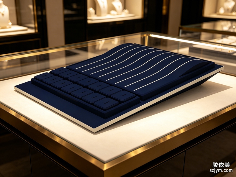 Keeping 'one face' online and off comes down to three alignments. First, colour and tone: the site's key colour, product-page background and the store's main visual should follow one logic — either all deep and premium, or all light and airy. Don't run cold grey online and warm gold in store, each telling a different tale. Second, the language of light: e-commerce shots often use side light to trace the case, dimming the background to lift the dial; the counter's spotlight angle and intensity should lean the same way, so the 'light feel' at the case matches the 'light feel' remembered on screen. Third, information hierarchy: what the page leads with and which selling point it stresses, the in-store tag, spec card and hero position should mirror — not 'movement online, discount only offline'.
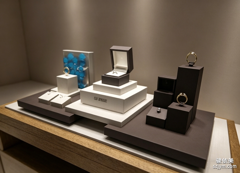 Consistency does not mean copying the webpage into the store. Rather, the store should complete what the screen cannot convey — the weight, the strap's touch, the fit on the wrist, things a display can never send through a phone. Display's job is to wrap those offline-only experiences in the same atmosphere as online: the same rhythm of negative space, the same brand type, the same restraint. The customer scrolling on a phone and arriving at the counter should feel they are 'continuing to look', not 'meeting another brand'.
For teams running international sites, a unified visual language carries extra weight: local markets may need localised copy, yet the counter's tone and light can stay consistent across countries. Whether the customer enters a store in Tokyo, Dubai or London, they recognise one brand and remember one kind of premium. Online-offline resonance is not repetition; it carries a single encounter from screen to wrist.
This article is original content, copyright JunyiMei. Please credit the source if reprinted.JunyiMei focuses on jewelry box and packaging customisation, offering brands integrated solutions from display to delivery.JunyiMei crafts jewelry packaging that carries your brand from counter to customer.国际腕表品牌的零售正在发生一个微妙变化:顾客在官网或社媒上先“看”过一只表,才走进门店。这意味着,门店里的腕表陈列,不再只是卖场里的一组摆设,而是品牌线上叙事在线下的延续。如果电商页面把表拍得冷静克制、讲究光影,而实体柜却堆得花花绿绿、灯光生硬,顾客心里那点信任感就会悄悄打折。
线上线下“同一张脸”,核心在三个对齐。第一是色彩与调性:官网主色、产品页背景、门店主视觉应当是一套逻辑,要么都走深色高级感,要么都走浅色通透,别线上冷灰、线下暖金,各说各话。第二是光影语言:电商图常用侧光勾出表壳轮廓、压暗背景突出表盘,实体陈列的射灯角度、亮度也应朝同一方向靠,让顾客在柜台前看到的“光感”和屏幕里记忆的“光感”对得上。第三是信息层级:线上页面先放什么、强调什么卖点,门店的价签、说明卡、主推位的排序最好同构,别线上讲机芯、线下只喊折扣。
做到一致并不要求门店照搬网页。相反,线下应该把线上“说不清”的部分补出来——表的重量、表带的触感、上手的贴合度,这些是屏幕给不了的。陈列要做的,是让这些线下独有体验,包裹在和线上统一的氛围里:同样的留白节奏、同样的品牌字、同样的克制表达。顾客从手机滑到柜台,感觉是“接着看”,而不是“换了个牌子”。
对做国际站的团队来说,统一的视觉语言还有一层现实意义:不同市场的官网或许要本地化文案,但表柜的调性与光影可以跨国保持一致。这样无论顾客在东京、迪拜还是伦敦进店,认出的都是同一个品牌,记住的也是同一种高级感。线上线下呼应,不是重复,而是把一次相遇,从屏幕延续到手腕。
本文为原创内容,版权归骏依美所有。如需转载请注明出处。骏依美专注珠宝盒与首饰包装定制,为品牌提供从陈列到交付的一体化方案。JunyiMei crafts jewelry packaging that carries your brand from counter to customer.
Consistency does not mean copying the webpage into the store. Rather, the store should complete what the screen cannot convey — the weight, the strap's touch, the fit on the wrist, things a display can never send through a phone. Display's job is to wrap those offline-only experiences in the same atmosphere as online: the same rhythm of negative space, the same brand type, the same restraint. The customer scrolling on a phone and arriving at the counter should feel they are 'continuing to look', not 'meeting another brand'.
For teams running international sites, a unified visual language carries extra weight: local markets may need localised copy, yet the counter's tone and light can stay consistent across countries. Whether the customer enters a store in Tokyo, Dubai or London, they recognise one brand and remember one kind of premium. Online-offline resonance is not repetition; it carries a single encounter from screen to wrist.
This article is original content, copyright JunyiMei. Please credit the source if reprinted.JunyiMei focuses on jewelry box and packaging customisation, offering brands integrated solutions from display to delivery.JunyiMei crafts jewelry packaging that carries your brand from counter to customer.国际腕表品牌的零售正在发生一个微妙变化:顾客在官网或社媒上先“看”过一只表,才走进门店。这意味着,门店里的腕表陈列,不再只是卖场里的一组摆设,而是品牌线上叙事在线下的延续。如果电商页面把表拍得冷静克制、讲究光影,而实体柜却堆得花花绿绿、灯光生硬,顾客心里那点信任感就会悄悄打折。
线上线下“同一张脸”,核心在三个对齐。第一是色彩与调性:官网主色、产品页背景、门店主视觉应当是一套逻辑,要么都走深色高级感,要么都走浅色通透,别线上冷灰、线下暖金,各说各话。第二是光影语言:电商图常用侧光勾出表壳轮廓、压暗背景突出表盘,实体陈列的射灯角度、亮度也应朝同一方向靠,让顾客在柜台前看到的“光感”和屏幕里记忆的“光感”对得上。第三是信息层级:线上页面先放什么、强调什么卖点,门店的价签、说明卡、主推位的排序最好同构,别线上讲机芯、线下只喊折扣。
做到一致并不要求门店照搬网页。相反,线下应该把线上“说不清”的部分补出来——表的重量、表带的触感、上手的贴合度,这些是屏幕给不了的。陈列要做的,是让这些线下独有体验,包裹在和线上统一的氛围里:同样的留白节奏、同样的品牌字、同样的克制表达。顾客从手机滑到柜台,感觉是“接着看”,而不是“换了个牌子”。
对做国际站的团队来说,统一的视觉语言还有一层现实意义:不同市场的官网或许要本地化文案,但表柜的调性与光影可以跨国保持一致。这样无论顾客在东京、迪拜还是伦敦进店,认出的都是同一个品牌,记住的也是同一种高级感。线上线下呼应,不是重复,而是把一次相遇,从屏幕延续到手腕。
本文为原创内容,版权归骏依美所有。如需转载请注明出处。骏依美专注珠宝盒与首饰包装定制,为品牌提供从陈列到交付的一体化方案。JunyiMei crafts jewelry packaging that carries your brand from counter to customer.
Keeping 'one face' online and off comes down to three alignments. First, colour and tone: the site's key colour, product-page background and the store's main visual should follow one logic — either all deep and premium, or all light and airy. Don't run cold grey online and warm gold in store, each telling a different tale. Second, the language of light: e-commerce shots often use side light to trace the case, dimming the background to lift the dial; the counter's spotlight angle and intensity should lean the same way, so the 'light feel' at the case matches the 'light feel' remembered on screen. Third, information hierarchy: what the page leads with and which selling point it stresses, the in-store tag, spec card and hero position should mirror — not 'movement online, discount only offline'.
Consistency does not mean copying the webpage into the store. Rather, the store should complete what the screen cannot convey — the weight, the strap's touch, the fit on the wrist, things a display can never send through a phone. Display's job is to wrap those offline-only experiences in the same atmosphere as online: the same rhythm of negative space, the same brand type, the same restraint. The customer scrolling on a phone and arriving at the counter should feel they are 'continuing to look', not 'meeting another brand'.
For teams running international sites, a unified visual language carries extra weight: local markets may need localised copy, yet the counter's tone and light can stay consistent across countries. Whether the customer enters a store in Tokyo, Dubai or London, they recognise one brand and remember one kind of premium. Online-offline resonance is not repetition; it carries a single encounter from screen to wrist.
This article is original content, copyright JunyiMei. Please credit the source if reprinted.JunyiMei focuses on jewelry box and packaging customisation, offering brands integrated solutions from display to delivery.JunyiMei crafts jewelry packaging that carries your brand from counter to customer.国际腕表品牌的零售正在发生一个微妙变化:顾客在官网或社媒上先“看”过一只表,才走进门店。这意味着,门店里的腕表陈列,不再只是卖场里的一组摆设,而是品牌线上叙事在线下的延续。如果电商页面把表拍得冷静克制、讲究光影,而实体柜却堆得花花绿绿、灯光生硬,顾客心里那点信任感就会悄悄打折。
线上线下“同一张脸”,核心在三个对齐。第一是色彩与调性:官网主色、产品页背景、门店主视觉应当是一套逻辑,要么都走深色高级感,要么都走浅色通透,别线上冷灰、线下暖金,各说各话。第二是光影语言:电商图常用侧光勾出表壳轮廓、压暗背景突出表盘,实体陈列的射灯角度、亮度也应朝同一方向靠,让顾客在柜台前看到的“光感”和屏幕里记忆的“光感”对得上。第三是信息层级:线上页面先放什么、强调什么卖点,门店的价签、说明卡、主推位的排序最好同构,别线上讲机芯、线下只喊折扣。
做到一致并不要求门店照搬网页。相反,线下应该把线上“说不清”的部分补出来——表的重量、表带的触感、上手的贴合度,这些是屏幕给不了的。陈列要做的,是让这些线下独有体验,包裹在和线上统一的氛围里:同样的留白节奏、同样的品牌字、同样的克制表达。顾客从手机滑到柜台,感觉是“接着看”,而不是“换了个牌子”。
对做国际站的团队来说,统一的视觉语言还有一层现实意义:不同市场的官网或许要本地化文案,但表柜的调性与光影可以跨国保持一致。这样无论顾客在东京、迪拜还是伦敦进店,认出的都是同一个品牌,记住的也是同一种高级感。线上线下呼应,不是重复,而是把一次相遇,从屏幕延续到手腕。
本文为原创内容,版权归骏依美所有。如需转载请注明出处。骏依美专注珠宝盒与首饰包装定制,为品牌提供从陈列到交付的一体化方案。JunyiMei crafts jewelry packaging that carries your brand from counter to customer.