Why The Window Display Is Your Best Salesperson好橱窗自带客流
On a street with dozens of shops, why does a passerby walk into yours? Often the answer isn't the stock inside — it's the glass that has only seconds to win them over. For a high-consideration category like jewelry, where people look before they buy, the window isn't decoration; it's the first gate of store traffic. Retail TouchPoints puts it plainly: the storefront remains "one of the most powerful — and often overlooked — ways to invite customers inside."
Q1: Do windows actually drive foot traffic?
A: Yes, and the numbers are hard. A December 2024 study in the Journal of Design Service and Social Innovation found that 100% of participants noticed storefront windows — among all "first impression" touchpoints, it is the most reliably seen. VM & Retail Magazine reports compelling windows can lift foot traffic by as much as 23%; jewelry-specific sources put a well-built window closer to 30% more walk-ins. What happens after they step in matters just as much: the National Retail Federation finds shoppers spend 20% more time in stores with strong visual merchandising, and 73% are more likely to return to a well-merchandised store. POPAI research is blunter still — as many as 76% of purchase decisions are made in-store, specialized displays influence roughly one in six of those decisions, and dedicated displays can lift same-store sales by an average of 30%; interactive visual merchandising can push product engagement up to 40%. The logic is simple: your window is the only salesperson who works 24/7, never asks for a commission, and greets every passerby. Its single job is to turn "walking past" into "I want to step inside." For a jewelry store, how jewelry packaging and jewelry display props are staged in that window decides whether the glass pulls people in or quietly pushes them away. In other words, the window isn't the end of your marketing — it's the beginning of the sale, the one channel where you fully control the story before a customer ever crosses the threshold.
Q2: How much patience does a passerby have?
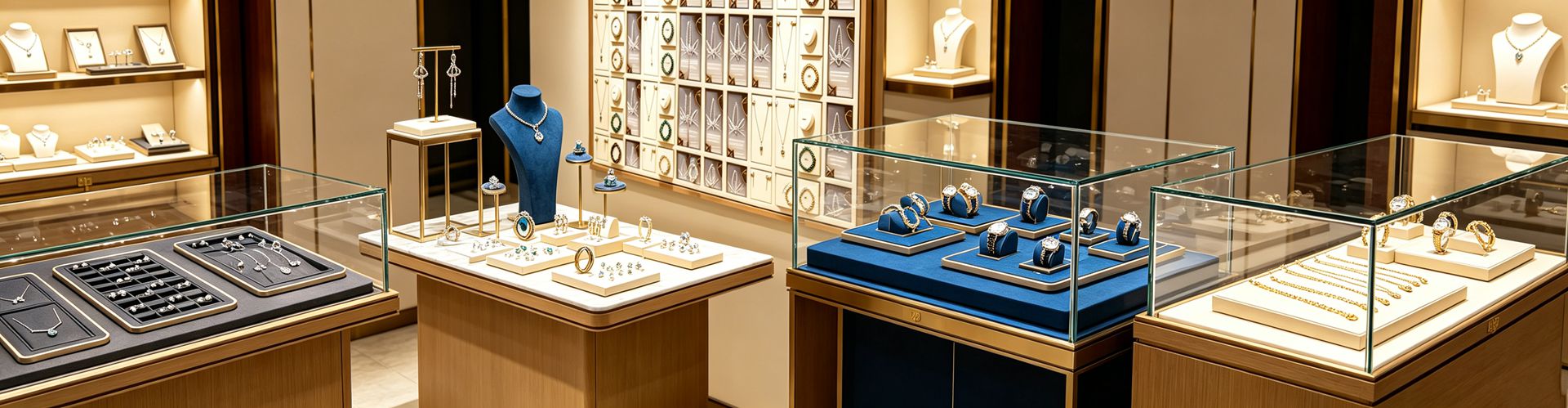
A: About 2.5 seconds. Display expert Scott Day notes a storefront window has roughly 2.5 seconds to catch the eye — less time than it takes to read this sentence. That means the message must be stripped to a minimum: one hero piece, one color story, one clear idea beats a wall of merchandise. Shenzhen Junyimei has seen this again and again with jewelry clients — negative space reads as premium. Richpack's review of thousands of stores confirms it: single-hero windows earn 40% longer dwell time than multi-item layouts, because the eye needs one place to land. Another number is just as sharp: 64% of shoppers say a unique window display is a key factor in deciding which store to visit, and the best-performing windows hold a passerby for an average of 45 seconds versus just 15 for weak ones — that 30-second gap is often the line between a sale and a walk-by. Poorly executed windows don't just fail to help; a peer-reviewed analysis of 88 studies in the Journal of Business Research found bad placement and confusing navigation actively harm store image and reduce shopping behavior. So don't overstuff. Leave the supporting jewelry boxes and watch boxes for the counter; the window should hold only the pieces that tell a story. A useful guardrail is the 80/20 rule — dedicate roughly 80% of the space to your hero item or hero group, and resist the urge to show everything you sell at once.
Q3: How do I make it look expensive?
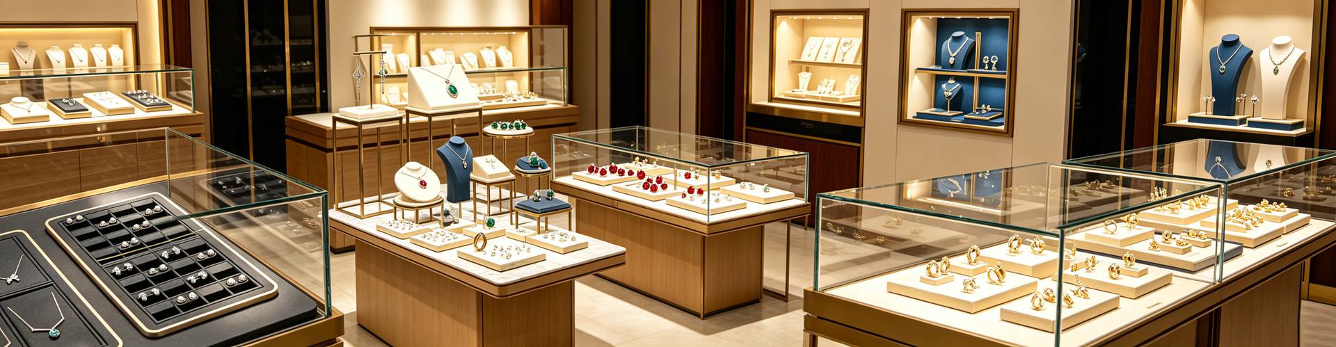
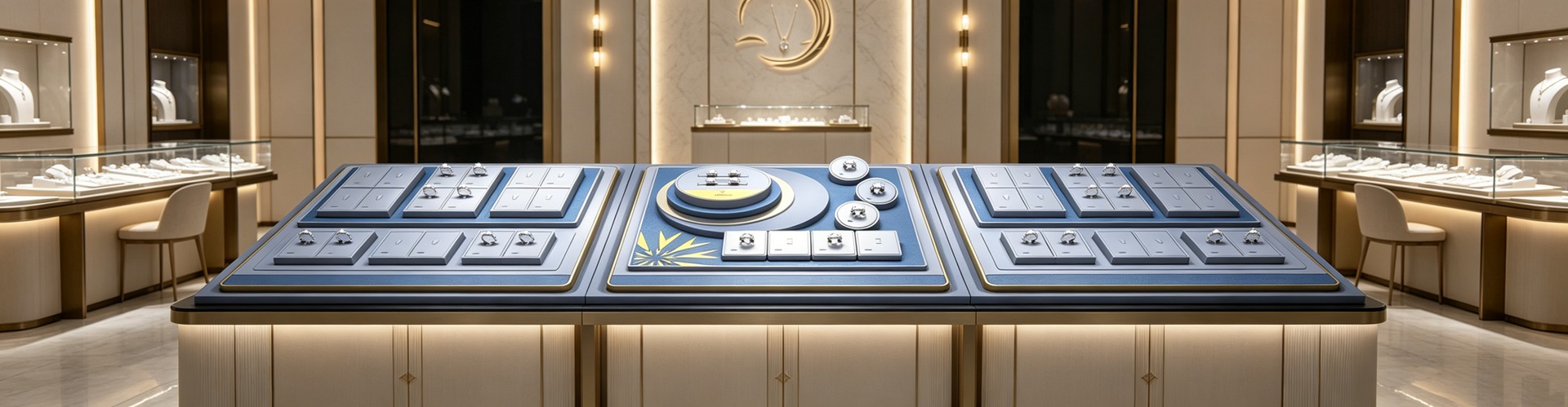
A: Three moves are enough. First, breathe. Give the window 40–50% empty space — emptier reads as luxury, fuller reads as a clearance sale; Marketing Scoop data also shows stores that embrace negative space see a 19% higher average order value. Second, use the "rule of three" and a triangle composition. Group pieces in odd numbers — three necklaces of varying length, three rings with complementary design — for natural visual harmony; place the tallest piece at the rear center, medium on the sides, lowest at the front, so the eye travels a Z-pattern and is led to the hero. Risers create height variation and give each piece its own moment to shine, while angled placement draws the eye inward. Third, match the background to the metal: dark (black, navy) makes diamonds and colored stones pop, warm neutrals (beige, taupe) flatter gold, white or cream lets silver and pearls glow. The materials of your jewelry display props and jewelry showcases matter too — natural wood, velvet, and marble suit fine jewelry far better than plastic flowers or cheap tulle, which quietly cheapen the whole window and make even a real diamond look like costume jewelry. Cohesion is the watchword: every element, from palette to prop, should tell one brand story.
Q4: What about lighting?
A: Lighting is the soul of the window, and the easiest place to fail. Gold wants warm light (2700–3000K), diamonds and silver want cool white (4000–5000K) to pull out fire and shine; color rendering index (CRI) must be 95 or above, or the stones look wrong and dirty. Put 800–1200 lux of accent on the hero — about three times the ambient — so it "earns" the brightness, then add a decorative rim light for depth. Richpack's three-layer method (ambient 200–300 lux + hero 800–1200 lux + decorative rim light) is the safest default for jewelry. Inadequate or unflattering lighting makes a window feel dull and uninviting, so invest in programmable LED fixtures you can tune by brightness and color temperature. Don't wash the whole window flat with one big white lamp; that kills the sparkle in diamonds and the warmth in gold, and the window starts to look like a storeroom. Clean the glass daily and check every fixture weekly, because a dead spotlight or a smudged pane undoes a thousand dollars of styling in seconds. When Shenzhen Junyimei does custom jewelry box design for clients, "true color under light" is often written into acceptance criteria — an expensive stone lit badly simply won't sell at its price.
Q5: How often should I change it?
A: At least every two to four weeks. Humans are naturally drawn to novelty, and the eye builds immunity to "the same old thing" — keep one window up for two months and regulars stop seeing it. The data is blunt: windows rotated monthly draw 23% more foot traffic than static ones; bi-weekly rotation can add another 15–20% on top, and brand-aligned windows reach a 19% conversion rate. Stores that feature new or best-selling pieces prominently in the window see a 28% lift in those items' sales. Tie the change to a rhythm — romantic reds for Valentine's, bright gemstones in summer, gift themes at year-end — and let seasonal rotation keep the brand feeling alive rather than frozen. When Shenzhen Junyimei does custom jewelry box design for clients, "theme-swappable" is often built into the plan: the same jewelry box, swapped liner and cardstock, fits a different season's window — cheaper and always fresh. One practical tip: refresh on Sunday night, so Monday opens on a clean slate and regulars "see" you again on their way past. A mid-sized apparel retailer that began rotating every two weeks reported a 20% foot-traffic rise within three months, with featured-product sales doubling during rotation periods — evidence that consistency of refresh, not budget, is what moves the needle.
Q6: Can a window help me online too?
A: Increasingly, yes. An "Instagrammable" window is free social-media real estate. When Zara added photo-friendly backdrops to its holiday windows, brand-related UGC rose 28% during the campaign, and displays that go viral on social see a 35% boost in foot traffic. Interactive elements — touchscreens, AR try-on mirrors — earn 40% longer engagement than static setups; Ted Baker's motion-activated windows triggered animation as people approached, lifting dwell time by 35% and store visits by 15%, while Hermès' 2023 Paris windows fused real-time emotion analysis into avant-garde storytelling for a 41% year-over-year rise in social engagement. The lesson from top performers is balance: let data guide budget, but never let it replace the creative core. For a jewelry store, a window with a real story, thoughtful color, and correct light is itself shareable content — which is exactly why jewelry display stands and jewelry display racks are increasingly designed with "photogenic" in mind, because every photo taken is one more cost-free impression of the brand, and every tag extends your reach far beyond the street corner. Even a modest boutique can win here: a single well-lit, story-led window captured by one customer can land in hundreds of local feeds overnight, turning a quiet storefront into a neighborhood talking point without spending a cent on ads.
This is original content. Copyright belongs to Shenzhen Junyimei.
Junyimei — present every jewel and timepiece at its best.
一条街几十家店,路人为什么偏偏走进你这家?答案常常不在店里的货,而在那块几秒钟就要决定一切的玻璃。对珠宝这类"先看再买"的高客单品类,橱窗不是装饰,是门店流量的第一道闸门。
Q1:橱窗真的能影响进店吗?
A:能,而且是硬指标。2024年12月《Journal of Design Service and Social Innovation》一项研究发现,100%的参与者都注意到了沿街橱窗——它在所有"第一印象"触点里是最容易被看见的那个。VM & Retail Magazine 的数据显示,有吸引力的橱窗能把步行客流最多拉高23%;珠宝行业的实战口径更乐观,做得好的橱窗进店率可提升近30%。更关键的是"进店之后":美国零售联合会(NRF)统计,视觉陈列好的店,顾客停留时间多20%;73%的顾客更愿回到陈列出色的店复购。POPAI 的研究更直接——多达76%的购买决定是在店内做出的,而专门设计的陈列能拉动同店销售平均提升30%。这背后的逻辑很简单:橱窗是你唯一一个"7×24小时不休息、还不要底薪"的导购,它要做的只有一件事——让路人从"路过"变成"想进去看看"。对一家珠宝店来说,珠宝包装和珠宝陈列道具在橱窗里的配合,直接决定这块玻璃是吸客还是劝退。
Q2:路人的耐心有多少?
A:平均只有2.5秒。陈列专家 Scott Day 的研究指出,一个橱窗大概只有2.5秒去抓住路人的眼睛——比读完这句话还短。这意味着"信息量"必须压到最低:一个主角、一个色彩故事、一个清晰概念,比塞满一整面货更管用。深圳骏依美在服务珠宝客户时反复验证一点——留白就是高级感。Richpack 对上千家门店的复盘也印证:单主角橱窗的驻足时长比多商品堆砌长40%,因为人眼需要一个落点。另一组数字同样刺眼:64%的顾客说,一个独特的橱窗是他们决定走进哪家店的关键因素;表现最好的橱窗平均能让路人驻足45秒,而平庸的只有15秒——这30秒的差距,往往就是成交与否的分水岭。所以别贪多,把首饰盒、手表盒这类"撑场"的道具留给柜台,橱窗只放能讲故事的 hero 款。
Q3:怎么摆才显贵?
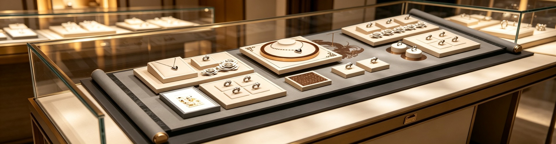
A:三个动作就够。第一,留白。给橱窗40%–50%的空,越空越像奢侈品,越满越像打折清仓;Marketing Scoop 的数据也显示,舍得留白的店平均客单价高19%。第二,用"奇数法则"和三角构图。把饰品按3件一组(三条不同长度的项链、三枚呼应设计的戒指)摆放,视觉最和谐;最高件放后方中央、两侧中高、最前最矮,视线沿 Z 字走,自然被主角牵着走。借助 riser(增高座)制造高低落差,能让每件都"有自己的高光时刻"。第三,背景色对症下药:深黑/藏蓝让钻石和宝石"炸"出来,暖米/驼色衬黄金,白/奶油色让银饰和珍珠发光。珠宝陈列道具和珠宝摆台的材质也别将就——天然木、丝绒、大理石比塑料花更配得起珠宝,廉价道具会拖累整块橱窗的身价。
Q4:灯光怎么打?
A:灯光是橱窗的灵魂,也是最容易翻车的地方。金饰用暖光(2700–3000K),钻石和银饰用冷白(4000–5000K)才能把火彩和亮面逼出来;显色指数 CRI 必须≥95,否则珠宝的色会偏、显脏。主角上方给800–1200lux的聚光,是周围环境光的3倍,让它"亮得有理";再补一道轮廓装饰光做层次。Richpack 的照明三层法(环境200–300lux + 主角800–1200lux + 轮廓装饰光)在珠宝店最稳妥。别用一盏大白灯把整窗照平——那样钻石不闪、黄金不暖,橱窗就成了仓库。深圳骏依美给客户做珠宝盒定制时,常把"灯下不偏色"写进验收项,毕竟再贵的宝石,照歪了也卖不上价。
Q5:多久换一次不显旧?
A:至少每2–4周动一次。人的眼睛对"一成不变"会产生免疫:同一套橱窗挂两个月,老顾客基本不再看它。行业数据很直接——每月轮换的橱窗比长期不动的进店率高23%;双周轮换还能再多吃15%–20%的客流增量。与品牌调性一致的橱窗,转化率还能到19%。换的方向跟着节奏走:情人节走浪漫红、夏天上亮色宝石、年末做礼赠主题。深圳骏依美给客户做珠宝盒定制时,常把"可换主题"写进方案——同一只首饰盒,换内衬换卡纸就能搭不同季的橱窗,省成本还常新。一个小提醒:周日晚上换窗最划算,周一开门就是全新开始,老顾客周一路过会重新"看见"你。
Q6:橱窗会不会帮我在网上也露脸?
A:会,而且越来越重要。"上相"的橱窗是免费的社媒广告位。Zara 在节日橱窗加了适合拍照的背景,活动期品牌相关 UGC 涨了28%;能把路人变成拍照打卡点的橱窗,客流还能再被社媒带高35%。带互动元素的橱窗(触摸屏、AR 试戴镜)比静态陈列的参与时长长40%;Ted Baker 用感应式动态橱窗,路人靠近就触发动画,驻足时长+35%、进店+15%;Hermès 2023年巴黎橱窗把实时情绪分析融进前卫叙事,社媒互动同比涨41%。对珠宝店而言,一个会讲故事、配色讲究、灯光到位的橱窗,本身就是值得被分享的内容——这也是为什么珠宝展示架和珠宝陈列架的造型越来越讲究"出片率",因为每一次被拍,都是一次零成本的品牌曝光。
本文为原创内容,版权归深圳骏依美所有,转载请注明出处。
骏依美——让每一件珠宝与腕表,都被更好地呈现。