Gold, Silver or Rose Gold: Setting the Metal Tone in Watch Display金、银还是玫瑰金:腕表陈列里的金属色调性
A wristwatch is one of the few jewelry categories where metal is the protagonist itself. The case, bracelet and clasp are already gold, silver or rose gold, which means the metal tone of display props is no supporting act — it is a direct counterpart talking to the exhibit. Get the metal tone right and a watch's character is amplified; get it wrong and the whole set looks messy or cheap.
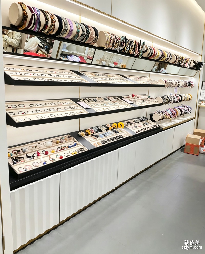 The gold family — yellow gold and champagne gold — carries luxury and formality, fitting dress mechanical watches and complicated complications best. When a prop's edge, base or signplate uses matte gold, it echoes a gold-case watch and reinforces perceived value. But avoid gold everywhere; large mirror-gold areas throw harsh glare. Use gold only on edging, the logo and thin lines, and leave the rest open.
The silver family — steel and platinum grey — is the safe, premium neutral. It never steals the show and flatters any dial color, especially sport and dive watches that stress functionality. Silver-grey metal with cool white lighting reads clean and modern, the default logic of flagship stores and airport duty-free cabinets.
The gold family — yellow gold and champagne gold — carries luxury and formality, fitting dress mechanical watches and complicated complications best. When a prop's edge, base or signplate uses matte gold, it echoes a gold-case watch and reinforces perceived value. But avoid gold everywhere; large mirror-gold areas throw harsh glare. Use gold only on edging, the logo and thin lines, and leave the rest open.
The silver family — steel and platinum grey — is the safe, premium neutral. It never steals the show and flatters any dial color, especially sport and dive watches that stress functionality. Silver-grey metal with cool white lighting reads clean and modern, the default logic of flagship stores and airport duty-free cabinets.
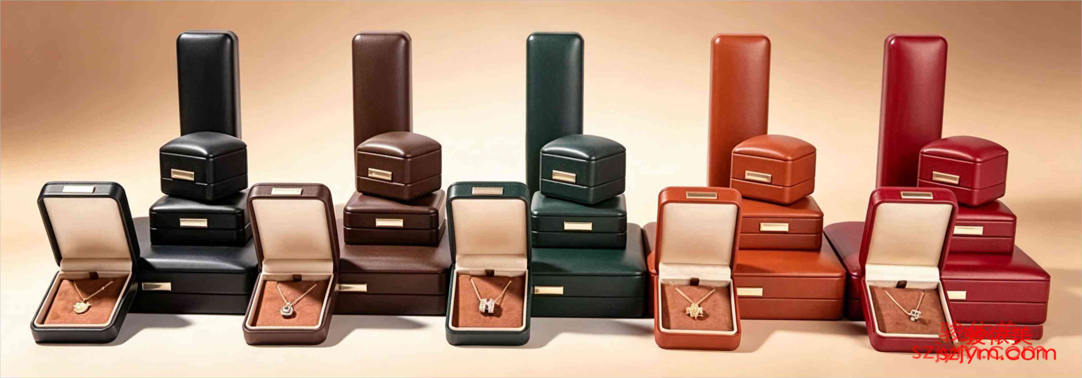 Rose gold is the most popular gentle metal of recent years. Its warm tone makes it more approachable than yellow gold and warmer than silver, ideal for ladies' watches and light-luxury positioning. Placed next to a same-color case, rose gold props lend the whole set a soft sophistication. But rose gold over a warm orange dial can blur into one mass, so separate the layers with texture or negative space.
Mature watch display rarely uses one metal alone; it builds a primary-plus-accent hierarchy: the brand's signature metal as the main tone, a small amount of contrasting metal as the accent. Silver-grey base with gold edging, or rose gold main with steel details. The key is one consistent metal language across the store, never gold, silver and rose gold each doing their own thing in one case.
On the ground, start with a metal-tone spec: list the primary metal, allowed accents, forbidden mixtures and the matching light color temperature. During prototyping, place the actual metal parts beside the watches to confirm reflection and feel before bulk ordering. Manage the metal tone and the refinement of watch display rises a notch at once.
This article is original content, copyrighted by Junyimei. Please credit the source for any reprint.
Junyimei Global: custom watch displays that make every timepiece seen and remembered.腕表是少数把金属当作主角本身的珠宝品类。表壳、表带、表扣本身就是金、银或玫瑰金,这意味着陈列道具的金属色不是配角,而是与展品直接对话的对手戏。选对金属色调性,能让腕表的气质被放大;选错,则会让整组陈列显得杂乱或廉价。
金色系,黄金与香槟金,自带奢华与正统感,最适配正装机械表与复杂功能表。当道具边沿、底座或标识牌采用哑光金时,能和金壳腕表形成呼应,强化价值感。但要避免满眼金,大面积镜面金容易反射出刺眼光斑,建议只在收口、LOGO 与细线条上用金,其余留白。
银色系,精钢与铂金灰,是安全而高级的中性选择。它不抢戏,能衬托任何色系表盘,尤其适合潜水表、运动表这类强调机能感的产品。银灰金属与冷白灯光搭配,会呈现出干净利落的现代感,是旗舰店与机场免税柜常用的底色逻辑。
玫瑰金是近年最受欢迎的温柔金属,暖调属性让它比黄金更亲和、比白银更温暖,特别适合女表与轻奢定位。玫瑰金道具与同色表壳并列时,整组陈列会透出柔和的高级感。但要注意,玫瑰金与某些暖橙表盘叠加可能糊成一片,需靠材质肌理或留白拉开层次。
真正成熟的腕表陈列,往往不是只用一种金属,而是建立主金属加辅金属的层次:以品牌的标志性金属为主调,用少量对比金属做点睛。比如以银灰为底、金线收边,或以玫瑰金为主、精钢做细节。关键是全店金属色要统一语言,避免金、银、玫瑰金在同一柜内各自为政。
落地时建议先定一份金属色规范:列出品牌主金属、允许出现的辅金属、禁止混用的组合,以及对应的灯光色温。道具打样阶段就把金属件实物与腕表并列比对,确认反光与观感后再批量下单。把金属色调性管起来,腕表陈列的精致度会立刻上一个台阶。
本文为原创内容,版权归骏依美所有。如需转载请注明出处。
骏依美国际站专注腕表陈列与展示道具定制,让每一只腕表都被看见、被记住。
This article is original content, copyrighted by Junyimei. Please credit the source for any reprint.
Junyimei Global: custom watch displays that make every timepiece seen and remembered.
Rose gold is the most popular gentle metal of recent years. Its warm tone makes it more approachable than yellow gold and warmer than silver, ideal for ladies' watches and light-luxury positioning. Placed next to a same-color case, rose gold props lend the whole set a soft sophistication. But rose gold over a warm orange dial can blur into one mass, so separate the layers with texture or negative space.
Mature watch display rarely uses one metal alone; it builds a primary-plus-accent hierarchy: the brand's signature metal as the main tone, a small amount of contrasting metal as the accent. Silver-grey base with gold edging, or rose gold main with steel details. The key is one consistent metal language across the store, never gold, silver and rose gold each doing their own thing in one case.
On the ground, start with a metal-tone spec: list the primary metal, allowed accents, forbidden mixtures and the matching light color temperature. During prototyping, place the actual metal parts beside the watches to confirm reflection and feel before bulk ordering. Manage the metal tone and the refinement of watch display rises a notch at once.
This article is original content, copyrighted by Junyimei. Please credit the source for any reprint.
Junyimei Global: custom watch displays that make every timepiece seen and remembered.腕表是少数把金属当作主角本身的珠宝品类。表壳、表带、表扣本身就是金、银或玫瑰金,这意味着陈列道具的金属色不是配角,而是与展品直接对话的对手戏。选对金属色调性,能让腕表的气质被放大;选错,则会让整组陈列显得杂乱或廉价。
金色系,黄金与香槟金,自带奢华与正统感,最适配正装机械表与复杂功能表。当道具边沿、底座或标识牌采用哑光金时,能和金壳腕表形成呼应,强化价值感。但要避免满眼金,大面积镜面金容易反射出刺眼光斑,建议只在收口、LOGO 与细线条上用金,其余留白。
银色系,精钢与铂金灰,是安全而高级的中性选择。它不抢戏,能衬托任何色系表盘,尤其适合潜水表、运动表这类强调机能感的产品。银灰金属与冷白灯光搭配,会呈现出干净利落的现代感,是旗舰店与机场免税柜常用的底色逻辑。
玫瑰金是近年最受欢迎的温柔金属,暖调属性让它比黄金更亲和、比白银更温暖,特别适合女表与轻奢定位。玫瑰金道具与同色表壳并列时,整组陈列会透出柔和的高级感。但要注意,玫瑰金与某些暖橙表盘叠加可能糊成一片,需靠材质肌理或留白拉开层次。
真正成熟的腕表陈列,往往不是只用一种金属,而是建立主金属加辅金属的层次:以品牌的标志性金属为主调,用少量对比金属做点睛。比如以银灰为底、金线收边,或以玫瑰金为主、精钢做细节。关键是全店金属色要统一语言,避免金、银、玫瑰金在同一柜内各自为政。
落地时建议先定一份金属色规范:列出品牌主金属、允许出现的辅金属、禁止混用的组合,以及对应的灯光色温。道具打样阶段就把金属件实物与腕表并列比对,确认反光与观感后再批量下单。把金属色调性管起来,腕表陈列的精致度会立刻上一个台阶。
本文为原创内容,版权归骏依美所有。如需转载请注明出处。
骏依美国际站专注腕表陈列与展示道具定制,让每一只腕表都被看见、被记住。
This article is original content, copyrighted by Junyimei. Please credit the source for any reprint.
Junyimei Global: custom watch displays that make every timepiece seen and remembered.
The gold family — yellow gold and champagne gold — carries luxury and formality, fitting dress mechanical watches and complicated complications best. When a prop's edge, base or signplate uses matte gold, it echoes a gold-case watch and reinforces perceived value. But avoid gold everywhere; large mirror-gold areas throw harsh glare. Use gold only on edging, the logo and thin lines, and leave the rest open.
The silver family — steel and platinum grey — is the safe, premium neutral. It never steals the show and flatters any dial color, especially sport and dive watches that stress functionality. Silver-grey metal with cool white lighting reads clean and modern, the default logic of flagship stores and airport duty-free cabinets.
Rose gold is the most popular gentle metal of recent years. Its warm tone makes it more approachable than yellow gold and warmer than silver, ideal for ladies' watches and light-luxury positioning. Placed next to a same-color case, rose gold props lend the whole set a soft sophistication. But rose gold over a warm orange dial can blur into one mass, so separate the layers with texture or negative space.
Mature watch display rarely uses one metal alone; it builds a primary-plus-accent hierarchy: the brand's signature metal as the main tone, a small amount of contrasting metal as the accent. Silver-grey base with gold edging, or rose gold main with steel details. The key is one consistent metal language across the store, never gold, silver and rose gold each doing their own thing in one case.
On the ground, start with a metal-tone spec: list the primary metal, allowed accents, forbidden mixtures and the matching light color temperature. During prototyping, place the actual metal parts beside the watches to confirm reflection and feel before bulk ordering. Manage the metal tone and the refinement of watch display rises a notch at once.
This article is original content, copyrighted by Junyimei. Please credit the source for any reprint.
Junyimei Global: custom watch displays that make every timepiece seen and remembered.腕表是少数把金属当作主角本身的珠宝品类。表壳、表带、表扣本身就是金、银或玫瑰金,这意味着陈列道具的金属色不是配角,而是与展品直接对话的对手戏。选对金属色调性,能让腕表的气质被放大;选错,则会让整组陈列显得杂乱或廉价。
金色系,黄金与香槟金,自带奢华与正统感,最适配正装机械表与复杂功能表。当道具边沿、底座或标识牌采用哑光金时,能和金壳腕表形成呼应,强化价值感。但要避免满眼金,大面积镜面金容易反射出刺眼光斑,建议只在收口、LOGO 与细线条上用金,其余留白。
银色系,精钢与铂金灰,是安全而高级的中性选择。它不抢戏,能衬托任何色系表盘,尤其适合潜水表、运动表这类强调机能感的产品。银灰金属与冷白灯光搭配,会呈现出干净利落的现代感,是旗舰店与机场免税柜常用的底色逻辑。
玫瑰金是近年最受欢迎的温柔金属,暖调属性让它比黄金更亲和、比白银更温暖,特别适合女表与轻奢定位。玫瑰金道具与同色表壳并列时,整组陈列会透出柔和的高级感。但要注意,玫瑰金与某些暖橙表盘叠加可能糊成一片,需靠材质肌理或留白拉开层次。
真正成熟的腕表陈列,往往不是只用一种金属,而是建立主金属加辅金属的层次:以品牌的标志性金属为主调,用少量对比金属做点睛。比如以银灰为底、金线收边,或以玫瑰金为主、精钢做细节。关键是全店金属色要统一语言,避免金、银、玫瑰金在同一柜内各自为政。
落地时建议先定一份金属色规范:列出品牌主金属、允许出现的辅金属、禁止混用的组合,以及对应的灯光色温。道具打样阶段就把金属件实物与腕表并列比对,确认反光与观感后再批量下单。把金属色调性管起来,腕表陈列的精致度会立刻上一个台阶。
本文为原创内容,版权归骏依美所有。如需转载请注明出处。
骏依美国际站专注腕表陈列与展示道具定制,让每一只腕表都被看见、被记住。
This article is original content, copyrighted by Junyimei. Please credit the source for any reprint.
Junyimei Global: custom watch displays that make every timepiece seen and remembered.