Why Quiet Packaging Sells Fine Jewelry Better简约包装的高级感
At the counter, a shopper gives a piece of jewelry less than a second of attention. What often decides that second is not the stone itself, but the box it comes in. Today we take on a judgment that keeps getting validated yet underestimated: high-end, minimalist jewelry packaging is more likely to win a customer's favor. That line sounds like a matter of taste, but behind it sits a stack of checkable consumer data. We will look at it the way a buyer, a store owner and a product manager would — what the design actually does to attention, to price, to durability, and to the next generation of customers.
 Q1: Why are high-end jewelry brands stripping their packaging down?
A: Because restraint has become the new signal of luxury. The simplest version of the argument is one our clients hear often: high-end, minimalist jewelry packaging is more likely to win a customer's favor. And the data backs it up. Ipsos' 2025 consumer-trends research found that 72% of consumers say clean, simple packaging makes a product look more premium. In controlled tests, minimalist packaging was judged 34% more premium and 28% more trustworthy than busy, information-dense packaging — even though the actual products were identical. The Luxury Institute reports that 68% of consumers associate minimalist design with premium quality. Brands like Apple, Aesop and Glossier prove that restraint can command a premium price; sometimes the absence of design is the design. When Shenzhen Junyimei works on a custom jewelry box, the brief is consistent: once the all-over foil and layered patterns step back, the box is left speaking only through its structure, material, and proportions — exactly the things a true luxury brand is least afraid to be compared on. There is also a quieter logic at work: when a box stops performing, it starts promising. A Harvard Business Review look at logos found that clear, descriptive marks — Apple, Starbucks — connect better than abstract symbols, because they reference what the brand actually offers. Minimalist jewelry packaging does the same thing for the product: it points at the jewel instead of at itself. Restraint, in other words, is not absence; it is a decision about what deserves the spotlight.
Q2: Doesn't "minimal" just mean "no design"?
A: Quite the opposite — minimalism is the hardest discipline. Negative space is not emptiness; it is breathing room. The most effective minimalist packages dedicate 60%–70% of their surface to blank space and keep a single focal point, usually with one typeface in at most two weights. A 2024 Journal of Consumer Psychology study found people process minimalist designs about 30% faster than complex ones; in an overloaded retail environment, that 30% is the gap between "seen" and "scrolled past." Psychologists call it the "empty canvas effect": the quieter the box, the more the customer projects their own story onto the jewel. A well-edited jewelry box design lets the stone be the only hero instead of a supporting act upstaged by its own trim. The restraint of the packaging, in the end, becomes the presence of the jewel itself. It is also why minimalism travels: a single clean silhouette reads correctly whether it sits under warm in-store light or under the flat flash of a phone camera, while a busy pattern can shift color and lose its legibility the moment the lighting changes.
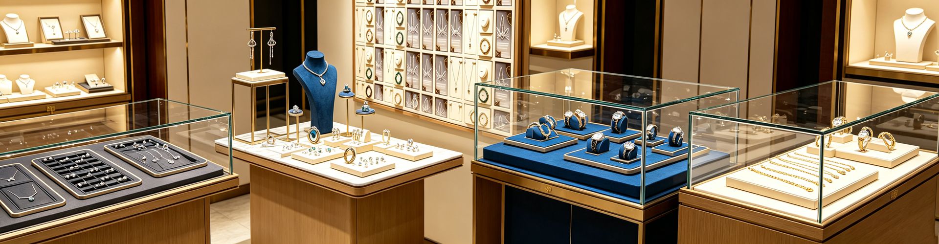
Q3: Can simple packaging really move price and conversion?
A: Yes, and the effect shows up on the bottom line. Shopify's 2025 commerce report notes that products with minimalist packaging outsell busier competitors online by roughly 15%, largely because clean layouts photograph better in listings. In cross-border and social commerce, monochrome designs also hold up better as thumbnails; Shopify data suggests single-color schemes perform about 37% better in cross-border sales. More fundamentally, a Journal of Marketing study of 1,300 packages found that the simplicity of a design correlates positively with the price consumers are willing to pay. McKinsey's beauty report puts the premium even more concretely: minimalist brands capture 15%–20% higher price elasticity. The foil and multi-pass printing you save can be redirected into fold precision and lining feel — the "worth" a customer senses the moment they pick it up. Good jewelry packaging makes the product, not the carton, the star. The mechanism is visual noise. On a shelf or a feed crowded with claims, badges and gradients, a calm carton reads as confidence; a noisy one reads as an attempt to distract from a weaker product. Minimalist jewelry packaging therefore does double duty — it lowers the cognitive load at the shelf and it survives the shrink of a phone thumbnail, where busy artwork collapses into mud.
Q4: If ornate patterns hide flaws, why choose minimalism?
A: Because the cost of hiding flaws is invisible failure points. Every layer of foil, metal appliqué, and extra cardstock adds a risk of loosening, crushing, or scuffing; by the time the box reaches the customer it already looks tired, and the jewel's aura drops with it. Minimalism pushes the tolerance into the structure: fold deviation held under 0.2 mm, magnet strength calibrated, lining seated flush against the piece. This is exactly the "let the tolerances speak" approach Shenzhen Junyimei applies to jewelry packaging — relying on precision rather than pattern to earn trust. It also trims cost and footprint: the Sustainable Packaging Coalition cites up to 45% less ink use and 60% faster production for pared-back designs. For a store owner, fewer returns and fewer complaints beat one more printed flower. There is a trust dividend too. Sustainability-directory research notes that minimalist packaging reads as more trustworthy and straightforward, because it signals substance over style and aligns with the eco-minded shopper's preference for less material and less waste. When the box is honest about being simple, the customer reads the brand as honest about everything else.
Q1: Why are high-end jewelry brands stripping their packaging down?
A: Because restraint has become the new signal of luxury. The simplest version of the argument is one our clients hear often: high-end, minimalist jewelry packaging is more likely to win a customer's favor. And the data backs it up. Ipsos' 2025 consumer-trends research found that 72% of consumers say clean, simple packaging makes a product look more premium. In controlled tests, minimalist packaging was judged 34% more premium and 28% more trustworthy than busy, information-dense packaging — even though the actual products were identical. The Luxury Institute reports that 68% of consumers associate minimalist design with premium quality. Brands like Apple, Aesop and Glossier prove that restraint can command a premium price; sometimes the absence of design is the design. When Shenzhen Junyimei works on a custom jewelry box, the brief is consistent: once the all-over foil and layered patterns step back, the box is left speaking only through its structure, material, and proportions — exactly the things a true luxury brand is least afraid to be compared on. There is also a quieter logic at work: when a box stops performing, it starts promising. A Harvard Business Review look at logos found that clear, descriptive marks — Apple, Starbucks — connect better than abstract symbols, because they reference what the brand actually offers. Minimalist jewelry packaging does the same thing for the product: it points at the jewel instead of at itself. Restraint, in other words, is not absence; it is a decision about what deserves the spotlight.
Q2: Doesn't "minimal" just mean "no design"?
A: Quite the opposite — minimalism is the hardest discipline. Negative space is not emptiness; it is breathing room. The most effective minimalist packages dedicate 60%–70% of their surface to blank space and keep a single focal point, usually with one typeface in at most two weights. A 2024 Journal of Consumer Psychology study found people process minimalist designs about 30% faster than complex ones; in an overloaded retail environment, that 30% is the gap between "seen" and "scrolled past." Psychologists call it the "empty canvas effect": the quieter the box, the more the customer projects their own story onto the jewel. A well-edited jewelry box design lets the stone be the only hero instead of a supporting act upstaged by its own trim. The restraint of the packaging, in the end, becomes the presence of the jewel itself. It is also why minimalism travels: a single clean silhouette reads correctly whether it sits under warm in-store light or under the flat flash of a phone camera, while a busy pattern can shift color and lose its legibility the moment the lighting changes.
Q3: Can simple packaging really move price and conversion?
A: Yes, and the effect shows up on the bottom line. Shopify's 2025 commerce report notes that products with minimalist packaging outsell busier competitors online by roughly 15%, largely because clean layouts photograph better in listings. In cross-border and social commerce, monochrome designs also hold up better as thumbnails; Shopify data suggests single-color schemes perform about 37% better in cross-border sales. More fundamentally, a Journal of Marketing study of 1,300 packages found that the simplicity of a design correlates positively with the price consumers are willing to pay. McKinsey's beauty report puts the premium even more concretely: minimalist brands capture 15%–20% higher price elasticity. The foil and multi-pass printing you save can be redirected into fold precision and lining feel — the "worth" a customer senses the moment they pick it up. Good jewelry packaging makes the product, not the carton, the star. The mechanism is visual noise. On a shelf or a feed crowded with claims, badges and gradients, a calm carton reads as confidence; a noisy one reads as an attempt to distract from a weaker product. Minimalist jewelry packaging therefore does double duty — it lowers the cognitive load at the shelf and it survives the shrink of a phone thumbnail, where busy artwork collapses into mud.
Q4: If ornate patterns hide flaws, why choose minimalism?
A: Because the cost of hiding flaws is invisible failure points. Every layer of foil, metal appliqué, and extra cardstock adds a risk of loosening, crushing, or scuffing; by the time the box reaches the customer it already looks tired, and the jewel's aura drops with it. Minimalism pushes the tolerance into the structure: fold deviation held under 0.2 mm, magnet strength calibrated, lining seated flush against the piece. This is exactly the "let the tolerances speak" approach Shenzhen Junyimei applies to jewelry packaging — relying on precision rather than pattern to earn trust. It also trims cost and footprint: the Sustainable Packaging Coalition cites up to 45% less ink use and 60% faster production for pared-back designs. For a store owner, fewer returns and fewer complaints beat one more printed flower. There is a trust dividend too. Sustainability-directory research notes that minimalist packaging reads as more trustworthy and straightforward, because it signals substance over style and aligns with the eco-minded shopper's preference for less material and less waste. When the box is honest about being simple, the customer reads the brand as honest about everything else.
 Q5: Why do younger buyers reward quiet packaging?
A: Because they grew up in a flood of information. Vogue Business estimates Gen Z judges a package in just 0.3 seconds; in Nielsen's 2025 data, 78% of millennials prefer "quiet luxury" packaging over busy design. The values matter more: 49% of Gen Z will pay extra for eco-friendly packaging (Shorr Packaging 2025), 61% of consumers overall favor minimal packaging, and 53% of Gen Z will actively drop brands that over-use plastic. A 2025 Uprinting survey adds that 77% of Americans trust brands more when packaging looks eco-friendly, and 90% of consumers say they are more likely to support brands that prioritize it. That impulse aligns neatly with the logic of a reusable, opaque, clearly labeled jewelry pouch — long after leaving the counter, the pouch is still speaking for the brand. Moving budget from one-time spectacle to recyclable restraint is the vote this generation casts with its wallet. The scale is hard to ignore: EcoPackables projects Gen Z's global spending power at roughly 12 trillion dollars by 2030, and 54% of that cohort have actively searched online for sustainable packaging. In that world, a jewelry pouch that is reusable and clearly labeled is not a cost line — it is a small, repeated brand impression that travels from the counter into a drawer, a gift, and a photo.
Q6: How do you make "simple" feel premium instead of cheap?
A: The answer is material and precision, not accumulation. In minimalist design the material is the aesthetic: the tactile fiber of specialty paper, the low-key sheen of a matte finish, the fine line of blind embossing all read as more expensive than full-bleed printing. On color, one or two Pantone spot inks on a natural substrate out-power a full CMYK rainbow. Material choice does the heavy lifting that printing used to: a matte black rigid box reads as luxury minimalism, natural kraft reads as honest and earthy, white reads as clinical and clean. Pick the substrate before the graphics, and the paper itself starts carrying the brand. The same holds for display props — restrained reflection and a clean backdrop let that sapphire blue or emerald green become the focus instead of washing out under mirror glare. The pitfall to avoid, noted by Packaging Technology Today, is "generic minimalism": strip the design without investing in structure and a store-brand kind of minimalism can feel cheap. The craft details are what separate the two outcomes. Uncoated stock shows its fiber; a single blind-embossed mark rewards a second look; one focal element — a logo, a name, a line — is all the eye needs. Aesop's clinical typography, for instance, lifted perceived efficacy by 28% in consumer surveys, proof that restraint, executed with care, is read as competence. Shenzhen Junyimei keeps proving in custom jewelry boxes that once decoration steps back, what remains — the fold, the magnet, the lining fit — is the entire substance of premium feel. Minimalism is not doing less; it is doing every part right.
This is original content. Copyright belongs to Shenzhen Junyimei.
Q5: Why do younger buyers reward quiet packaging?
A: Because they grew up in a flood of information. Vogue Business estimates Gen Z judges a package in just 0.3 seconds; in Nielsen's 2025 data, 78% of millennials prefer "quiet luxury" packaging over busy design. The values matter more: 49% of Gen Z will pay extra for eco-friendly packaging (Shorr Packaging 2025), 61% of consumers overall favor minimal packaging, and 53% of Gen Z will actively drop brands that over-use plastic. A 2025 Uprinting survey adds that 77% of Americans trust brands more when packaging looks eco-friendly, and 90% of consumers say they are more likely to support brands that prioritize it. That impulse aligns neatly with the logic of a reusable, opaque, clearly labeled jewelry pouch — long after leaving the counter, the pouch is still speaking for the brand. Moving budget from one-time spectacle to recyclable restraint is the vote this generation casts with its wallet. The scale is hard to ignore: EcoPackables projects Gen Z's global spending power at roughly 12 trillion dollars by 2030, and 54% of that cohort have actively searched online for sustainable packaging. In that world, a jewelry pouch that is reusable and clearly labeled is not a cost line — it is a small, repeated brand impression that travels from the counter into a drawer, a gift, and a photo.
Q6: How do you make "simple" feel premium instead of cheap?
A: The answer is material and precision, not accumulation. In minimalist design the material is the aesthetic: the tactile fiber of specialty paper, the low-key sheen of a matte finish, the fine line of blind embossing all read as more expensive than full-bleed printing. On color, one or two Pantone spot inks on a natural substrate out-power a full CMYK rainbow. Material choice does the heavy lifting that printing used to: a matte black rigid box reads as luxury minimalism, natural kraft reads as honest and earthy, white reads as clinical and clean. Pick the substrate before the graphics, and the paper itself starts carrying the brand. The same holds for display props — restrained reflection and a clean backdrop let that sapphire blue or emerald green become the focus instead of washing out under mirror glare. The pitfall to avoid, noted by Packaging Technology Today, is "generic minimalism": strip the design without investing in structure and a store-brand kind of minimalism can feel cheap. The craft details are what separate the two outcomes. Uncoated stock shows its fiber; a single blind-embossed mark rewards a second look; one focal element — a logo, a name, a line — is all the eye needs. Aesop's clinical typography, for instance, lifted perceived efficacy by 28% in consumer surveys, proof that restraint, executed with care, is read as competence. Shenzhen Junyimei keeps proving in custom jewelry boxes that once decoration steps back, what remains — the fold, the magnet, the lining fit — is the entire substance of premium feel. Minimalism is not doing less; it is doing every part right.
This is original content. Copyright belongs to Shenzhen Junyimei.
Junyimei — present every jewel and timepiece at its best.在柜台前,顾客平均只给一件珠宝不到一秒的注意力;而决定这“一秒”买不买账的,常常不是石头本身,而是装它的那只盒子。今天我们把话题交给一个被反复验证、却总被低估的判断:高端简约的珠宝首饰品包装设计,更容易被顾客青睐。这句话听起来像一句审美偏好,但它背后站着一连串可核对的消费数据。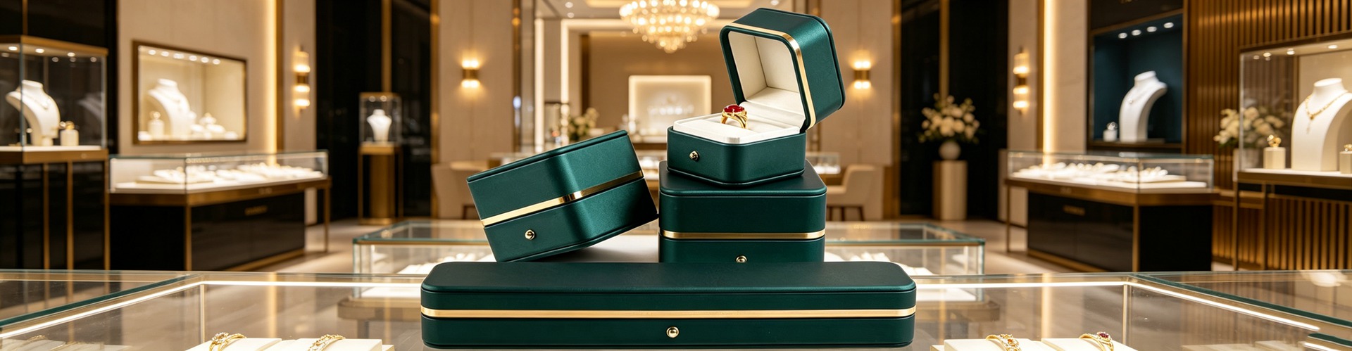 Q1:为什么高端珠宝包装越来越“做减法”?
A:因为克制,正在成为新的高级感。老板常挂在嘴边的一句话很直白——高端简约的珠宝首饰品包装设计,更容易被顾客青睐。这不是感觉,是有数据的。Ipsos 2025 消费者趋势调研显示,72% 的消费者认为“干净、简单的包装让产品看起来更高级”;在一项对照实验里,简约包装比信息密集的繁复包装,被感知为“高级感高出 34%、可信度高 28%”,而两组的实物完全一样。Luxury Institute 的研究也给出佐证:68% 的消费者会把“极简设计”与“优质品质”直接挂钩。苹果、Aesop、Glossier 这些品牌反复证明,有时“没有设计”恰恰是设计本身,简约就能撑起溢价。深圳骏依美在做珠宝盒定制时反复提醒客户:当满版烫金和层层花纹退场,盒子就只剩下结构、材质和比例说话,而这恰恰是高端品牌最不怕被比较的地方。
Q2:简约,等于“没设计”吗?
A:正好相反,简约是最考验设计功力的一种。所谓留白,不是空,而是“呼吸的空间”——业内公认有效的极简包装,会把 60%–70% 的表面留给空白,只保留一个视觉焦点,字体通常也只用一个家族、至多两种字重。Journal of Consumer Psychology 2024 的研究发现,消费者处理极简设计比处理复杂设计快约 30%;在信息过载的柜台,这 30% 就是“被看见”和“被划走”的区别。心理学上叫“空画布效应”:盒子越安静,顾客越容易把自己的想象投射到珠宝上。首饰盒设计一旦学会做减法,主石就成了唯一的主角,而不是被花边抢戏的配角;包装的克制,最后都变成了珠宝本身的存在感。
Q3:简约包装,真的能影响成交和价格吗?
A:能,而且影响直接在账面上。Shopify 2025 电商报告提到,采用极简包装的产品线上销量平均高出约 15%,原因很朴素——干净的版面在商品图里更“上相”。在跨境与社媒场景,单色极简方案在缩略图里表现更稳,有数据称单色设计在跨境电商中表现高出约 37%。更根本的是价格感知:一项覆盖 1300 件包装的 Journal of Marketing 研究发现,包装设计的“简”与消费者愿意支付的价格呈正相关;麦肯锡美妆报告则指出,极简品牌能拿到 15%–20% 更高的价格弹性。换句话说,省下的烫金和套印预算,本可以挪去打磨折边精度和内衬手感,而这恰恰是顾客上手就能摸到的“值”。
Q4:繁复花纹能遮丑,为什么反而更该用简约?
A:因为遮丑的代价,是看不见的失效点。满版花纹、金属贴片、多层卡纸,每一层都多一个松脱、压陷、刮花的风险;等顾客拿到手,盒子已经“显脏”,珠宝的贵气先掉了一半。极简的思路是把容错交给结构:折边误差控制在 0.2 毫米以内、磁吸力度经过标定、内衬与首饰严丝合缝。深圳骏依美在珠宝包装上坚持的,就是这样一套“用公差说话”的做法——不靠图案掩盖,而靠精度让人放心。这还顺带省了成本与环境负担:可持续包装联盟统计,极简设计可减油墨约 45%、生产提速约 60%。对店主来说,少返修、少客诉,比多印一朵花实在得多。
Q1:为什么高端珠宝包装越来越“做减法”?
A:因为克制,正在成为新的高级感。老板常挂在嘴边的一句话很直白——高端简约的珠宝首饰品包装设计,更容易被顾客青睐。这不是感觉,是有数据的。Ipsos 2025 消费者趋势调研显示,72% 的消费者认为“干净、简单的包装让产品看起来更高级”;在一项对照实验里,简约包装比信息密集的繁复包装,被感知为“高级感高出 34%、可信度高 28%”,而两组的实物完全一样。Luxury Institute 的研究也给出佐证:68% 的消费者会把“极简设计”与“优质品质”直接挂钩。苹果、Aesop、Glossier 这些品牌反复证明,有时“没有设计”恰恰是设计本身,简约就能撑起溢价。深圳骏依美在做珠宝盒定制时反复提醒客户:当满版烫金和层层花纹退场,盒子就只剩下结构、材质和比例说话,而这恰恰是高端品牌最不怕被比较的地方。
Q2:简约,等于“没设计”吗?
A:正好相反,简约是最考验设计功力的一种。所谓留白,不是空,而是“呼吸的空间”——业内公认有效的极简包装,会把 60%–70% 的表面留给空白,只保留一个视觉焦点,字体通常也只用一个家族、至多两种字重。Journal of Consumer Psychology 2024 的研究发现,消费者处理极简设计比处理复杂设计快约 30%;在信息过载的柜台,这 30% 就是“被看见”和“被划走”的区别。心理学上叫“空画布效应”:盒子越安静,顾客越容易把自己的想象投射到珠宝上。首饰盒设计一旦学会做减法,主石就成了唯一的主角,而不是被花边抢戏的配角;包装的克制,最后都变成了珠宝本身的存在感。
Q3:简约包装,真的能影响成交和价格吗?
A:能,而且影响直接在账面上。Shopify 2025 电商报告提到,采用极简包装的产品线上销量平均高出约 15%,原因很朴素——干净的版面在商品图里更“上相”。在跨境与社媒场景,单色极简方案在缩略图里表现更稳,有数据称单色设计在跨境电商中表现高出约 37%。更根本的是价格感知:一项覆盖 1300 件包装的 Journal of Marketing 研究发现,包装设计的“简”与消费者愿意支付的价格呈正相关;麦肯锡美妆报告则指出,极简品牌能拿到 15%–20% 更高的价格弹性。换句话说,省下的烫金和套印预算,本可以挪去打磨折边精度和内衬手感,而这恰恰是顾客上手就能摸到的“值”。
Q4:繁复花纹能遮丑,为什么反而更该用简约?
A:因为遮丑的代价,是看不见的失效点。满版花纹、金属贴片、多层卡纸,每一层都多一个松脱、压陷、刮花的风险;等顾客拿到手,盒子已经“显脏”,珠宝的贵气先掉了一半。极简的思路是把容错交给结构:折边误差控制在 0.2 毫米以内、磁吸力度经过标定、内衬与首饰严丝合缝。深圳骏依美在珠宝包装上坚持的,就是这样一套“用公差说话”的做法——不靠图案掩盖,而靠精度让人放心。这还顺带省了成本与环境负担:可持续包装联盟统计,极简设计可减油墨约 45%、生产提速约 60%。对店主来说,少返修、少客诉,比多印一朵花实在得多。
 Q5:为什么年轻一代更偏爱“安静的包装”?
A:因为他们是在信息洪流里长大的一代。Vogue Business 2025 的估算很扎心:Z 世代判断一件包装只需 0.3 秒;尼尔森 2025 调研里,78% 的千禧一代偏好“静奢”包装胜过花哨设计。更重要的是价值观:49% 的 Z 世代愿为环保包装多付钱(Shorr Packaging 2025),61% 的消费者整体偏好极简包装,53% 的 Z 世代会主动拉黑“过度塑料包装”的品牌。Uprinting 2025 调研还显示,77% 的美国消费者更信任环保包装的品牌,90% 的人更愿支持重视环保包装的品牌。这股风,正好和“可复用、不透光、标识清晰”的首饰袋逻辑合拍——离开柜台后,那只袋子还在替品牌说话。把预算从一次性华丽,挪到可循环的克制,是这一代人用钱包投的票。
Q6:怎么把“简约”做成高级感,而不是“廉价感”?
A:关键在材质和精度,不在堆砌。极简设计里,材料本身就是美学:特种纸的纤维触感、哑面处理的低调光泽、盲压凸起的细腻线条,都比满版印刷更“贵”。配色上,1–2 个潘通专色配原色纸,比一套 CMYK 彩虹更有力量。珠宝陈列道具同理——克制的反光、干净的背景,才让那抹蓝或那片绿成为焦点,而不是被镜面晃成死白。要避开“廉价极简”的坑:包装科技媒体提醒,若只删设计不投结构,自有品牌式极简反而显廉价。深圳骏依美在珠宝盒定制里反复验证,装饰退场后,折边、磁吸、内衬贴合度才是高级感的全部底气。首饰盒设计的最高境界,不是少做,是把每一分都做对。
本文为原创内容,版权归深圳骏依美所有,转载请注明出处。
Q5:为什么年轻一代更偏爱“安静的包装”?
A:因为他们是在信息洪流里长大的一代。Vogue Business 2025 的估算很扎心:Z 世代判断一件包装只需 0.3 秒;尼尔森 2025 调研里,78% 的千禧一代偏好“静奢”包装胜过花哨设计。更重要的是价值观:49% 的 Z 世代愿为环保包装多付钱(Shorr Packaging 2025),61% 的消费者整体偏好极简包装,53% 的 Z 世代会主动拉黑“过度塑料包装”的品牌。Uprinting 2025 调研还显示,77% 的美国消费者更信任环保包装的品牌,90% 的人更愿支持重视环保包装的品牌。这股风,正好和“可复用、不透光、标识清晰”的首饰袋逻辑合拍——离开柜台后,那只袋子还在替品牌说话。把预算从一次性华丽,挪到可循环的克制,是这一代人用钱包投的票。
Q6:怎么把“简约”做成高级感,而不是“廉价感”?
A:关键在材质和精度,不在堆砌。极简设计里,材料本身就是美学:特种纸的纤维触感、哑面处理的低调光泽、盲压凸起的细腻线条,都比满版印刷更“贵”。配色上,1–2 个潘通专色配原色纸,比一套 CMYK 彩虹更有力量。珠宝陈列道具同理——克制的反光、干净的背景,才让那抹蓝或那片绿成为焦点,而不是被镜面晃成死白。要避开“廉价极简”的坑:包装科技媒体提醒,若只删设计不投结构,自有品牌式极简反而显廉价。深圳骏依美在珠宝盒定制里反复验证,装饰退场后,折边、磁吸、内衬贴合度才是高级感的全部底气。首饰盒设计的最高境界,不是少做,是把每一分都做对。
本文为原创内容,版权归深圳骏依美所有,转载请注明出处。
骏依美——让每一件珠宝与腕表,都被更好地呈现。
Q1: Why are high-end jewelry brands stripping their packaging down?
A: Because restraint has become the new signal of luxury. The simplest version of the argument is one our clients hear often: high-end, minimalist jewelry packaging is more likely to win a customer's favor. And the data backs it up. Ipsos' 2025 consumer-trends research found that 72% of consumers say clean, simple packaging makes a product look more premium. In controlled tests, minimalist packaging was judged 34% more premium and 28% more trustworthy than busy, information-dense packaging — even though the actual products were identical. The Luxury Institute reports that 68% of consumers associate minimalist design with premium quality. Brands like Apple, Aesop and Glossier prove that restraint can command a premium price; sometimes the absence of design is the design. When Shenzhen Junyimei works on a custom jewelry box, the brief is consistent: once the all-over foil and layered patterns step back, the box is left speaking only through its structure, material, and proportions — exactly the things a true luxury brand is least afraid to be compared on. There is also a quieter logic at work: when a box stops performing, it starts promising. A Harvard Business Review look at logos found that clear, descriptive marks — Apple, Starbucks — connect better than abstract symbols, because they reference what the brand actually offers. Minimalist jewelry packaging does the same thing for the product: it points at the jewel instead of at itself. Restraint, in other words, is not absence; it is a decision about what deserves the spotlight.
Q2: Doesn't "minimal" just mean "no design"?
A: Quite the opposite — minimalism is the hardest discipline. Negative space is not emptiness; it is breathing room. The most effective minimalist packages dedicate 60%–70% of their surface to blank space and keep a single focal point, usually with one typeface in at most two weights. A 2024 Journal of Consumer Psychology study found people process minimalist designs about 30% faster than complex ones; in an overloaded retail environment, that 30% is the gap between "seen" and "scrolled past." Psychologists call it the "empty canvas effect": the quieter the box, the more the customer projects their own story onto the jewel. A well-edited jewelry box design lets the stone be the only hero instead of a supporting act upstaged by its own trim. The restraint of the packaging, in the end, becomes the presence of the jewel itself. It is also why minimalism travels: a single clean silhouette reads correctly whether it sits under warm in-store light or under the flat flash of a phone camera, while a busy pattern can shift color and lose its legibility the moment the lighting changes.
Q3: Can simple packaging really move price and conversion?
A: Yes, and the effect shows up on the bottom line. Shopify's 2025 commerce report notes that products with minimalist packaging outsell busier competitors online by roughly 15%, largely because clean layouts photograph better in listings. In cross-border and social commerce, monochrome designs also hold up better as thumbnails; Shopify data suggests single-color schemes perform about 37% better in cross-border sales. More fundamentally, a Journal of Marketing study of 1,300 packages found that the simplicity of a design correlates positively with the price consumers are willing to pay. McKinsey's beauty report puts the premium even more concretely: minimalist brands capture 15%–20% higher price elasticity. The foil and multi-pass printing you save can be redirected into fold precision and lining feel — the "worth" a customer senses the moment they pick it up. Good jewelry packaging makes the product, not the carton, the star. The mechanism is visual noise. On a shelf or a feed crowded with claims, badges and gradients, a calm carton reads as confidence; a noisy one reads as an attempt to distract from a weaker product. Minimalist jewelry packaging therefore does double duty — it lowers the cognitive load at the shelf and it survives the shrink of a phone thumbnail, where busy artwork collapses into mud.
Q4: If ornate patterns hide flaws, why choose minimalism?
A: Because the cost of hiding flaws is invisible failure points. Every layer of foil, metal appliqué, and extra cardstock adds a risk of loosening, crushing, or scuffing; by the time the box reaches the customer it already looks tired, and the jewel's aura drops with it. Minimalism pushes the tolerance into the structure: fold deviation held under 0.2 mm, magnet strength calibrated, lining seated flush against the piece. This is exactly the "let the tolerances speak" approach Shenzhen Junyimei applies to jewelry packaging — relying on precision rather than pattern to earn trust. It also trims cost and footprint: the Sustainable Packaging Coalition cites up to 45% less ink use and 60% faster production for pared-back designs. For a store owner, fewer returns and fewer complaints beat one more printed flower. There is a trust dividend too. Sustainability-directory research notes that minimalist packaging reads as more trustworthy and straightforward, because it signals substance over style and aligns with the eco-minded shopper's preference for less material and less waste. When the box is honest about being simple, the customer reads the brand as honest about everything else.
Q5: Why do younger buyers reward quiet packaging?
A: Because they grew up in a flood of information. Vogue Business estimates Gen Z judges a package in just 0.3 seconds; in Nielsen's 2025 data, 78% of millennials prefer "quiet luxury" packaging over busy design. The values matter more: 49% of Gen Z will pay extra for eco-friendly packaging (Shorr Packaging 2025), 61% of consumers overall favor minimal packaging, and 53% of Gen Z will actively drop brands that over-use plastic. A 2025 Uprinting survey adds that 77% of Americans trust brands more when packaging looks eco-friendly, and 90% of consumers say they are more likely to support brands that prioritize it. That impulse aligns neatly with the logic of a reusable, opaque, clearly labeled jewelry pouch — long after leaving the counter, the pouch is still speaking for the brand. Moving budget from one-time spectacle to recyclable restraint is the vote this generation casts with its wallet. The scale is hard to ignore: EcoPackables projects Gen Z's global spending power at roughly 12 trillion dollars by 2030, and 54% of that cohort have actively searched online for sustainable packaging. In that world, a jewelry pouch that is reusable and clearly labeled is not a cost line — it is a small, repeated brand impression that travels from the counter into a drawer, a gift, and a photo.
Q6: How do you make "simple" feel premium instead of cheap?
A: The answer is material and precision, not accumulation. In minimalist design the material is the aesthetic: the tactile fiber of specialty paper, the low-key sheen of a matte finish, the fine line of blind embossing all read as more expensive than full-bleed printing. On color, one or two Pantone spot inks on a natural substrate out-power a full CMYK rainbow. Material choice does the heavy lifting that printing used to: a matte black rigid box reads as luxury minimalism, natural kraft reads as honest and earthy, white reads as clinical and clean. Pick the substrate before the graphics, and the paper itself starts carrying the brand. The same holds for display props — restrained reflection and a clean backdrop let that sapphire blue or emerald green become the focus instead of washing out under mirror glare. The pitfall to avoid, noted by Packaging Technology Today, is "generic minimalism": strip the design without investing in structure and a store-brand kind of minimalism can feel cheap. The craft details are what separate the two outcomes. Uncoated stock shows its fiber; a single blind-embossed mark rewards a second look; one focal element — a logo, a name, a line — is all the eye needs. Aesop's clinical typography, for instance, lifted perceived efficacy by 28% in consumer surveys, proof that restraint, executed with care, is read as competence. Shenzhen Junyimei keeps proving in custom jewelry boxes that once decoration steps back, what remains — the fold, the magnet, the lining fit — is the entire substance of premium feel. Minimalism is not doing less; it is doing every part right.
This is original content. Copyright belongs to Shenzhen Junyimei.Junyimei — present every jewel and timepiece at its best.在柜台前,顾客平均只给一件珠宝不到一秒的注意力;而决定这“一秒”买不买账的,常常不是石头本身,而是装它的那只盒子。今天我们把话题交给一个被反复验证、却总被低估的判断:高端简约的珠宝首饰品包装设计,更容易被顾客青睐。这句话听起来像一句审美偏好,但它背后站着一连串可核对的消费数据。
Q1:为什么高端珠宝包装越来越“做减法”?
A:因为克制,正在成为新的高级感。老板常挂在嘴边的一句话很直白——高端简约的珠宝首饰品包装设计,更容易被顾客青睐。这不是感觉,是有数据的。Ipsos 2025 消费者趋势调研显示,72% 的消费者认为“干净、简单的包装让产品看起来更高级”;在一项对照实验里,简约包装比信息密集的繁复包装,被感知为“高级感高出 34%、可信度高 28%”,而两组的实物完全一样。Luxury Institute 的研究也给出佐证:68% 的消费者会把“极简设计”与“优质品质”直接挂钩。苹果、Aesop、Glossier 这些品牌反复证明,有时“没有设计”恰恰是设计本身,简约就能撑起溢价。深圳骏依美在做珠宝盒定制时反复提醒客户:当满版烫金和层层花纹退场,盒子就只剩下结构、材质和比例说话,而这恰恰是高端品牌最不怕被比较的地方。
Q2:简约,等于“没设计”吗?
A:正好相反,简约是最考验设计功力的一种。所谓留白,不是空,而是“呼吸的空间”——业内公认有效的极简包装,会把 60%–70% 的表面留给空白,只保留一个视觉焦点,字体通常也只用一个家族、至多两种字重。Journal of Consumer Psychology 2024 的研究发现,消费者处理极简设计比处理复杂设计快约 30%;在信息过载的柜台,这 30% 就是“被看见”和“被划走”的区别。心理学上叫“空画布效应”:盒子越安静,顾客越容易把自己的想象投射到珠宝上。首饰盒设计一旦学会做减法,主石就成了唯一的主角,而不是被花边抢戏的配角;包装的克制,最后都变成了珠宝本身的存在感。
Q3:简约包装,真的能影响成交和价格吗?
A:能,而且影响直接在账面上。Shopify 2025 电商报告提到,采用极简包装的产品线上销量平均高出约 15%,原因很朴素——干净的版面在商品图里更“上相”。在跨境与社媒场景,单色极简方案在缩略图里表现更稳,有数据称单色设计在跨境电商中表现高出约 37%。更根本的是价格感知:一项覆盖 1300 件包装的 Journal of Marketing 研究发现,包装设计的“简”与消费者愿意支付的价格呈正相关;麦肯锡美妆报告则指出,极简品牌能拿到 15%–20% 更高的价格弹性。换句话说,省下的烫金和套印预算,本可以挪去打磨折边精度和内衬手感,而这恰恰是顾客上手就能摸到的“值”。
Q4:繁复花纹能遮丑,为什么反而更该用简约?
A:因为遮丑的代价,是看不见的失效点。满版花纹、金属贴片、多层卡纸,每一层都多一个松脱、压陷、刮花的风险;等顾客拿到手,盒子已经“显脏”,珠宝的贵气先掉了一半。极简的思路是把容错交给结构:折边误差控制在 0.2 毫米以内、磁吸力度经过标定、内衬与首饰严丝合缝。深圳骏依美在珠宝包装上坚持的,就是这样一套“用公差说话”的做法——不靠图案掩盖,而靠精度让人放心。这还顺带省了成本与环境负担:可持续包装联盟统计,极简设计可减油墨约 45%、生产提速约 60%。对店主来说,少返修、少客诉,比多印一朵花实在得多。
Q5:为什么年轻一代更偏爱“安静的包装”?
A:因为他们是在信息洪流里长大的一代。Vogue Business 2025 的估算很扎心:Z 世代判断一件包装只需 0.3 秒;尼尔森 2025 调研里,78% 的千禧一代偏好“静奢”包装胜过花哨设计。更重要的是价值观:49% 的 Z 世代愿为环保包装多付钱(Shorr Packaging 2025),61% 的消费者整体偏好极简包装,53% 的 Z 世代会主动拉黑“过度塑料包装”的品牌。Uprinting 2025 调研还显示,77% 的美国消费者更信任环保包装的品牌,90% 的人更愿支持重视环保包装的品牌。这股风,正好和“可复用、不透光、标识清晰”的首饰袋逻辑合拍——离开柜台后,那只袋子还在替品牌说话。把预算从一次性华丽,挪到可循环的克制,是这一代人用钱包投的票。
Q6:怎么把“简约”做成高级感,而不是“廉价感”?
A:关键在材质和精度,不在堆砌。极简设计里,材料本身就是美学:特种纸的纤维触感、哑面处理的低调光泽、盲压凸起的细腻线条,都比满版印刷更“贵”。配色上,1–2 个潘通专色配原色纸,比一套 CMYK 彩虹更有力量。珠宝陈列道具同理——克制的反光、干净的背景,才让那抹蓝或那片绿成为焦点,而不是被镜面晃成死白。要避开“廉价极简”的坑:包装科技媒体提醒,若只删设计不投结构,自有品牌式极简反而显廉价。深圳骏依美在珠宝盒定制里反复验证,装饰退场后,折边、磁吸、内衬贴合度才是高级感的全部底气。首饰盒设计的最高境界,不是少做,是把每一分都做对。
本文为原创内容,版权归深圳骏依美所有,转载请注明出处。骏依美——让每一件珠宝与腕表,都被更好地呈现。