What Travel Retail Teaches Jewelry免税柜台的展陈课
For decades, "duty-free" meant a last-minute scramble before boarding: grab a bottle of gin, a box of chocolates, and run for the gate. By 2026, the sixty minutes between security and boarding have a new name in the industry — the "golden hour" — and they have become the most valuable hour in the world of luxury. As Hainan's offshore duty-free stores and airport shops push jewellery and watches to the front, how the counter is arranged and how the box is built are being redefined.
Q1. Just how hot is jewellery and watch retail in the duty-free channel?
The numbers tell the story. Hainan customs data show that offshore duty-free sales reached 19.92 billion yuan in the first half of 2026 with 2.79 million shoppers, up 18.8% and 12.6% year on year. In Q1, Haikou's duty-free retail sales rose 37%, with gold and jewellery surging 61.3%. Sanya's four duty-free stores topped 10.06 billion yuan in Q1, up 28.2%. Haikou International Duty Free City has logged 3.38 million visits since the new policy, up 46%, with both volume and price rising. Brands are doubling down: the sixth CDF Watch Festival gathered more than 70 jewellery and watch brands, with global debuts staged through the CDF channel; Haikou Meilan Airport opened nearly 4,000 square metres of new retail space and almost 40 new stores in the first half, watches front and centre. Globally, travel retail is now a market of over 70 billion US dollars, with Asia-Pacific as its engine and Hainan described by foreign media as the world's duty-free "laboratory." In short: jewellery and watches are no longer the supporting act — they are the new growth pole.
Q2. Why does travel retail demand something different from display props?
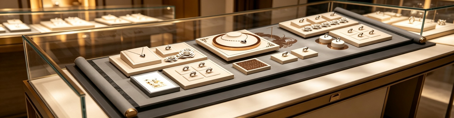
Because the shopper's state of mind is different. Analysts call the stretch from security to boarding the "golden hour" — travellers enter with a "vacation mindset" and a far higher appetite for high-ticket, impulse purchases. That means the display has to stop, hold and convince in a very short window. With heavy footfall, mixed languages and a boarding clock ticking, the jewellery display props inside the case cannot merely look pretty: the hero position needs a clear visual focus, with limited debut pieces lit and stood up on their own so they can be locked onto from five metres away; jewellery display stands should sit in the 1.2-to-1.6-metre golden sightline; the flow must be smooth so a queue never keeps people from the glass. A global-debut watch is scarcity manufactured through exclusivity — and focus display is what amplifies it. In travel retail, props are fighting for attention inside those sixty minutes.
Q3. Why must duty-free and airport packaging be both "grab-and-go" and travel-proof?
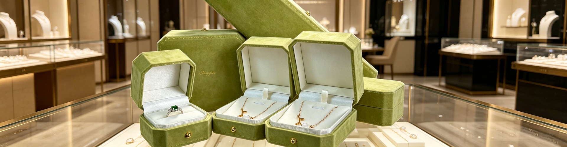
This is a physical constraint unique to travel retail. Hainan runs "buy-and-collect on the spot," airports have embraced "order online, collect at the gate," and packaging must be handed over in minutes — no more waiting to be wrapped. What matters more is the journey that follows: the piece gets stuffed into a carry-on or a wheelie case, endures the crush and vibration of checked baggage, temperature and humidity swings, and may be opened for customs inspection. So the first priority for travel-retail packaging is light, stable and protective — a watch box whose pillow size, lining firmness and closing force can survive the knocks of transit, rather than leaning on layers of foam shells for a sense of grandeur. With departure tax refunds rising fast (Haikou refund applications jumped 16.8-fold in the first half), the original box, invoice and certificate increasingly become documents travellers carry, so the box must reserve fixed slots for them. Here, packaging is not ceremony — it is a seatbelt for the trip.
Q4. Why is minimalist high-end packaging actually favoured in a duty-free setting?
Because travel retail stacks "many nationalities" on top of "a very short decision," and minimalism has three edges here. First, a universal language: Russian, Southeast Asian, Middle Eastern and European customers buy side by side, and any ornate symbol risks offending one culture or another; a solid colour with one clean mark is an Esperanto everyone reads and no one misreads. Second, glanceable recognition: in the golden hour a traveller sweeps a row of counters with peripheral vision, the brain processing colour blocks and contrast first, so full-surface foil blurs on the move while a matte solid with a single mark stays legible at a glance. Third, cross-border portability: the simpler the box, often the slimmer, and the easier to fit in hand luggage. A caveat: minimalism is never the cheap option — with no pattern to hide behind, every tolerance falls on the structure; a fold that is 0.2 mm off is caught instantly, and a batch colour shift becomes two colours under duty-free lighting. The real move is shifting budget from surface decoration to structure and tolerance — the consistent philosophy at Shenzhen Junyimei — so the box still stands up under the fussiest light and the shortest time.

Q5. Gold, watches, coloured stones — how should display and packaging differ in duty-free?
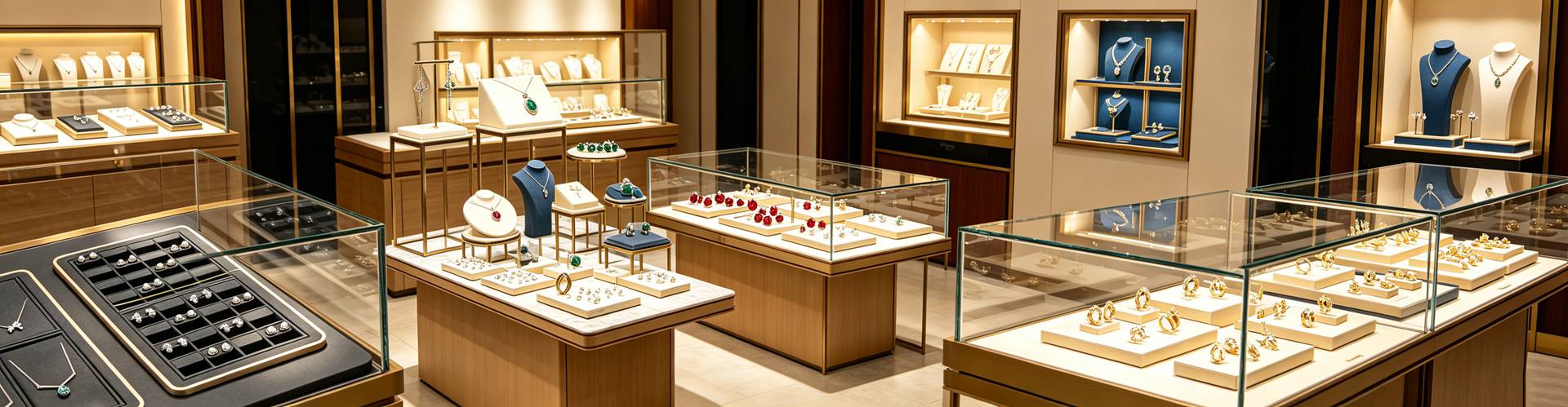
Different categories, different logic. Gold jewellery is the channel's "hard currency" — CDF and Chow Tai Fook have moved gold priced against the live spot rate into Shanghai Pudong Airport, where large-gram bangles and necklaces win on the "tax-free discount" gap; display should highlight weight and craft, and packaging should let travellers compare prices on the spot and carry easily. Watches are about exclusivity and debut — a global first release needs dedicated watch display props to reveal the movement, the caseback and the limited number, while the watch box must hold the warranty card, certificate and spare strap and protect the crystal and movement in transit. Coloured stones and high-value singles rely on light to restore fire and on focus display to create a reason to come specially. What they share: in travel retail, props and packaging must both make a piece clear and easy to pick up in store, and then accompany it through the journey afterward.
Q6. Where can smaller brands step onto the travel-retail train affordably?
Start where the packaging keeps speaking after the sale. First, an opaque, reusable pouch printed with a single clean mark — the traveller stuffs it into a backpack, flies with it, brings it home, and it becomes a moving advertisement for a few yuan, the single biggest visual change across the whole chain. Second, provenance and proof: a numbered card and a QR verification page start at tens of yuan, catching travel retail's rising demand for traceability — surveys report that younger shoppers who ask about supply-chain transparency convert about 15% higher at transparent brands. Third, restrained cross-cultural design to cut misreading among many nationalities; one box shape, recoloured and re-marked, adapts to different source markets. Factories like Shenzhen Junyimei support small-batch flexible sampling — a few hundred units are enough to recolour, test the channel's feedback and then scale. The ticket to travel retail is not about how much you spend on a lavish box, but about thinking through what happens after it is carried away.
The counter fights for a few seconds inside the golden hour; the box fights for the moment a traveller lands and lifts it out of the luggage.
This is original content. Copyright belongs to Shenzhen Junyimei.
Junyimei — present every jewel and timepiece at its best.
过去,"免税"两个字意味着登机前的手忙脚乱——抓一瓶酒、一盒巧克力就冲向登机口。可到了2026年,安检到登机之间的这一小时被行业称作"黄金一小时",成了全球奢侈品最值钱的六十分钟。当海南离岛免税和机场免税店把珠宝腕表推上风口,柜台该怎么摆、盒子该怎么做,正在被重新定义。
问一:免税和旅游零售渠道的珠宝腕表,到底有多热?
热度是数字给的。海口海关数据显示,2026年上半年海南离岛免税购物金额199.2亿元、购物人数279.3万人次,同比分别增长18.8%和12.6%;一季度海口免税企业零售额同比增长37%,其中金银珠宝类猛增61.3%。三亚一季度4家免税店销售额破100.6亿元、同比增长28.2%,进店与购物人数双双增长两成以上,客单价领跑全省。海口美兰机场上半年新开商业面积近4000平方米、新店近40间,腕表精品是重点。
问二:旅游零售的场景,为什么对陈列道具提出了不一样的要求?
因为顾客的状态不一样。市场分析师把安检到登机称作"黄金一小时"——旅客带着"度假心态"进店,对高单价、冲动型购买的意愿明显更高。这意味着陈列要在极短时间里完成"拦住—留住—打动"三件事。免税城客流大、语言杂、停留时间被航班倒计时压着,柜内的珠宝陈列道具就不能只顾好看:主推位要有明确的视觉焦点,把限量首发款单独打光、单独立起来,让人五米外就锁定;珠宝展示架的高度要落在1.2到1.6米的黄金视线带。旅游零售的道具,是在替品牌抢那六十分钟里的注意力。
问三:免税和机场渠道的包装,为什么必须"即买即走、还要扛得住跨境携带"?
这是旅游零售独有的物理约束。海南推行"即购即提、担保即提",机场普及"线上下单、到店即取",包装要能在几分钟内交付到旅客手上,不能再让人等着现包。更关键的是旅程本身:珠宝腕表要经历托运挤压、颠簸与温湿度变化,还可能被海关开箱查验。所以旅游零售的包装第一位是"轻、稳、扛得住"——手表盒的表枕尺寸、内衬硬度、闭合力要能顶住托运的磕碰,而不是靠一层层泡壳撑体面。再加上离境退税的兴起(上半年海口离境退税申请单同比增加16.8倍),原包装、发票、证书越来越成为旅客要随身留存的凭证,盒内得给这些留出固定位置。包装在这里不是仪式,是旅途里的安全带。
问四:为什么在免税店这种场景,高端简约的珠宝包装反而更容易被青睐?
因为旅游零售是"多国客群 + 极短决策"的叠加,简约在这里有三重优势。第一是通用语言:免税城里俄罗斯、东南亚、中东、欧洲客人挨着买,任何一个花哨符号都可能在某个文化里踩雷,纯色加一枚干净标识,是谁都读得懂、谁都不会误解的"世界语"。第二是缩略认知:黄金一小时里,旅客余光扫过一排柜台,大脑先处理的是色块与明暗,满版烫金在快走中糊成一团,纯色哑面配一枚标识反而在一瞥之间可辨。第三是跨境携带:越简约往往越轻薄,越好塞进随身行李。要提醒的是,简约从来不是省钱——表面没有花纹遮丑,所有容错都交给结构,折边歪0.2毫米一眼看穿。真正的做法,是把预算从表面工艺挪到结构与公差,这也是深圳骏依美一贯的思路:让盒子在最挑剔的灯光和最短的时间里,依然立得住。这正应了一句老话——高端简约的珠宝首饰品包装设计,更容易被顾客青睐。
问五:黄金、腕表、彩宝,在免税渠道的陈列和包装该怎么区别对待?
品类不同,逻辑就不同。黄金珠宝是免税渠道的"硬通货"——中免联合周大福把按实时金价计价的黄金搬进浦东机场,大克重手镯、项链靠"免税即减"的价差取胜,陈列要突出克重与工艺、包装要方便旅客当场比价和随身携带。腕表讲的是"独家与首发",全球首发款需要单独的手表陈列道具把机芯、表背、限量编号亮出来,手表盒要装得下保卡、证书、备用带,还要在托运中护住表镜与机芯。彩宝和高值单品则要靠灯光还原火彩、靠焦点陈列制造"值得专程来买"的理由。共同点是:道具与包装既要让人看得清、拿得动,又要陪它走完离店后的旅程。
问六:中小品牌想搭上旅游零售这班车,能从哪里低成本切入?
先从"离店后还在替你说话"的地方做起。第一,用一只不透光、可重复使用、只印一枚干净标识的首饰袋——旅客把它塞进背包带上飞机、带回家,就是一张会移动的广告,成本不过几元,却是全链条里视觉变化最大的一处。第二,做溯源与凭证:编号卡、二维码验真页几十元就能起步,恰好接住旅游零售里越来越强的溯源诉求——外媒调研显示,追问供应链透明度的年轻客群在透明品牌处转化率高出约15%。第三,用跨文化的克制设计降低多国客群的误读风险,同一盒型换色换标就能适配不同客源。深圳骏依美支持小批量柔性打样,几百只就能先换色试跑免税渠道反馈再放量。旅游零售的入场券,不在于砸钱做华丽包装,而在于把"被带走之后"想在前头。
免税店的柜台争的是黄金一小时里的几秒钟。
本文为原创内容,版权归深圳骏依美所有,转载请注明出处。
骏依美——让每一件珠宝与腕表,都被更好地呈现。