Do Display Props Really Sell Jewelry?陈列道具决定成交
The same ring placed inside a crowded counter and placed alone at the centre of a plain riser does not convert at the same rate. Many stores still treat merchandising as tidying up stock, yet retail data keeps proving otherwise: the counter is a silent salesperson, and display props are its vocabulary. Below are six questions store owners, buyers and brand managers ask us most often.
Q1. Do display props actually move sales, or do they just look nice?
They move sales, by margins too large to ignore. Controlled merchandising data compiled by display specialists attributes roughly a 38% conversion lift to reducing product density alone, about 31% to upgrading LED spotlights, about 27% to occasion-based grouping, about 24% to designating a hero piece, and about 18% to aligning prop materials with brand identity. Applied together, cumulative gains commonly exceed 40%. Separate industry figures suggest a professionally designed showcase raises customer attention by 30%–50% and lifts purchase conversion by up to 20%.
Put in commercial terms: a five-point conversion gain in a store receiving ten thousand visitors a week produces meaningful incremental revenue without a single extra dollar of traffic or marketing spend.
Q2. How many pieces should sit in one counter? Does a fuller case look better stocked?
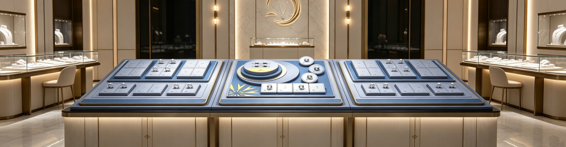
The opposite is true. The most consistent finding in visual merchandising research is that lower density increases per-item engagement time and perceived value. A case holding 15–20 pieces in clear groupings typically outperforms one holding 50 or more on both conversion and average transaction value. Overcrowding triggers cognitive overload, and the default response is not patient browsing but disengagement.
Height matters just as much. Ergonomic studies place roughly 65% of shopper sightlines between 1.6m and 1.7m, while shelving data identifies 50–54 inches as the eye-level buy-level zone; interaction drops sharply below 30 inches and above 60 inches. In a jewellery store, a workable rule is to step display heights down from the entrance inward: a 1.5m case at the door for impact, 1.2m mid-floor for try-on interaction, and 0.9m at the rear for intimate, unhurried selection.
Q3. With a limited budget, should lighting or props be upgraded first?
Lighting, without hesitation. The same diamond can read several times better or worse depending on the light above it. Three parameters need locking down. Colour temperature: 5000–6000K for diamonds and platinum, 3000–3500K for gold, around 4000K for pearls and jade. Colour rendering index: never below CRI 95, or gemstone colour is distorted. Illuminance: display zones should sit at three to five times ambient level, with 500–800 lux over diamond rings and 300–500 lux over jade. Most stores use 3–7W LED spots with a 15–30 degree beam angle.
The payoff is measurable. One chain that rebalanced ambient and accent lighting saw average dwell time rise from 18 to 27 minutes and try-on rates improve by roughly 33%; broader industry figures credit LED lighting with a 40% gain in visible gemstone sparkle. For watch zones, adjustable micro-spots are worth the extra cost because they let you aim light precisely at dial detail and brushed metal.
Q4. Why does restrained, high-end packaging tend to win customers over?
Because restraint removes visual noise, not cost. McKinsey research found 68% of urban Chinese shoppers treat packaging design as a key signal of product quality, and Ipsos reports that 72% of shoppers notice how a package looks. Across consumer preference surveys, minimalist design records preference rates as high as 85%, with 81% associating it with environmental responsibility. A joint study by the University of Wisconsin and packaging firm Pregis is blunter still: the same product delivered in premium packaging was perceived to be worth about 45% more than in economy packaging, and scored higher on unboxing emotion and gifting intent across every measure.
One caveat: minimalism is not a universal answer. Early-2026 survey data from the US market shows 58% of Millennials prefer minimalist packaging while 52% of Gen Z lean maximalist, and gift occasions skew toward more ceremonial design. The correct reading is therefore about where money goes — shift budget away from full-surface printing and into structure, material and the feel of the hinge. A restrained jewellery box that speaks through board thickness, suede lining and damped closure holds a price point better than one covered in graphics.
Q5. On a small budget, which three things should change first?
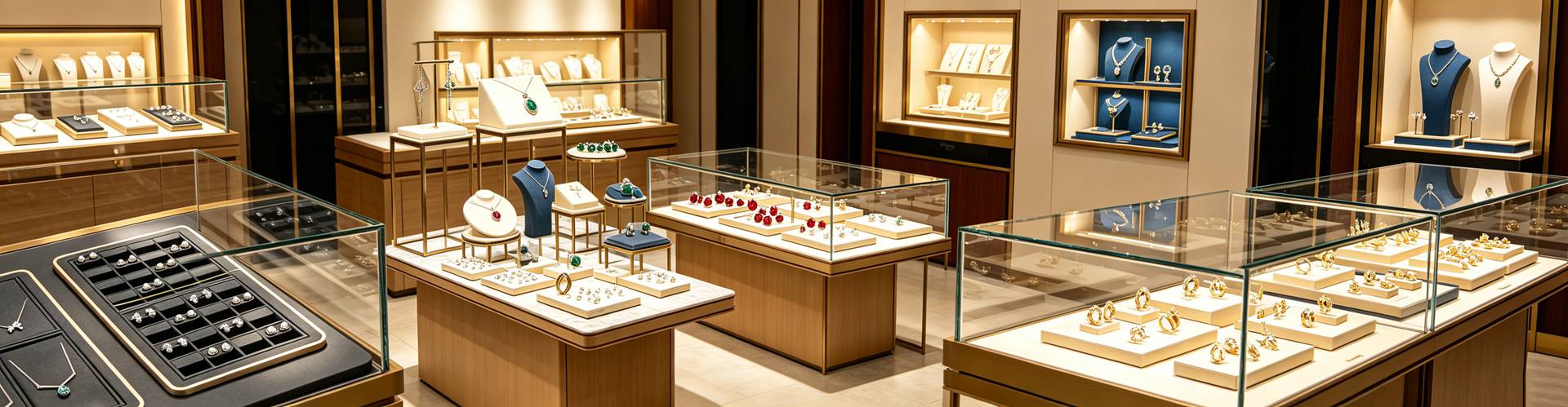
First, subtract. Remove roughly a third of the stock from each case, give every grouping breathing room, and appoint one hero piece per zone — elevated, better lit, centrally placed. It gives the eye a landing point and gives staff a natural opening line.
Second, relight. Rework colour temperature and illuminance to the figures above. It is usually the smallest investment with the fastest return.
Third, unify prop materials. Materials speak before staff do: black velvet flatters diamond brilliance but reads traditional; cream and blush read romantic and contemporary; natural stone and raw wood signal craft and bespoke work; acrylic and brushed metal signal modern accessibility. Background tone divides the same way — dark grounds sharpen diamonds and platinum, light grounds flatter gold lustre and pearl overtone. Choose one language, then execute it consistently across risers, trays and stands.
Q6. Should display props and packaging boxes be planned as one set?
Yes, and this is the step most often skipped. Whatever quality a customer perceives at the counter gets re-verified the moment the box reaches their hand. A matte timber riser paired with a cheap glossy box dismantles your own price argument within three seconds of closing the sale. When props and packaging share the same materials, colours and finishing language, brand recall compounds instead of leaking — retail research indicates 74% of consumers are more likely to repurchase from brands that feel tailored to them.
That is how Shenzhen Junyimei approaches the work: display props and packaging are designed and sampled as one system, from riser suede colour codes to the slot dimensions inside the box, proofed and colour-matched in the same batch, so what a customer admires on the counter is the same brand they carry home.
Merchandising is not decoration. It is the translation of product value into a language customers can read in seconds — and shoppers spend an average of just 13 seconds deciding whether a product deserves their attention. Props, light and packaging determine what they see in those 13 seconds.
This is original content. Copyright belongs to Shenzhen Junyimei.
Junyimei — present every jewel and timepiece at its best.
同样一枚戒指,摆在塞满五十件货的柜台里,和放在一方素色摆台的正中央,成交概率并不相同。很多门店把陈列当成“把货放整齐”,但零售数据一次次证明:柜台是沉默的销售员,道具是它的语言。以下六个问题,来自店主、采购与品牌方最常问我们的疑惑。
问一:陈列道具真的能影响成交吗,还是只是“好看”?
能,而且幅度大到不该被忽略。国际零售陈列机构整理的对照数据显示:单独降低陈列密度可带来约 38% 的转化提升,LED 射灯升级约 31%,按场景(婚嫁、纪念日、生日石)分组陈列约 27%,设立主推款视觉焦点约 24%,道具材质与品牌调性统一约 18%。五项叠加,累计转化改善普遍超过 40%。另有行业统计指出,专业设计的珠宝展柜可让顾客注意力提升 30%–50%,购买转化率最高提升约 20%。国内调研同样给出参照:合理陈列可使顾客停留时间延长约 40%、连带购买率提升约 25%。

问二:一个柜台到底该摆多少件?越满越显得货全吗?
恰恰相反。零售视觉营销研究中最稳定的一条结论是:降低柜内密度会提高单件的被注视时长与感知价值。一个陈列 15–20 件、分组清晰的柜台,在转化率和客单价上通常优于摆了 50 件以上的柜台——货品过密会造成认知过载,顾客的默认反应不是“慢慢挑”,而是“不看了”。
高度同样是变量。人体工学研究显示约 65% 的顾客视线集中在 1.6–1.7 米;海外货架数据把 50–54 英寸称为黄金视线带,低于 30 英寸的“弯腰区”与高于 60 英寸的“举头区”互动率明显下降。落到门店,较有效的做法是让珠宝陈列道具的高度从入口向纵深递减:入口 1.5 米高柜制造冲击,中部 1.2 米便于试戴,深处 0.9 米营造私密选购氛围。
问三:预算有限,灯光和道具先改哪个?
先改灯光,性价比最高。同一颗钻石在不同光线下的呈现差异可达数倍。三个参数需要卡住:色温——钻石与铂金 5000–6000K,黄金 3000–3500K,珍珠与翡翠 4000K;显色指数 CRI 不低于 95,否则宝石颜色会失真;照度——展示区应是环境照度的 3–5 倍,钻戒区 500–800lux,翡翠类 300–500lux。灯具以 3–7W、光束角 15–30 度的 LED 射灯为主流。
效果是可量化的。某连锁品牌调整环境光与展示光配比后,顾客平均驻店时间从 18 分钟增至 27 分钟,试戴率提升约 33%;行业统计也显示,LED 照明可使宝石火彩的可见度提升约 40%。腕表区建议使用可调角度的微型射灯,精确控制光线落点,突出表盘细节与金属拉丝质感。
问四:为什么高端简约的珠宝包装,反而更容易被顾客青睐?
因为简约省下的是视觉噪音,而不是成本。麦肯锡调研显示,68% 的中国城市消费者把包装设计视为判断产品品质的关键因素;Ipsos 数据显示 72% 的购物者会留意包装外观;在多项消费者偏好统计中,极简设计的偏好率达到 85%,且 81% 的人会把极简与环保、克制联想在一起。威斯康星大学与包装企业 Pregis 的联合实验更直接:同一件商品,用高端包装交付时,被感知的零售价值比用普通包装高出约 45%,且在开箱情绪、赠礼意愿等所有维度上得分更高。
但简约并非万能公式:2026 年初的分人群调查显示,千禧一代 58% 偏好极简,Z 世代却有 52% 更吃“繁复表达”,礼赠场景也偏向仪式感。正确的理解是把预算从满版烫印挪到结构与材质上——一只克制的首饰盒,用纸张厚度、内衬绒面与合页阻尼说话,比印满图案更撑得起价格。
问五:小预算改造,先动哪三件事?
第一,做减法。撤掉柜内约三分之一的货品,为每组留出呼吸位,并为每个展示区确立一个“英雄单品”——它应被垫高、被重点打光、居中放置,让顾客的视线有落点,也给导购一个自然的开口。
第二,换灯。按上文的色温与照度重做一遍,通常是投入最小、回报最快的一步。
第三,统一道具材质。不同材质在开口之前就已经替品牌说了话:黑绒衬托钻石火彩但偏传统;米白与藕粉偏浪漫现代;天然石与原木传递手作与高定感;亚克力与拉丝金属则是现代、亲和的信号。背景色也有分工——深色背景强化钻石与铂金的对比,浅色背景更衬黄金光泽与珍珠伴色。选定一套语义,再让珠宝摆台、首饰展台与托盘围绕它统一执行。
问六:陈列道具和包装盒,需要成套考虑吗?
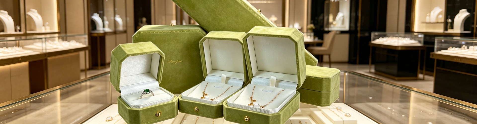
需要,而且这是最容易被忽略的一环。顾客在柜台感知到的质感,会在拿到首饰盒的那一刻被再验证一次。摆台是哑光原木、盒子却是廉价亮膜,溢价说服力会在成交后的三秒里被自己拆掉;反之,道具与包装共用同一套材质与工艺语言,品牌记忆会被叠加强化——零售统计显示 74% 的消费者愿意复购那些“更懂自己”的品牌。
这也是深圳骏依美的做法:把珠宝陈列道具与包装当成一套系统设计打样,从摆台绒面色号到盒体内衬开槽尺寸,同批打版、同批比色,确保柜台上看到的与顾客带回家的是同一个品牌。
陈列不是装饰,是把产品价值翻译成顾客能在几秒内读懂的语言。顾客平均只用约 13 秒决定是否为一件商品停留——道具、灯光与包装,决定了这 13 秒里他看见了什么。
本文为原创内容,版权归深圳骏依美所有,转载请注明出处。
骏依美——让每一件珠宝与腕表,都被更好地呈现。